Hi, so i was wondering if its possible to graph drawdowns in the EQ curve?
Something like this perhaps:
dd = 0

if longonmarket and close < positionprice then
dd = positionprice - close
endif

if shortonmarket and close > positionprice then
dd = close - positionprice
endif

graph dd
On second thoughts it is better to use high and low as this shows how far max drawdown could have gone if you had a position in each candle.
dd = 0

if longonmarket and low < positionprice then
dd = positionprice - close
endif

if shortonmarket and high > positionprice then
dd = close - positionprice
endif

graph dd
I should really think before posting! The above codes don’t consider multiple positions. This does:
dd = 0

if longonmarket and low < positionprice then
dd = (positionprice - close) * countofposition
endif

if shortonmarket and high > positionprice then
dd = (close - positionprice) * abs(countofposition)
endif

graph dd
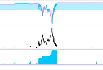
Hm thats not exactly what i had imagined. Was thinking more in the line of this (see picture)
When a drawdown starts a graph would be start to be drawn, when the drawdown ends the graph can just go to zero.
to the left is what u made Vonasi, to the right is more what i would have wanted. Would be easier to “see” the drawdown and how extreme and or mild it is compared to other drawdown periods. Hope that makes sense
Edit: Something more like this: https://www.managedfuturesinvesting.com/analyzing-a-ctas-daily-returns-part-two-equity-curve-vs-underwater-chart/ (photo)
Edit2: Guess its called “underwater chart”
Something like this then:
if longonmarket then
floatingProfit = (((low - positionprice ) * pointvalue) *countofposition) / pipsize
endif

if shortonmarket then
floatingProfit = (((high - positionprice) * pointvalue) * abs(countofposition)) / pipsize
endif

floatingEquity = StrategyProfit + floatingProfit
maxequity = max(maxequity, StrategyProfit + floatingProfit)
ddperc =  ((floatingequity / maxequity) * 100) - 100

graph ddperc
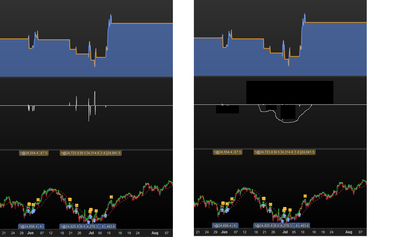
I think ur closing in haha except when ur not in drawdown anymore (when EQ curve hits new highs, then it should just go to zero, cus ur not in drawdown.
Then when EQ curve hits new lows (from the current high) then it starts graphin
edit: which is what is happening maybe, in ur graph? lol
except when ur not in drawdown anymore (when EQ curve hits new highs, then it should just go to zero, cus ur not in drawdown. Then when EQ curve hits new lows (from the current high) then it starts graphin
That is exactly what it does. It stores the maximum high of the equity curve and whenever equity is lower than this it calculates the percentage drop from the highest ever equity.
The image I posted is perhaps not a good representation as it was just a dumb strategy that bought on a red candle and sold if price ever closed in profit so the draw downs shown are long and deep until price moves back above the buy price.
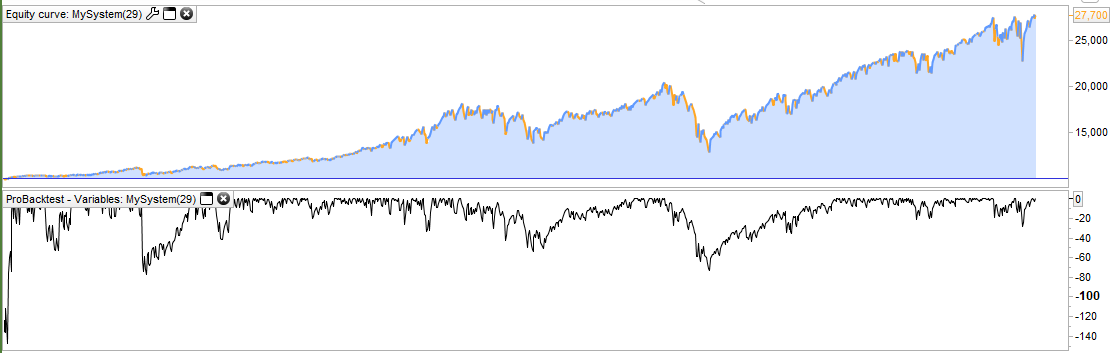
Looks very good 🙂 Thanks
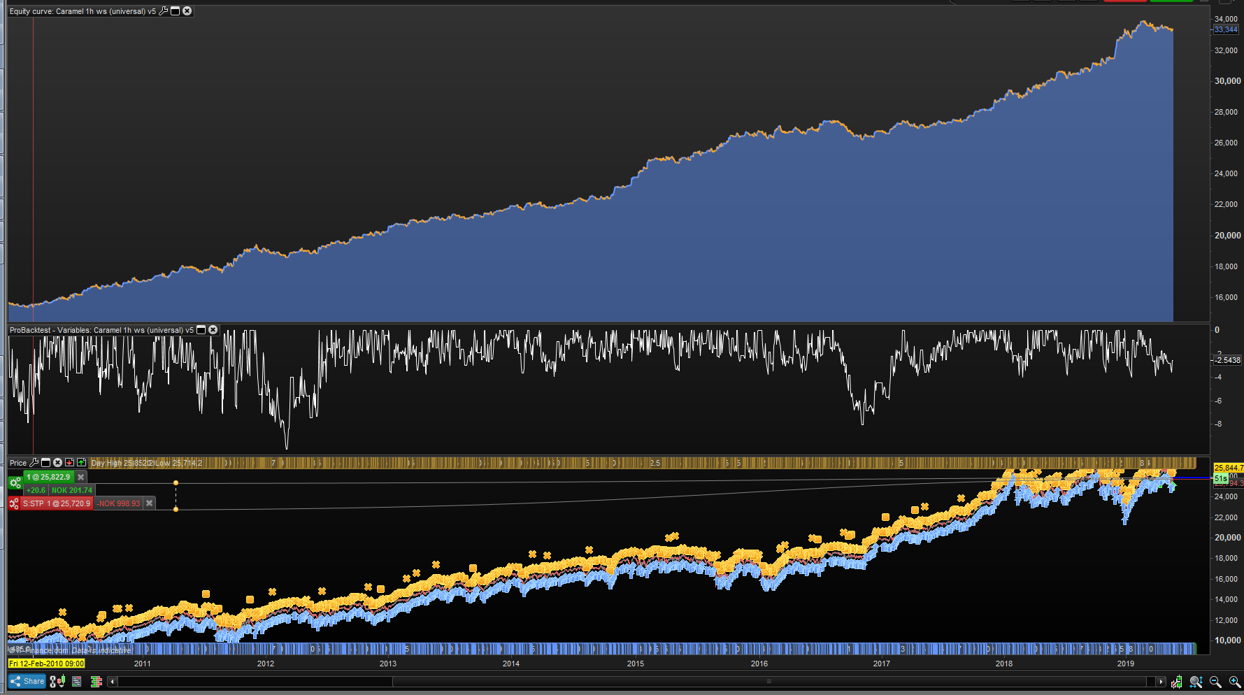
Edit: might be a dumb question but, any way to use this on every strategy and then somehow analyze when their big drawdowns happens?
Like is there a way to export this graph or the numbers? 😛 Would love to look at say 10x strategies drawdown “underwater” charts to analyze to have a better correlated portfolio of strategies..
I dont think this is possible, but would be amazing.
I dont think this is possible, but would be amazing.
You maybe entering territory way beyond what PRT can provide right now! It would be great if we could present graphed values or indicator outputs in a table rather than just a chart. Then we could drag and drop them into Excel and mix them with other instrument/strategy tables then re-organise them and produce a chart that tells us something about correlated strategies. Hard work and slow but it might be useful.
I’ll let you post it as a suggestion! Maybe we will see it in v12.9?