Hi so the indicator im talking about is found here: https://www.tradingview.com/chart/BTCUSD/6SIl2X3f-The-Holy-Grail-of-Trading-Advanced-Volatility-Theory/
Its the 3d heatmap indicator which is explained like this:
“So you may be thinking to yourself, would it be possible to measure the longest period of mass to find the longest possible pivot that will define trend and mean reversion? Why yes it is. I’ve had my developer create a 3D heat map representing 32 separate periods of mass. Red represents a mass level above 0.9. This allows you to define which periods are overexpanded, your longest overexpanded period, and volatility overhead (longer period distributions compressing that will define lateral trading as represented by their 1.25 stdev.) ”
Scroll down until you see the indicator.
Thanks.
Yes, that would be possible.
I read 2 times the description of the concept and I think that we should be able to it.
First we need to code the “Mark Whistler’s Wave PM” indicator. Then a loop through the 32 periods (from 10 to 600? if we refer to the screenshots?) that plot a dot for each tested period and with a colour change depending of the mass level retrieved.
Do you have an idea of where to find the code for that indicator? (didn’t have the time to browse now..). Thanks.
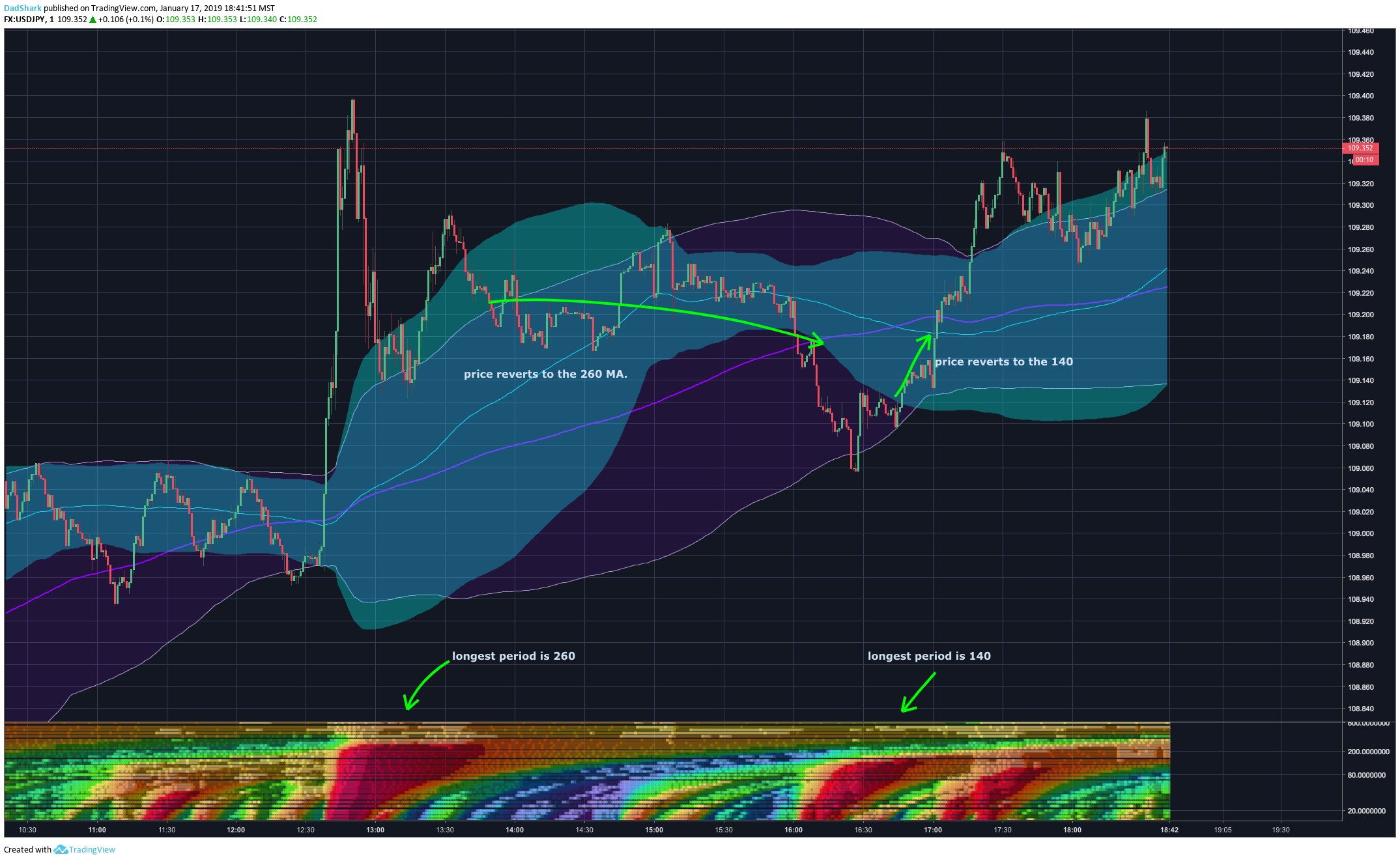
EDIT: I added a screenshot of the original indicator to your post for future reference.
I found out that the “Mark Whistler’s Wave PM” is like a bollinger bandwidth or kinda..
delta = average[14] - (average[14]-std[14]*2.2)
width = highest[100](delta)-lowest[100](delta)

return delta /width
So now, let’s try to make some colors! 🙂
There must be some conditions to generate so much different colors in the original indicator. In this first version, I only made a simple matrix that gradient color from red (indicator result of that period is extreme) to green.
//delta = average[14] - (average[14]-std[14]*2.2)
//width = highest[100](delta)-lowest[100](delta)
//
//return delta /width

defparam drawonlastbaronly=false
//defparam calculateonlastbars=500

dev=1.5
startperiod=10

period=startperiod
while period<=600 do
period=max(startperiod,period+18)
delta = average[period] - (average[period]-std[period]*dev)
width = highest[100](delta)-lowest[100](delta)
result = min(100,(delta/width)*100)
R = max(0,50+(200-(result-50)*12))
G = max(0,50+(200+(result-50)*12))

drawtext("■",barindex,period,dialog,bold,18) coloured(min(r,255),min(g,255),0)
wend

return startperiod,600
I’m not satisfied but this is just the beginning 🙂
Great start Nicolas. I notice in the image of the original indicator that the y scale is not linear. It seems that less high value periods are tested than low value periods. Once you’ve perfected the colours then perhaps the period calculation could then be tweaked to get something similar. You’d need to calculate a separate y value to replace period in the DRAWTEXT. The only problem that I see with this is that the scale to the right would be wrong so perhaps on second thoughts we’ll just have to put up with too many results!
I think that the Y scale is logarithmic…
But I just found that the indicator is not so similar to a BB width, because the normalization is not really dependent to the period of observation, and that’s where the originality and accuracy of the method rely, I guess I must restart from scratch! 😐
This is the good one now:
BandsPeriod=14
BandsDeviations=1.25
Chars= 100

avg= average[BandsPeriod](close)

if barindex>Chars then
sum=0
temp=0
for j=BandsPeriod-1 downto 0 do
temp = Close[j] - avg
sum = sum + temp * temp
next

Dev= BandsDeviations * Sqrt(sum / BandsPeriod)
Dev1 = square(Dev / Pointsize)

//changed
temp=summation[Chars](temp+dev1)
temp=sqrt(temp/Chars)*pointsize
if temp<>0 then
temp=dev/temp
endif

x=temp
if(x>0) then
iexp=Exp(-2*x)
returnNum= (1-iexp)/(1+iexp)
osc= (returnNum)
else
iexp=Exp(2*x)
returnNum=(iexp-1)/(1+iexp)
osc= (returnNum)
endif
endif

return osc
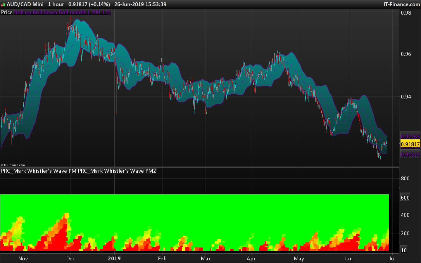
As you can see in the attached picture, the Bollinger Bandwidth I posted previously was close (the one at the bottom), but this code is the perfect one I will use now for the heatmap.
Very interesting gentlemen.
I’d like to help but it is far beyond my actual possibilities.
I simplified the code in order to incorporate it into the loop to make the heatmap: (trying to avoid nested loops…)
BandsPeriod=14
BandsDeviations=1.25
Chars= 100

if barindex>Chars then

Dev = std[BandsPeriod]*BandsDeviations
Dev1 = square(Dev / Pointsize)

temp=summation[Chars](temp+dev1)
temp=sqrt(temp/Chars)*pointsize
if temp<>0 then
temp=dev/temp
endif

x=temp
if(x>0) then
iexp=Exp(-2*x)
returnNum= (1-iexp)/(1+iexp)
osc= (returnNum)
else
iexp=Exp(2*x)
returnNum=(iexp-1)/(1+iexp)
osc= (returnNum)
endif
endif

return osc
The output is zero with any bandsperiod value above 102?
Right! Let’s try with this fix:
BandsPeriod=103
BandsDeviations=1.25
Chars= 100

if barindex>max(Chars,BandsPeriod) then

Dev = std[BandsPeriod]*BandsDeviations
Dev1 = square(Dev / Pointsize)

temp=summation[Chars](temp+dev1)
temp=sqrt(temp/Chars)*pointsize
if temp<>0 then
temp=dev/temp
endif

x=temp
if(x>0) then
iexp=Exp(-2*x)
returnNum= (1-iexp)/(1+iexp)
osc= (returnNum)
else
iexp=Exp(2*x)
returnNum=(iexp-1)/(1+iexp)
osc= (returnNum)
endif
endif

return osc
Another more simplified version (trying to make it works for the heatmap loop with previous version but with no succeed, so I will try now with this one).
BandsPeriod=14
BandsDeviations=1.25
Chars= 100

if barindex>max(Chars,BandsPeriod) then

Dev = std[BandsPeriod]*BandsDeviations
Dev1 = square(Dev / Pointsize)

temp=sqrt(average[chars](dev1))*pointsize
if temp<>0 then
temp=dev/temp
endif

if(temp>0) then
iexp=Exp(-2*temp)
returnNum= (1-iexp)/(1+iexp)
osc= (returnNum)
else
iexp=Exp(2*temp)
returnNum=(iexp-1)/(1+iexp)
osc= (returnNum)
endif
endif

return osc
Amazing work Nicolas, thank you so much for ur time so far.
Better now, but still not good… result of each iteration of the indicator in the loop does not match the exact same value as the standalone indicator (!?).
Still in debugging mode trying to find out why values of the indicator are not correctly calculated in the loop.
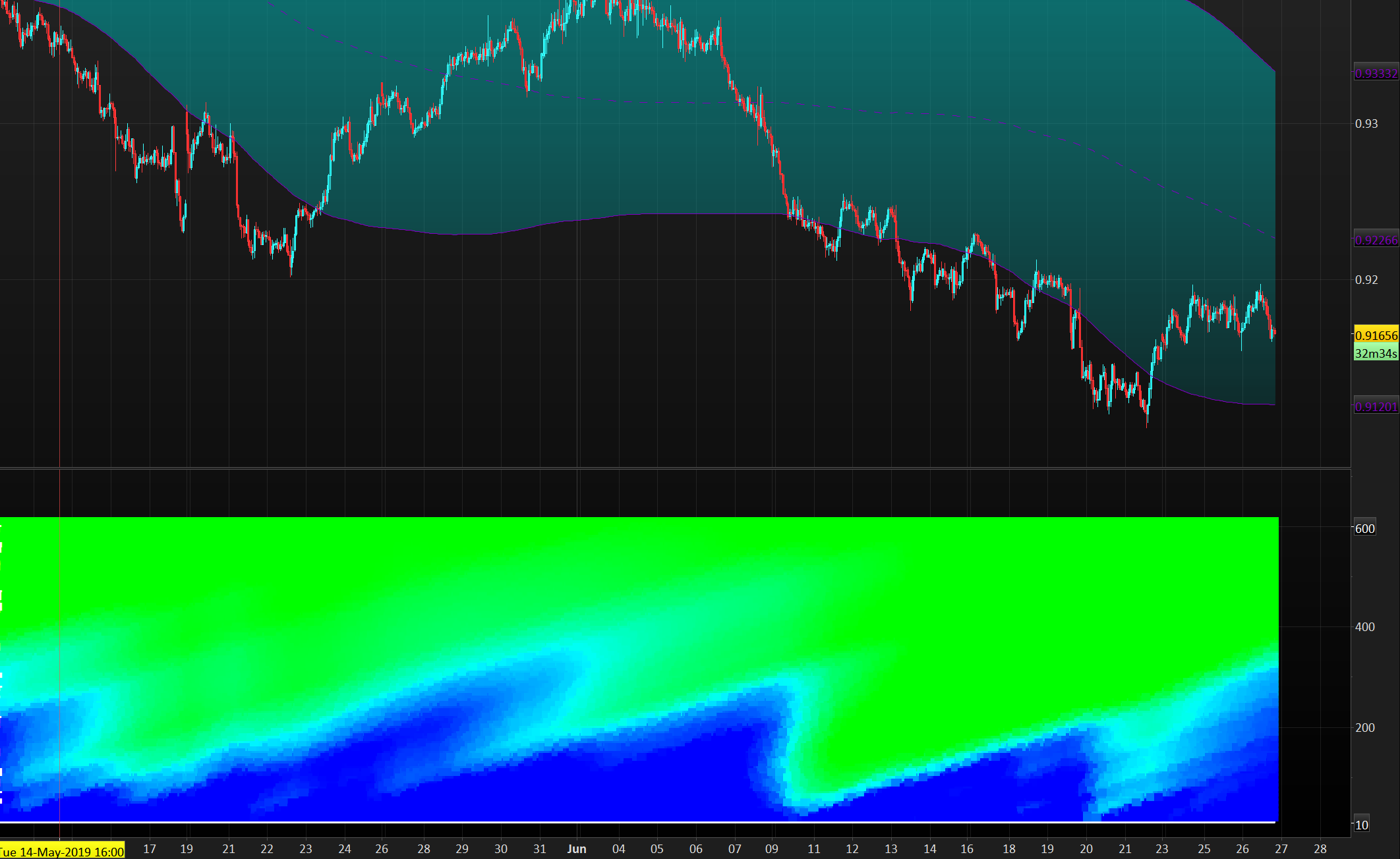
I found a complete explanation about the color matrix used for the 3D heatmap:
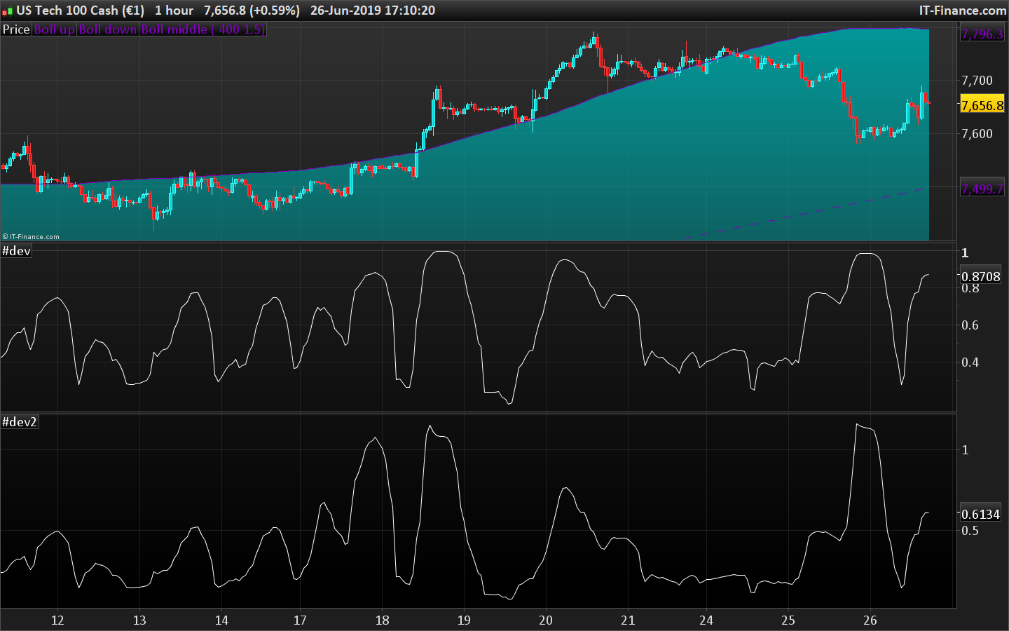
This is an extension of the WAVE-PM indicator as explained by Mark Whistler in his book Volatility Illuminated.
This heatmap represent different lengths of WAVE-PM indicator, starting from 20 and incremented by 15 until 485.
As a reminder, WAVE-PM compare the size of the current distribution to the last 100.
The result is represented as a number between 0 and 1.
The more close to 0, the more contracted the distribution is.
The more close to 1, the more expanded the distribution is.
The color code is :
Between 0.35 and 0.5 also known as the “Gear change” level => Grey
Between 0.5 and 0.7 also known as the “Consolidation” level => Green
Between 0.7 and 0.9 also known as the “Breakout” level => Blue
Between 0.9 and 1 also known as the “Danger” level => Red
Note that i have colored results below 0.35 as black
Note also that each level has been divided in 2 colors : The light one for the lower half of the range and the dark one for the higher half.