Help with conversion of Metastock code

Forums ProRealTime English forum ProBuilder support Help with conversion of Metastock code

Viewing 15 posts - 1 through 15 (of 16 total)
  • #35885

    Hi

    Once again I would appreciate some help with conversion of the code below.  I am unable to correctly translate the line starting with x5 (I think). Have tried ‘all’ the possible variations with little success.  This is my attempt to create a True Slope Indicator as discussed in trading The Invisible by Kirk Northington. This code is for the lower band.  The tandem indicator for the upper band I would be able to code myself.  The graphic shows how the indicator plots in Metastock.  Thanks in advance.

    x:=   BBandBot(c,20, E,2) ;
    x1:=LinearReg(x,7);
    x2:=LinRegSlope(x,7);
    x3:=x1-x2;
    x4:=Min(x1,x3)/Max(x1,x3);
    x5:=(If(x1>x3,2-x4,x4)-1);
    If(x5<0,Atan(x5,1)-360, Atan(x5,1))

    #35918

    Do you have an example of the indicator applied to an instrument of your choice, as I could compare with the translated code I made .. I’m not quite sure about the last part and the Tangent! Thanks.

    #35923

    Hi Nicolas


    Here we go – same as last time EURUSD EOD for 2007

    #35931

    Oh, just remember I got another project with you!

    This is the code for this indicator, I’ll try to find information on it and add it in the library later.


    #35935

    Thanks Nicolas.  Like I said, I thought I had tried everything – except putting the x5 =x5-1 outside the endif loop – told you I struggled with loops.

    #35944

    There is no loop here, it is the “if” statement with parenthesis which is a bit complicate to understand under this form.. I must admit that I looked twice at it too 🙂

    #35956

    What is the name of this indicator? I can’t find anything about it, do you got a link to share with me? Many thanks.

    #35959

    Hi Nicolas

    As I said in my initial post “This is my attempt to create a True Slope Indicator (he calls it “N Band Slopes”) as discussed in trading The Invisible by Kirk Northington.” As the code is proprietary I am attempting to emulate it.  He discusses it in Chapter 11 of the book.  He uses it combination with the “N bands” indicator (which I am also trying to emulate) that you helped me code initially. So, it can at best be called True Slope Emulation v1.00 😉

    I will scan some text and pictures from the book where he explains it.  It will also help with my next request 😉 which is an enhancement of the “N bands” indicator which is used to look for potential “volatility shifts”.

    #35966

    It seems that there is also the upper band slope like in this picture. So the oscillator has the two slopes, right?


    #35981

    It can be used singly or in combination. It will all become clear when I post the scanned material.

    #36000

    As promised -herewith some information from Trading the Invisible by Kirk Northington. In the book he presents both public and proprietary indicators. I am trying to implement parts of his system in PRT, trying to emulate some of his indicators.  Much of the work was carried out in Metastock – hence the requests for help in conversion. I have edited the scanned material and it is presented in  4 parts. Enjoy.


    #36002

    [part 1] MOMENTUM HIDE AND GO SEEK

    So far we’ve confined our discussion of momentum to the challenge of recognizing the true slope of closing prices accurately. We must focus on a different aspect of price to find the most overlooked hidden momentum.

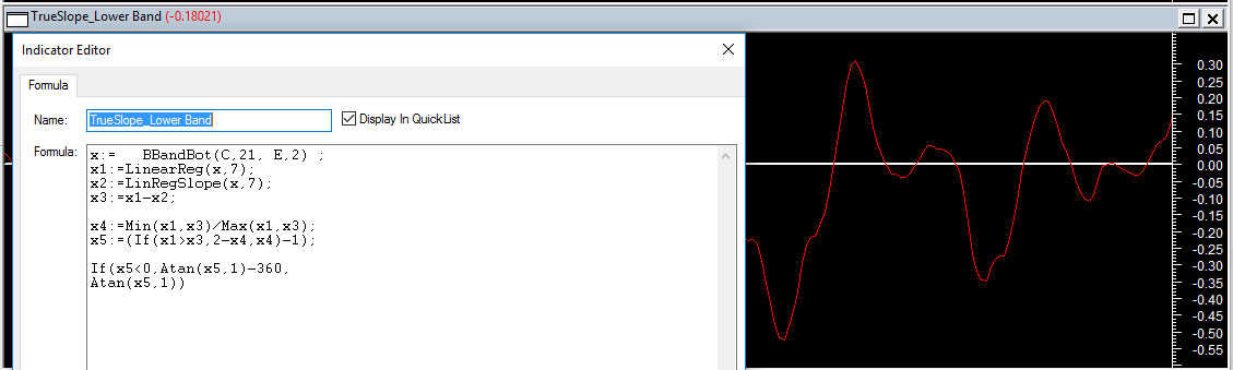
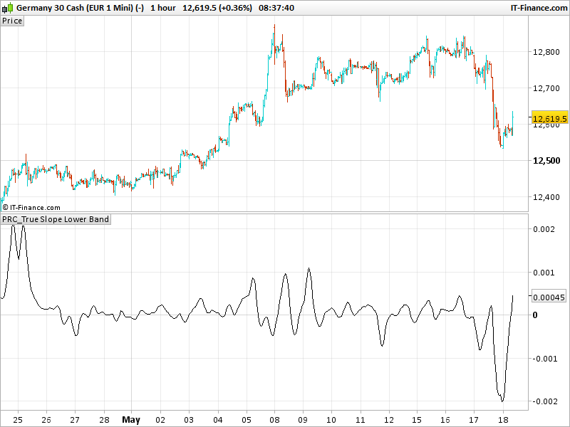
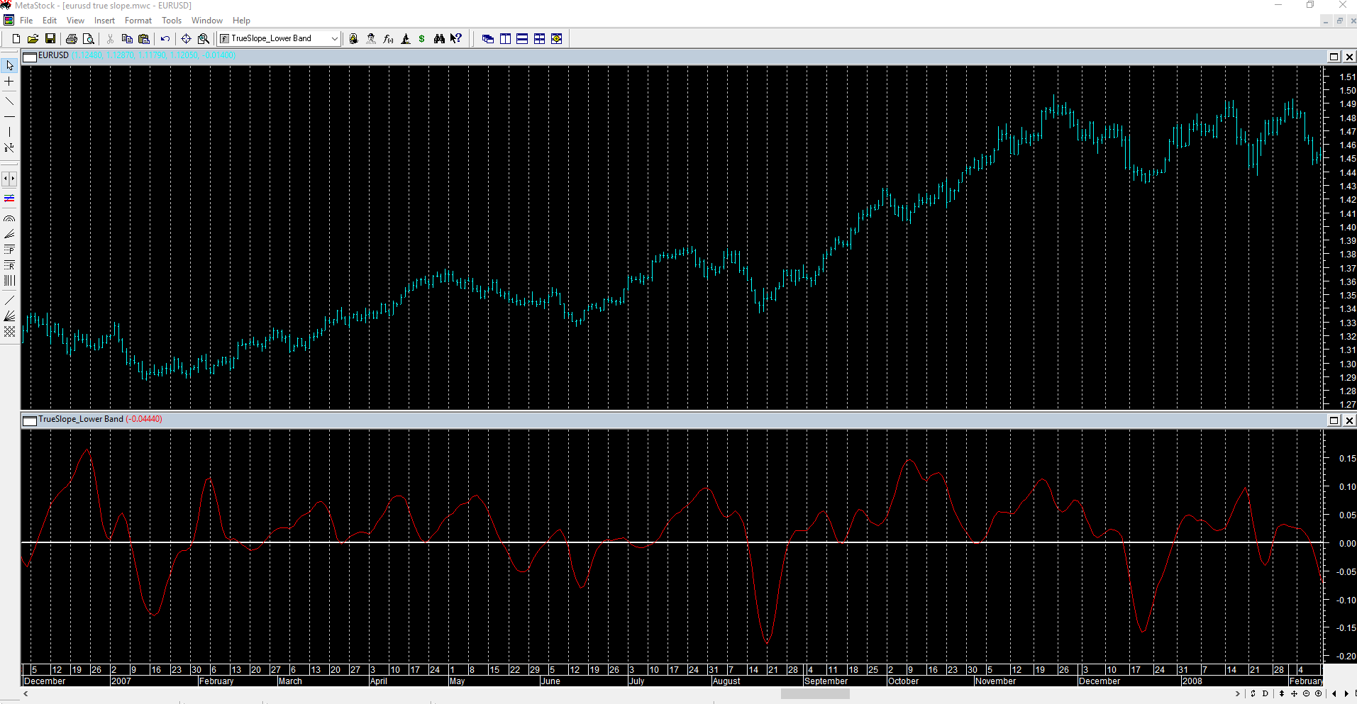
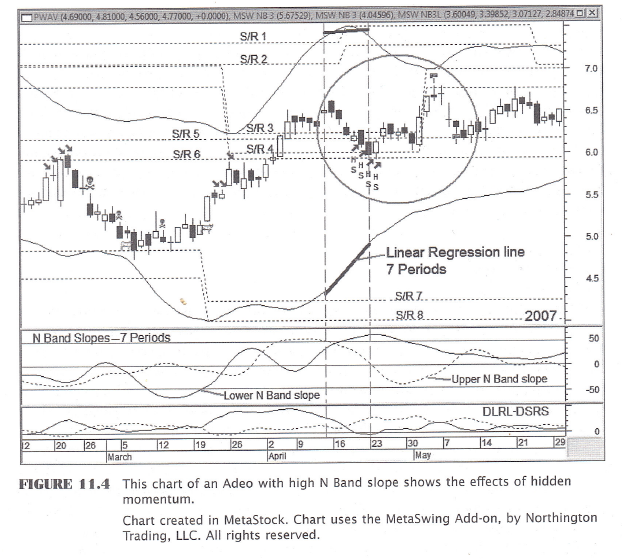
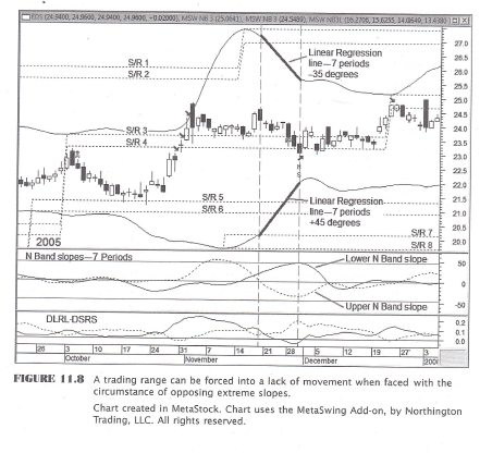
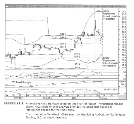
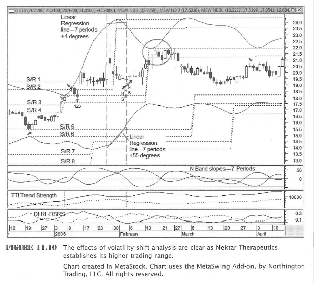
    Here’s the answer. Momentum hides in the movement of implied volatility. A good recent view of implied volatility is where we should measure momentum on the stock chart. The simplest direct gauge of this is to use a true slope indication of the N Band  [[ proprietary ]] . Because implied volatility in its primary form exists as a dynamic matrix of percentages produced by option valuation models, it is difficult to identify as a single value. The N Band well represents a consolidation of its most critical levels. It does so in the immediate time frame as direct support and resistance, and in the future as Projected Implied Volatility (PIV), quantified by S/R lines. Significantly high levels of N Band slope  [[ proprietary ]] , therefore contain hidden price momentum. Another way to express this is that significantly high levels of N Band slope contain the energy for potential price movement.

    Figure 11.1,shows the lower N Band slope measurement. The following are the volatility dynamics at work, which result in hidden momentum.  As the lower N Band rises, the more immediate downside volatility for a stock decreases in that time frame. Thus, the perceived probability of the stock’s price to fall decreases, and the perceived probability for the stock’s price to rise increases.

    As the lower N Band falls, the more immediate downside volatility for a stock increases in that time frame. Thus, the perceived probability of the stock’s price to fall increases, and the perceived probability for the stock’s price to rise decreases.

    As the lower N Band rises, the future potential for downside PIV for a stock decreases in that time frame. Thus, the perceived probability of the stock’s price to decline is also decreased.

    As the lower N band falls, the future potential for downside PIV for a stock increases in that time frame. Thus, the perceived probability of the stock’s price to decline is increased.

    The same tendencies occur in an inverse manner for the upper N Band.

    This theoretical stored price momentum has its roots in logic. It can be best described somewhat anecdotally. Consider that a stock’s closing price is sitting evenly between the upper and lower N Bands. The upper N Band stays at the same value over the next few periods. The lower N Band rises in each of those same periods. Price declines over the same few periods. This means that price and the lower N Band are moving toward each other. Since the lower N Band represents immediate support and is rising to meet price, then a long trade entry begins to show a higher success probability because support (lower N Band) is nearer and resistance (upper N Band) is further away.

    The analyst’s interpretation of this situation is that upside volatility is now greater than downside volatility; and indeed, it is. With all other things being equal, as long as the downside implied volatility is being reduced at a greater rate than the upside volatility, then these conditions favor greater short-term trade success on the long side versus the short side.
    Focusing too intensely on simple price movement can lull the analyst’s judgment.

    Remember that “volatility cycles even when price does not.” If you are really having trouble sleeping and want to dive deeply into the reasons why this is so, then research the mathematical models of ARCH (autoregressive conditional heteroskedasticity) and GARCH (generalized autoregressive conditional heteroskedasticity).

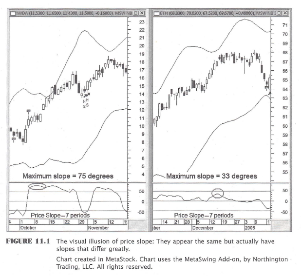
    So how can we be more secure in believing that a rapidly rising N Band improves the probabilites for a rising price? Certainly a handful of examples can be found that support virtually any theory, good or bad. How can we feel confident that these slope measurements will identify additional hidden momentum?

    [[ An anlaysis is then undertaken to test the effectiveness of this approach – the following are his main findings (edited):
    *  When the lower N Band has a high slope condition, the potential trade
    profit increases from 5.3 percent to 9.0 percent. That’s a 69.5 percent increase.  The largest implication of this study is that the potential profit increases two and a half times more than the potential loss: 69.5 percent versus 28. 7 percent. That means that the increase in profit is not just due to volatility magnification. It strongly supports that there is genuine value to the high slope measurement.
    The bottom line here points to a win-win proposition of volatility analysis. The change in performance between the two groups is due to high N Band slope because the disproportionate increase in profit to loss improves the successful trade probability. ]]

    #36005

    [part2]: MOMENTUM FOUND

    Illuminating the invisible and exploiting it with volatility measurement is a central theme of this book. As a general rule, you can accomplish this by using the component framework to build technical structure into the chart. In same way a master builder lays a foundation and constructs the frame of a house, you can create mathematical measurements with predictive value. Using N Band slope embodies this practical application. It adds meaning to a mathematical form of physical structure plotted on the chart. It is messier, as always, when applying the techniques to an actual trade.

    When you are picking out those beautiful new tires in the showroom, they look perfect. But as the saying goes, “when the rubber meets the road,” those tires get dirty. In the case of slope measurement, there are tools and techniques that we will rely on to make slope recognition more obvious and more profitable. We will incorporate them as this chapter progresses.

    Figure 11.4:  This chart’s components are displayed to assist us in accurately recognizing the slope of each N Band. The two N Band slope indicators are plotted in the middle indicator pane. The solid line represents the lower N Band slope, and the dotted line is for the upper N Band slope. The upper and lower thresholds are set at the positive and negative 45-degree marks. Overlaying each N Band for seven days in April is a linear regression line plot, which appears as a thick solid line. The N Band slope indicators base their calculations on a seven-period linear regression line.

    This seven-day look-back duration is bordered on each side with vertical dashed lines.
    Lastly, the Adeo HS (high slope) [[ proprietary ]] signal is shown for four consecutive days inside the circled area.

    The chart clearly shows us that:
    * The rapidly rising lower N Band registers a slope intensity of 58 degrees on April 23, well above the 45-degree threshold. This means that downside implied volatility is decreasing quickly. It also means that immediate support is rising quickly.
    * On April 23, an Adeo long trade sets up nicely. It has good DLRL-DSRS indicator  [[ proprietary ]] levels. It has retraced some of its advance to find support at the S/R 4 and S/R 6 lines.
    [You can examine the full color long-term version of this chart at http://www.tradingtheinvisible.com and see that Powerwave Technologies is not in the middle of a nice, safely rising trend, pushing it higher. In truth, this trade setup is part of a downward
    trend break.]
    * With a trade entry on April 24 and an exit nine days later on May 4, when the lower indicators cross and the Exit Long signal appears, this trade produces an 11 percent profit.

    #36007

    [part 3] Volatility Shift

    Over this seven-day period ending on April 23, 2007, it is obvious that Powerwave Technologies [fig 11.4] underwent a volatility shift. That is to say, its downside volatility decreased while its upside volatility remained virtually static. Stock traders are accustomed to
    thinking of volatility as a single measurement with equal implications for the long and short side potential of the market. They could benefit from looking at volatility the way their option trading cousins do. The option trader understands that implied volatility percentage values for calls and puts are separate from each other for a reason. They are separate because each represents a probability of movement in a specific direction.

    Let’s look at Figure 11.4 again [[previous post]] from the standpoint of its volatility shift. Our analysis so far has focused only on the lower N Band slope value. Powerwave Technologies presents a different picture of upside volatility across the same seven-day time window.

    The upper N Band slope is dropping daily, but is still a positive three degrees. These two slope measurements imply that resistance is remaining the same distance away while support is rising fast. For trading on the long side of the market, this logically translates to the following:
    * The risk of loss is decreasing.
    * The probability of profit has not yet decreased. Also, if it does, it is likely to decrease at a lower rate than the risk of loss.
    * This stock is therefore undergoing a short-term upward volatility shift.
    * The probable short-term trading range is rising because of the upward volatility shift. This is the objective we are seeking.
    * Logically then, the current price is likely positioned beneath the future mean of that new short-term trading range, especially if price has been falling during the slope measurement time window.

    One Slope or Two?

    This is very interesting so far, isn’t it? Is it not solely the lower N Band slope, however, that’s in charge? Perhaps the upper N Band slope should be considered as well. These two slopes could be somewhat like the yin and yang of consolidated implied volatility. But how can we understand this potential relationship better? How can we come closer to knowing the effects of the upper N Band slope on trading probabilities?

    [[ Another analysis is undertaken incorporating the upper N Band slope value as an additional qualifier for the trade signal. It further improves performance ]]

    Dueling Slopes

    Figure 11.8 shows a situation where the upper and lower N Band slopes are opposing. The time span is outlined by the two vertical dashed lines. The vertical line on the right is aligned with an Adeo HS  [[ proprietary ]]  signal. Seven-period linear regression lines are plotted to overlay the upper and lower N Bands so that their slopes are visually referenced. The middle indicator pane contains the seven-period N Band slope indicators.

    Price breaks through resistance at the SIR 3 and S/R 4 levels without pause in October. It trades atop support at the S/R 3 line for three weeks, however, in a narrow range straight line. This price action is a telltale sign that efficiency exists in the market for this stock. Efficiency is the last thing a trader wants to see. We want our employees, our home, and even our car to be efficient; we want to see inefficient stock prices. Inefficient markets are where we make money.

    This efficient price action also creates a contraction of short-term implied volatility. Both upside and downside volatility decreases and are heading right for each other, not unlike a game of chicken. The upper N Band slope is at – 35 degrees while the lower one is at +45 degrees. This is a very different technical setup from our Powerwave Technologies chart. [fig 11.4] Had price not stopped where it did in late October and pushed up to the S/R 1 line, the slope measurements would look very different. Here’s what we can deduce from the volatility measurements in Figure 11.8.

    1. Excessive price malaise in the first half of November, which is in effect price efficiency, causes the upper N Band peak and the lower N Band trough to form at the same time. The lower N Band slope, therefore, cannot reach a high level prior to the upper N Band slope reaching a low reading.
    2. On the Adeo HS  [[ proprietary ]] signal day, both bands are approaching price rapidly. This translates to a rapid and simultaneous decrease in upside and downside volatility.
    3. With upside and downside implied volatility converging rapidly on price, a volatility shift is not likely to develop immediately following the signal day.

    The bottom line in situations like this need not be that the trade is doomed to failure. It is simply not taking advantage of the best odds for success. Anything can and does happen in trading. If you are going to put on a long trade in this situation, it is best to know your odds of participating in an upward volatility shift before entering the position. With the N Band slopes being what they were at the time of the trade signal, an upward volatility shift was not likely to happen.

    #36009

    [part 4] Momentum Found

    So far in this chapter we’ve been studying the middle of the chart. But things aren’t always as clear at the time of decision. High and low N Band slope conditions are often created when sudden moves or changes occur. Getting caught on the wrong side of the market in an extended price retracement, while expecting a reversal, is always something we fear.

    The chart in Figure 11.9 gives us an opportunity to stare into the abyss of the right side of the chart, and all of the glory and failure it could possess. This daily chart of Nektar Therapeutics (NKTR) shows us a potentially scary trade setup. Actually, with the look of the price candles over the most recent two weeks, it would be a bit risky to take a long position without a favorable volatility shift analysis. This chart has the same seven-day slope measurements plotted as our previous examples had.

    At this point on the chart, the analysis factors that we can identify are:
    * The N Band slope measurements are great, with upper and lower at +4 and +55 degrees, respectfully. This is a signal of a probable upward volatility shift about to occur.
    * The TTI Trend Strength indicator  [[ proprietary ]]  has looked positive for the past two months. Its previous 20 days are blocked off by two dotted lines for clarity. The 20-day level changes are favorable as well.
    * The Adeo long  [[ proprietary ]]  signal has set up well with indicator readings that are positive for an Adeo trade.
    *  The price action in the beginning of January blasted up and through all four upper S/R lines quite forcefully. Support at the S/R 1 line has held firm for almost three weeks.
    * A negative sign is that price has not closed far above the SIR 1 line but for two sessions.
    This is not favorable behavior.
    * The opposing tandem indicator height (DSRS)  [[ proprietary ]]  is acceptable, but not at an absolute high. There were instances over the past seven months when the DSRS indicator  [[ proprietary ]] was higher. This is not a major problem, but it never hurts to have the opposing
    height at an extreme.

    With all of the factors lining up to make this a very profitable trade, there are a couple of them that are also detractors. The recent choppy price action settling for such an extended period on the S/R 1 line is one of them. That’s a long time to be at one support level. Also, the lack of an extreme height on the DSRS is the other. Together, they point to the possibility of some further price retracement.

    On the flip side of the coin are the good overall indicator readings combined with an Adeo signal  [[ proprietary ]] . In reality, the tiebreaker has to be the N Band slope readings. The odds of an upward volatility shift make this trade too hard to pass up. It decreases the risk
    of a long position stopping out. It would be best, however, to keep a tight stop on this
    one. A good level would be just below the S/R 2 line.

    In Figure 11.10, we move the right side of the chart forward by two months. This makes it clear that Nektar Therapeutics did indeed carve out a new and higher trading range. This is the effect of a volatility shift. A high slope trade should be managed with that expectation. If price does not behave as though it is finding a new range, then it is time to exit.

    If the trade proceeds as planned, then find your exit at the next level of resistance. Do not get greedy. The top of the next trading range is your target. In this case, it would be as price approaches the upper N Band on February 15 or 16. Whether price stops there or continues on to infinity, you have done your job as a trader. You have entered with the odds in your favor, and you have also exited with the odds in your favor. Looking forward through March, it is easy to see that price found a neutral position between the previously established N Bands.

Viewing 15 posts - 1 through 15 (of 16 total)

Create your free account now and post your request to benefit from the help of the community
Register or Login