This indicator can analyse the four indicators RSI, Stochastic, Williams%R and ADX and present the results in a scatter chart.
This indicator only works on PRTv11 onwards.
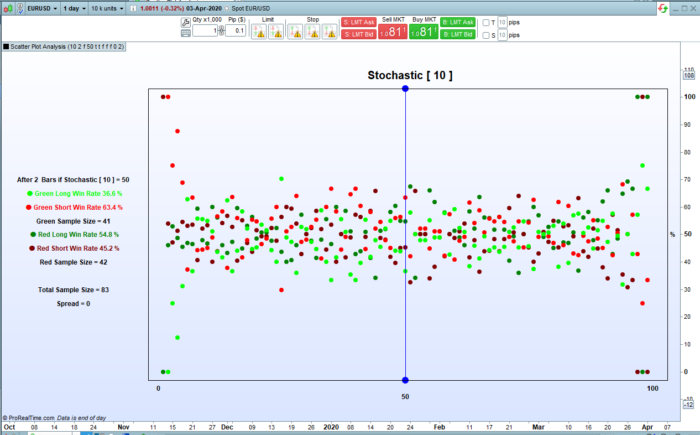
Each of these bounded indicators returns a result between zero and 100. Every candles returned value is calculated rounded up and then a win rate and profit and loss calculated on where price was ‘BarsAfter’ candles later and stored for that returned indicator value. The results are further separated into results for if our tested candle was a red candle or a green candle. The results are then displayed in a scatter chart and also as text to the left of the scatter chart. Sample size is also calculated and displayed so that we can see how big a sample the results are calculated on.
So for example on the DJI daily if we check the RSI indicator and base our calculations on 2 bars after we can see that if the RSI returned a value of 35 (actually >34 and <=35) then we had 192 candles in our history with an RSI value of 35 with 57 of them being green and 135 red. We can then also see the win rate for if we went long on green candles with RSI=35 and exited after two bars or short on green candles with RSI=35 and exited after two bars – and the same for long on red or short on red.
If we switch ‘ProfitLoss’ on then the scatter chart changes so we can see how much each trade direction would have won or lost. The scatter chart y axis is calculated to represent the most profitable indicator value return at 100% and the worst at 0%.
The x axis always represents the indicator returned values between zero and 100.
The indicator has two modes. ‘Live’ or not live. In Live mode the results and scatter plot display change to only show results for the current candle colour and current chosen indicator return value for the current candle. In ‘Not Live’ mode you can enter a ‘Value’ and check the results for any indicator returned value for any colour candle. In ‘Live’ mode the blue line represents the current candles indicator returned value location on the scatter chart and it will move up and down as this changes. The points at the top and bottom of the blue line change colour from red to green depending on current candle colour. In ‘Not Live’ mode the points of the line are blue and the blue line is located on whatever you have set ‘Value’ to be.
You can set a ‘Spread’ to be used in the profit and loss calculations. Spread is not taken into account when calculating the win rates however.
You can also set ‘DecimalPlaces’ to display more or less decimal places in the profit and loss displayed results.
Set ‘p’ to whatever period of your chosen indicator you want to analyse.
There are four tick boxes to choose an indicator. If no boxes are ticked then the default is RSI but if you tick more than one box then the order of display priority is ADX then Williams%R then Stochastic.
As always I advise downloading and importing to get full functionality.
|
1 2 3 4 5 6 7 8 9 10 11 12 13 14 15 16 17 18 19 20 21 22 23 24 25 26 27 28 29 30 31 32 33 34 35 36 37 38 39 40 41 42 43 44 45 46 47 48 49 50 51 52 53 54 55 56 57 58 59 60 61 62 63 64 65 66 67 68 69 70 71 72 73 74 75 76 77 78 79 80 81 82 83 84 85 86 87 88 89 90 91 92 93 94 95 96 97 98 99 100 101 102 103 104 105 106 107 108 109 110 111 112 113 114 115 116 117 118 119 120 121 122 123 124 125 126 127 128 129 130 131 132 133 134 135 136 137 138 139 140 141 142 143 144 145 146 147 148 149 150 151 152 153 154 155 156 157 158 159 160 161 162 163 164 165 166 167 168 169 170 171 172 173 174 175 176 177 178 179 180 181 182 183 184 185 186 187 188 189 190 191 192 193 194 195 196 197 198 199 200 201 202 203 204 205 206 207 208 209 210 211 212 213 214 215 216 217 218 219 220 221 222 223 224 225 226 227 228 229 230 231 232 233 234 235 236 237 238 239 240 241 242 243 244 245 246 247 248 249 250 251 252 253 254 255 256 257 258 259 260 261 262 263 264 265 266 267 268 269 270 271 272 273 274 275 276 277 278 279 280 281 282 283 284 285 |
//Scatter Plot Analysis //By Vonasi //Date 20200405 defparam drawonlastbaronly = true //p = 1 //Period to use in chosen indicator //BarsAfter = 1 //Number of bars later to record result on //Live = 0 //Switch between Live analysis and static analysis. Live = 1 Static = 0 //Value = 50 //Indicator returned result to see results of in static analysis //RSIndex = 1 //Analyse RSI[p] indicator results //Stoch = 0 //Analyse Stochastic[p] indicator results //WilliamsR = 0 //Analyse Williams%R[p] indicator results //ADXIndex = 0 //Analyse ADX[p] indicator results //ProfitLoss = 0 //Display Profit and Loss or Win Rate results 1 = Profit and Loss 0 = Win Rate //Spread = 0 //Spread to use in profit and loss calculations. //DecimalPlaces = 2 //Number of decimal places to display profit and loss results to p = max(1,p) value = max(1,value) value = min(100,value) barsafter = max(1,barsafter) spread = max(0,spread) decimalplaces = max(0,decimalplaces) if RSIndex or not RSIndex then indicator = rsi[p] indtype = 1 endif if stoch then indicator = stochastic[p,3] indtype = 2 endif if williamsR then indicator = abs(williams[p]) negflag = 1 indtype = 3 endif if adxindex then indicator = adx[p] indtype = 4 endif if live then thisresult = round(indicator) else thisresult = value endif BarsAfter = max(BarsAfter,1) indicatorvalue = round(indicator[barsafter]) if indicatorvalue >=1 and barindex > barsafter then if negflag then drawtext("-100",barindex-1,-6,sansserif,bold,12) drawtext(" -#thisresult#",barindex-(101-thisresult),-9,sansserif,bold,12) else drawtext("100",barindex-1,-6,sansserif,bold,12) drawtext(" #thisresult#",barindex-(101-thisresult),-9,sansserif,bold,12) endif redbar = 0 greenbar = 0 if close < open THEN redbar = 1 endif if close >= open THEN greenbar = 1 endif if not profitloss then //red close down if close < close[barsafter] and close[barsafter] < open[barsafter] then $redshortwin[indicatorvalue] = $redshortwin[indicatorvalue]+1 endif //red close up if close > close[barsafter] and close[barsafter] < open[barsafter] then $redlongwin[indicatorvalue] = $redlongwin[indicatorvalue]+1 endif //green close up if close > close[barsafter] and close[barsafter] > open[barsafter] then $greenlongwin[indicatorvalue] = $greenlongwin[indicatorvalue]+1 endif //green close down if close < close[barsafter] and close[barsafter] > open[barsafter] then $greenshortwin[indicatorvalue] = $greenshortwin[indicatorvalue]+1 endif else if close[barsafter] < open[barsafter] then //red short $redshortprofit[indicatorvalue] = $redshortprofit[indicatorvalue]+((close[barsafter]-close)-spread) //red long $redlongprofit[indicatorvalue] = $redlongprofit[indicatorvalue]+((close-close[barsafter])-spread) $redsample[indicatorvalue] = $redsample[indicatorvalue] + 1 endif if close[barsafter] > open[barsafter] then //green long $greenlongprofit[indicatorvalue] = $greenlongprofit[indicatorvalue]+((close-close[barsafter])-spread) //green short $greenshortprofit[indicatorvalue] = $greenshortprofit[indicatorvalue]+((close[barsafter]-close)-spread) $greensample[indicatorvalue] = $greensample[indicatorvalue] + 1 endif maxprofit = max(max(max(max($redshortprofit[indicatorvalue],$redlongprofit[indicatorvalue]),$greenlongprofit[indicatorvalue]),$greenshortprofit[indicatorvalue]),maxprofit) minprofit = min(min(min(min($redshortprofit[indicatorvalue],$redlongprofit[indicatorvalue]),$greenlongprofit[indicatorvalue]),$greenshortprofit[indicatorvalue]),minprofit) endif if islastbarupdate then for d = 100 downto 1 c = 101 - d if not profitloss then $redlongwinperc[d] = ($redlongwin[d]/($redlongwin[d]+$redshortwin[d]))*100 $redshortwinperc[d] = ($redshortwin[d]/($redlongwin[d]+$redshortwin[d]))*100 $greenshortwinperc[d] = ($greenshortwin[d]/($greenshortwin[d]+$greenlongwin[d]))*100 $greenlongwinperc[d] = ($greenlongwin[d]/($greenshortwin[d]+$greenlongwin[d]))*100 else profitrange = maxprofit - minprofit $redlongwinperc[d] = (($redlongprofit[d]- minprofit)/(profitrange))*100 $redshortwinperc[d] = (($redshortprofit[d]- minprofit)/(profitrange))*100 $greenshortwinperc[d] = (($greenshortprofit[d]- minprofit)/(profitrange))*100 $greenlongwinperc[d] = (($greenlongprofit[d]- minprofit)/(profitrange))*100 endif if redbar or not live then drawpoint(barindex-c,$redlongwinperc[d],2)coloured(0,128,0) drawpoint(barindex-c,$redshortwinperc[d],2)coloured(128,0,0) endif if redbar and live then drawtext("Red Candle",barindex-118,60,sansserif,bold,14)coloured(128,0,0) endif if greenbar or not live then drawpoint(barindex-c,$greenshortwinperc[d],2)coloured(255,0,0) drawpoint(barindex-c,$greenlongwinperc[d],2)coloured(0,255,0) endif if greenbar and live then drawtext("Green Candle",barindex-118,60,sansserif,bold,14)coloured(0,255,0) endif if not profitloss then redsample = $redshortwin[thisresult]+$redlongwin[thisresult] greensample = $greenshortwin[thisresult]+$greenlongwin[thisresult] else redsample = $redsample[thisresult] greensample = $greensample[thisresult] endif if thisresult = d then yp = 55 zp = 35 drawsegment(barindex-c,-2,barindex-c,103)coloured(0,0,255) if greenbar and live then drawpoint(barindex-c,-3,3)coloured(0,255,0) drawpoint(barindex-c,103,3)coloured(0,255,0) if not profitloss then shortrate = round($greenshortwinperc[d],1) longrate = round($greenlongwinperc[d],1) drawtext("● Long Win Rate #longrate#%",barindex-118,50,sansserif,bold,12)coloured(0,255,0) drawtext("● Short Win Rate #shortrate#%",barindex-118,45,sansserif,bold,12)coloured(255,0,0) else shortrate = round($greenshortprofit[d],decimalplaces) longrate = round($greenlongprofit[d],decimalplaces) if longrate < 0 then drawtext("● Long Loss #longrate#",barindex-118,50,sansserif,bold,12)coloured(0,255,0) else drawtext("● Long Profit #longrate#",barindex-118,50,sansserif,bold,12)coloured(0,255,0) endif if shortrate < 0 then drawtext("● Short Loss #shortrate#",barindex-118,45,sansserif,bold,12)coloured(255,0,0) else drawtext("● Short Profit #shortrate#",barindex-118,45,sansserif,bold,12)coloured(255,0,0) endif endif drawtext("Sample Size = #greensample#",barindex-118,40,sansserif,bold,12) endif if redbar and live then drawpoint(barindex-c,-3,3)coloured(128,0,0) drawpoint(barindex-c,103,3)coloured(128,0,0) if not profitloss then shortrate = round($redshortwinperc[d],1) longrate = round($redlongwinperc[d],1) drawtext("● Long Win Rate #longrate#%",barindex-118,50,sansserif,bold,12)coloured(0,128,0) drawtext("● Short Win Rate #shortrate#%",barindex-118,45,sansserif,bold,12)coloured(128,0,0) else shortrate = round($redshortprofit[d],decimalplaces) longrate = round($redlongprofit[d],decimalplaces) if longrate < 0 then drawtext("● Long Loss #longrate#",barindex-118,50,sansserif,bold,12)coloured(0,128,0) else drawtext("● Long Profit #longrate#",barindex-118,50,sansserif,bold,12)coloured(0,128,0) endif if shortrate < 0 then drawtext("● Short Loss #shortrate#",barindex-118,45,sansserif,bold,12)coloured(128,0,0) else drawtext("● Short Profit #shortrate#",barindex-118,45,sansserif,bold,12)coloured(128,0,0) endif endif drawtext("Sample Size = #redsample#",barindex-118,40,sansserif,bold,12) endif if not live then yp = 70 zp = 25 drawpoint(barindex-c,-3,3)coloured(0,0,255) drawpoint(barindex-c,103,3)coloured(0,0,255) if not profitloss then shortrate = round($greenshortwinperc[d],1) longrate = round($greenlongwinperc[d],1) drawtext("● Green Long Win Rate #longrate#%",barindex-118,65,sansserif,bold,12)coloured(0,255,0) drawtext("● Green Short Win Rate #shortrate#%",barindex-118,60,sansserif,bold,12)coloured(255,0,0) drawtext("Green Sample Size = #greensample#",barindex-118,55,sansserif,bold,12) shortrate = round($redshortwinperc[d],1) longrate = round($redlongwinperc[d],1) drawtext("● Red Long Win Rate #longrate#%",barindex-118,50,sansserif,bold,12)coloured(0,128,0) drawtext("● Red Short Win Rate #shortrate#%",barindex-118,45,sansserif,bold,12)coloured(128,0,0) drawtext("Red Sample Size = #redsample#",barindex-118,40,sansserif,bold,12) else shortrate = round($greenshortprofit[d],decimalplaces) longrate = round($greenlongprofit[d],decimalplaces) if longrate < 0 then drawtext("● Green Long Loss #longrate#",barindex-118,65,sansserif,bold,12)coloured(0,255,0) else drawtext("● Green Long Profit #longrate#",barindex-118,65,sansserif,bold,12)coloured(0,255,0) endif if shortrate < 0 then drawtext("● Green Short Loss #shortrate#",barindex-118,60,sansserif,bold,12)coloured(255,0,0) else drawtext("● Green Short Profit #shortrate#",barindex-118,60,sansserif,bold,12)coloured(255,0,0) endif drawtext("Green Sample Size = #greensample#",barindex-118,55,sansserif,bold,12) shortrate = round($redshortprofit[d],decimalplaces) longrate = round($redlongprofit[d],decimalplaces) if longrate < 0 then drawtext("● Red Long Loss #longrate#",barindex-118,50,sansserif,bold,12)coloured(0,128,0) else drawtext("● Red Long Profit #longrate#",barindex-118,50,sansserif,bold,12)coloured(0,128,0) endif if shortrate < 0 then drawtext("● Red Short Loss #shortrate#",barindex-118,45,sansserif,bold,12)coloured(128,0,0) else drawtext("● Red Short Profit #shortrate#",barindex-118,45,sansserif,bold,12)coloured(128,0,0) endif drawtext("Red Sample Size = #redsample#",barindex-118,40,sansserif,bold,12) endif sample = greensample + redsample drawtext("Total Sample Size = #sample#",barindex-118,30,sansserif,bold,12) endif drawsegment(barindex-103,-3,barindex-103,103) drawsegment(barindex+2,-3,barindex+2,103) drawsegment(barindex-103,-3,barindex+2,-3) drawsegment(barindex-103,103,barindex+2,103) if indtype = 1 then drawtext("Relative Strength Index [ #p#]",barindex-50,108,sansserif,bold,20) drawtext("After #barsafter# Bars if RSI [ #p#] = #thisresult#",barindex-118,yp,sansserif,bold,12) //drawtext("RSI Value",barindex-(100-thisresult),-11,sansserif,bold,12) endif if indtype = 2 then drawtext("Stochastic [ #p#]",barindex-50,108,sansserif,bold,20) drawtext("After #barsafter# Bars if Stochastic [ #p#] = #thisresult#",barindex-118,yp,sansserif,bold,12) //drawtext("Stochastic Value",barindex-(100-thisresult),-11,sansserif,bold,12) endif if indtype = 3 then drawtext("Williams%R [ #p#]",barindex-50,108,sansserif,bold,20) drawtext("After #barsafter# Bars if Williams%R [ #p#] = #thisresult#",barindex-118,yp,sansserif,bold,12) //drawtext("Williams%R Value",barindex-(100-thisresult),-11,sansserif,bold,12) endif if indtype = 4 then drawtext("Average Directional Index [ #p#]",barindex-50,108,sansserif,bold,20) drawtext("After #barsafter# Bars if ADX [ #p#] = #thisresult#",barindex-118,yp,sansserif,bold,12) //drawtext("ADX Value",barindex-(100-thisresult),-11,sansserif,bold,12) endif drawtext("Spread = #spread#",barindex-118,zp,sansserif,bold,12) drawtext("0",barindex-101,-6,sansserif,bold,12) drawtext("%",barindex+3,50,sansserif,bold,12) endif next endif endif return 108 coloured(0,0,0,0),-12 coloured(0,0,0,0) |
Share this
No information on this site is investment advice or a solicitation to buy or sell any financial instrument. Past performance is not indicative of future results. Trading may expose you to risk of loss greater than your deposits and is only suitable for experienced investors who have sufficient financial means to bear such risk.
ProRealTime ITF files and other attachments :
Find other exclusive trading pro-tools on ![]()
PRC is also on YouTube, subscribe to our channel for exclusive content and tutorials


Vonasi you’re a beast !!! ;-)))
Amazing indicator , you are pushing PRT to the limit! But looking at the scatter its not clear to me how can we interpret the plot , I mean should we look for some kind of linear correlation between x/y ?