Hi All again,
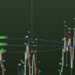
What I was trying to get at was, you’d have a 5min chart, followed by a 1sec chart. Drawings-labels etc etc can be configured to display on an inferior timeframe, all good, no problem.
Problem now it would seem is, viewable area on 1sec is reduced and the closest to what it once was, until the other week (maybe), is a 10sec chart expanded.
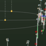
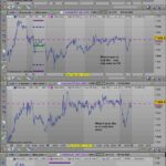
Scroll wheel has very little effect on 1sec, it will blow up (zoom-in) the current session (which might be down to what Gra has said already) (with 200k units @1sec – 2.2days). But only last week, you could scroll-zoom out proper, see ALL days available. I have historical charts showing this but have included a basic form of what’s being seen now in the attachment.
There’s no rocket science here, vanilla, vanilla. Apologies for not explaining better. Still not sure if I have.
Attached is as close as an example as I can get when looking at yesterdays sessions for AUS 200.
You used to be able to draw-lable-study on a 5m (or higher) and have those studies appear on lower TF and easily read-accessed by using 200k units on 1s and then zoom in-out with a scroll wheel.
Scroll-wheel would zoom out the entire available dataset on 1sec.
The scroll wheel won’t get you there now on 1sec – higher TF no problems. In TCP terms you’d say the queue or buffers are a bit shallow @1sec.
So as a general gist you’d have a 1sec chart below a 5min and they’d – almost – marry, displaying the ‘drawn items’ across multi-TF and when you needed to adjust you’d simply zoom in/out which on 1sec isn’t doable now.
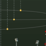
Effectively you no longer see the 1s chart data plot on the chart (if you move to where the drawing is), close bar and scale prices are in play but not any ‘future’ bars (clear chart ahead)(as seen in the bottom chart).
Thanks again everyone, hope this clears it up a little … fingers crossed 🙂