It is raining and windy here in Greece today so I can’t get on with any boat jobs and so thought I would do a bit of analysis instead. I thought I’d see if there is any truth in what candlestick shadows are supposed to tell us. If there is a very big lower shadow it is supposed to indicate a lot of buying pressure and if there is a very long upper shadow it is supposed to indicate a lot of selling pressure.
I decided to test on the DJI for my first analysis and to use weekly candles as these will give us a whole weeks worth of bull and bear representation. So I coded a simple strategy like this:
longshort = 1  //1=long  2=short
upperlower = 1 //1=upper  2=lower

//upper shadow
if upperlower = 1 then
shadow = ((high-max(open,close))/(high-low))*100
endif

//lower shadow
if upperlower = 2 then
shadow = ((min(open,close)-low)/(high-low))*100
endif

if longshort = 1 and shadow >= x and shadow < x + 5 then
buy 1 contract at market
endif

if longshort = 2 and shadow >= x and shadow < x + 5 then
sellshort 1 contract at market
endif

if onmarket then
sell at market
exitshort at market
endif
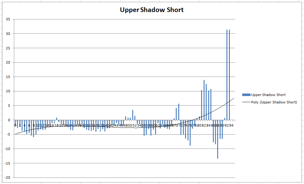
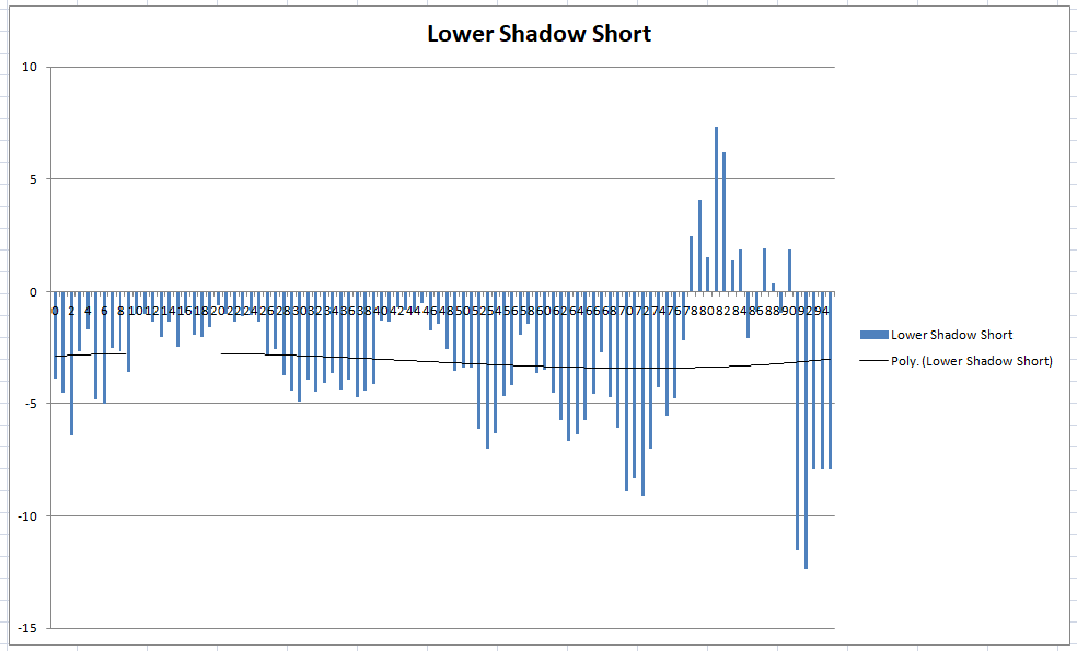
This simply checks to see if a candles shadow is within a certain percentage size range and if it is it opens a trade and closes it at the end of the week. By changing the ‘longshort’ and ‘upperlower’ and optimising with an x value from 0 to 95 I was able to analyse four different scenarios.
- Upper shadow size and going long.
- Lower shadow size and going long
- Upper shadow size and going short.
- Lower shadow size and going short.
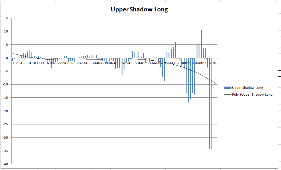
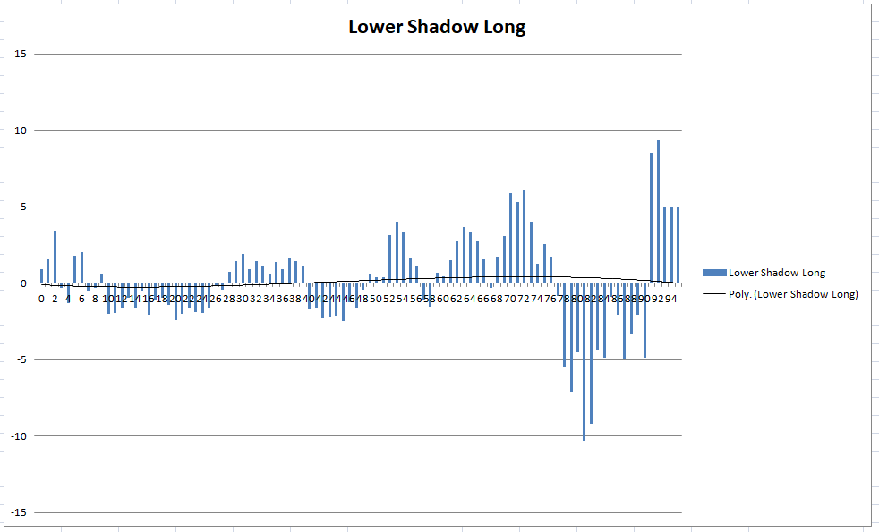
Each test returns in the optimised report results for if the shadow size is 0% to 5% of the candle range then >1% to 6% then >2% to 7% and so on. I was then able to plot the results of these tests in Excel (average gain per trade) and see if shadow size meant any greater probability that the next week would be a green or a red one. The results were interesting and it seems that on the DJI weekly at least that extremely large shadow sizes are worth trading.
Interestingly it seems that if say for example a lower shadow is larger than 87% of range then going long works very well but 77% to 87% you would do better to mean revert and go short and the opposite for large upper shadows.
It will be interesting to check other markets to see if they are similar.
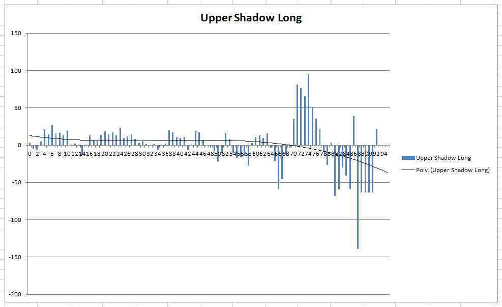
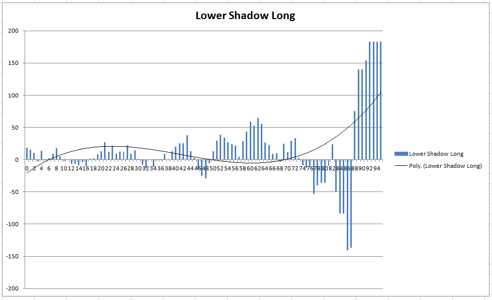
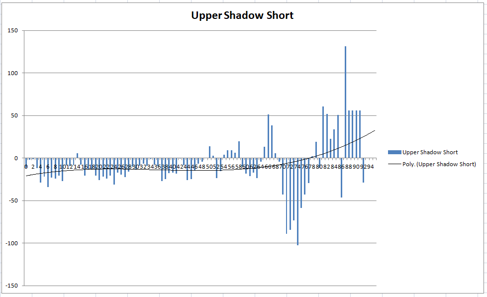
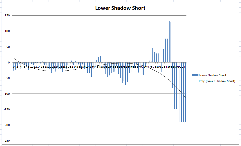
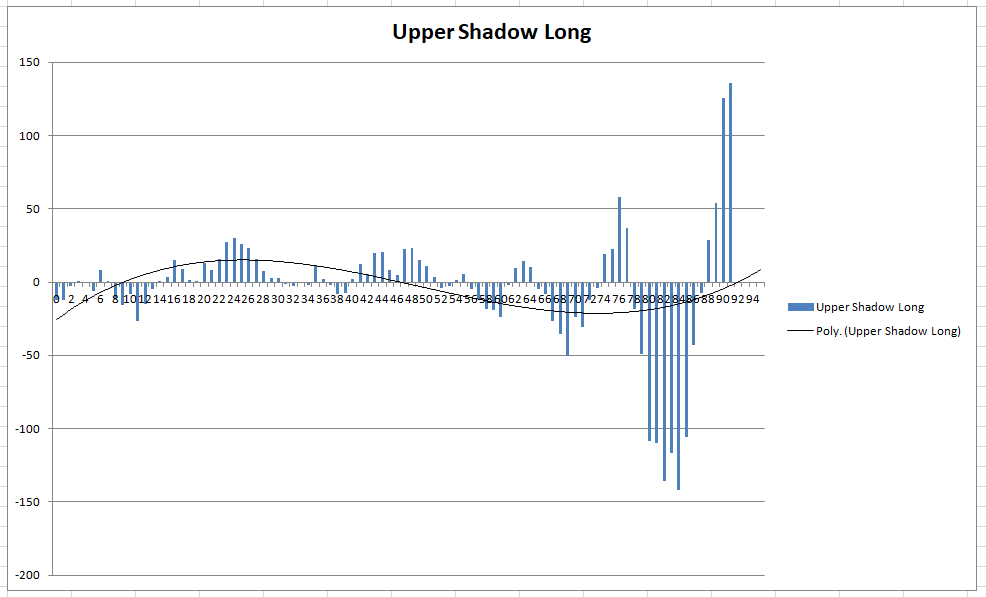
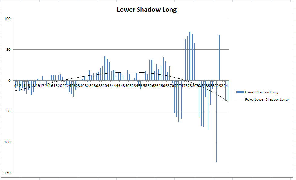
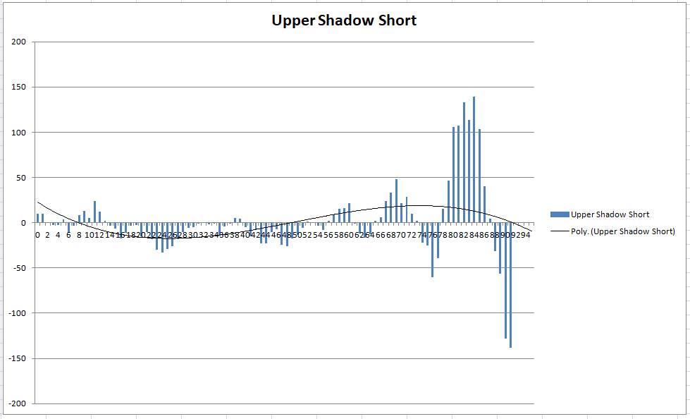
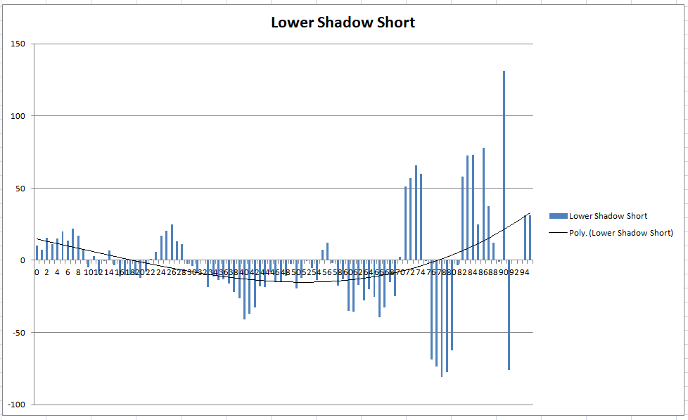
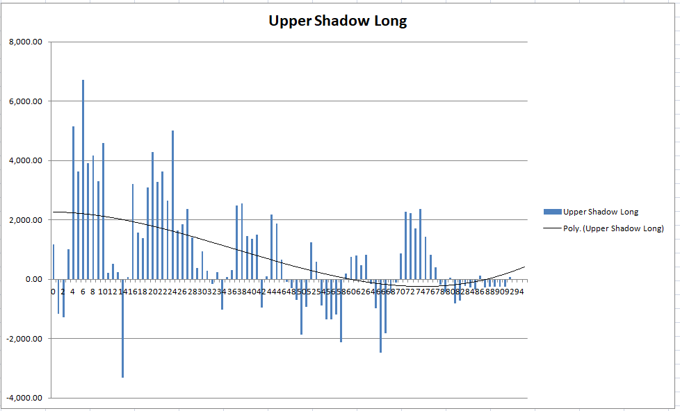
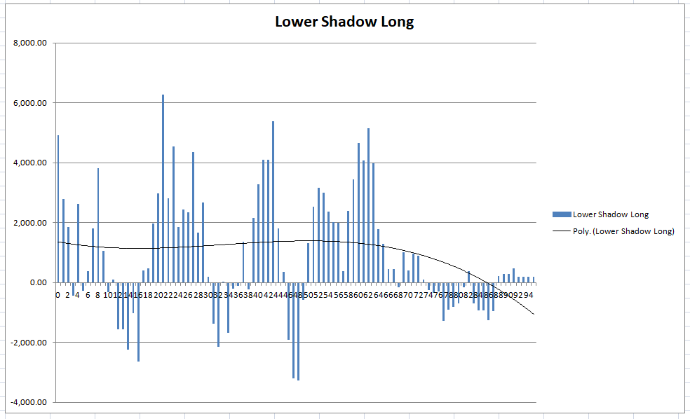
The four attached charts show the results.
Here are the results for the SP500 weekly with spread = 1.5
Once again similar results with extremely long shadows being profitable if traded in the right direction but also with an area of mean reversal just below the extreme length shadows.
So the Y-axis is the % of return of a trade executed at next bar open and exited after 1 weekly bar?
…and here are the results for EURUSD.
Interestingly they are the opposite to the results for the indices tested and highlight the truly mean reversal nature of forex. An extremely long lower shadow is a signal to go short and an extremely long upper shadow a signal to go long.
So the Y-axis is the % of return of a trade executed at next bar open and exited after 1 weekly bar?
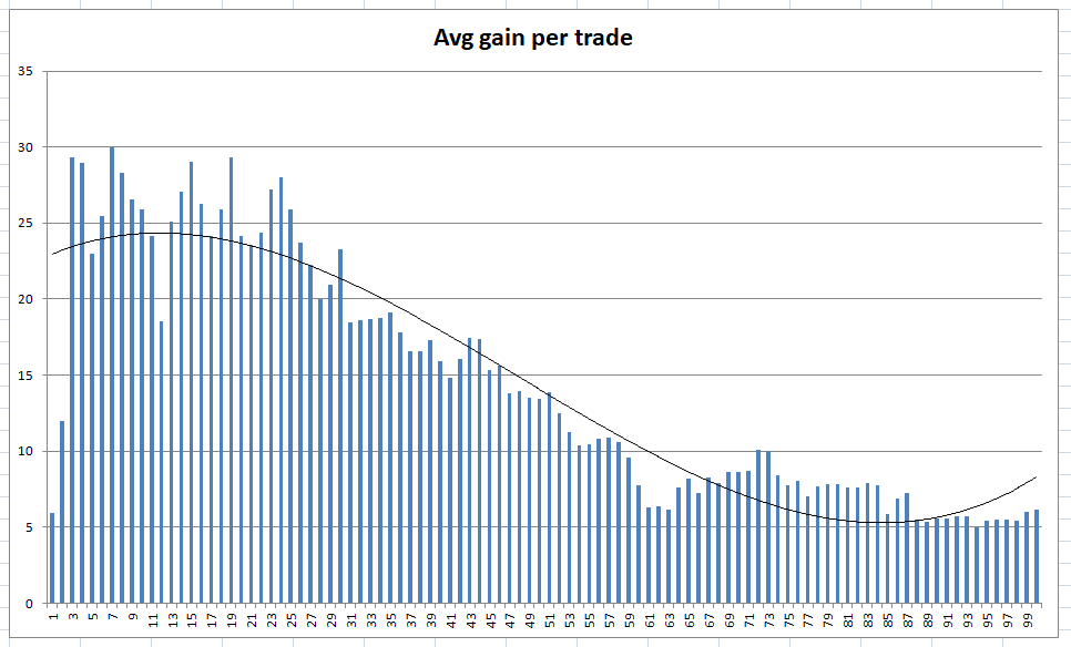
The Y axis is the average gain per trade for all trades in that particular bucket so 0% to 5% shadow size then 1 to 6% shadow size then 2% to 7% and so on.
Unfortunately when I look more closely at the results it is clear that they are skewed due to the lack of trades at the extremes. You might get a large average gain per trade but that is no use if there has only ever been one trade in all of history! Back to the drawing board I guess.
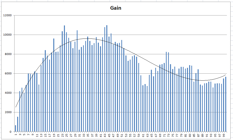
If we plot the same charts but using total gain instead of average gain per trade it is quite interesting.
Ignoring the short charts for the DJI (because they look terrible and confirm how hard it is to short the DJI) here are the long charts for the various upper and lower shadow sizes. It seems that the smaller the upper shadow the better your chance of the next week being a long one. Below about 46% shadow size there are very few buckets that make a loss. The lower shadow size chart seems a bit more all over the place so it seems on the DJI that upper shadow size tells us more than lower shadow size.
Fine but what is the average orders per year for each % rank? As you stated, if there is not enough orders, how would it be relevant as a statistical fact? 🙂
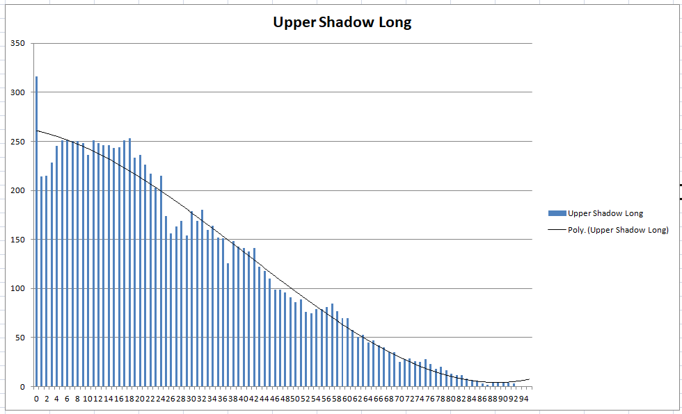
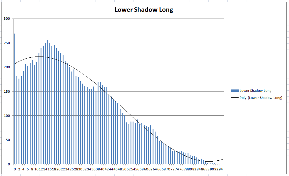
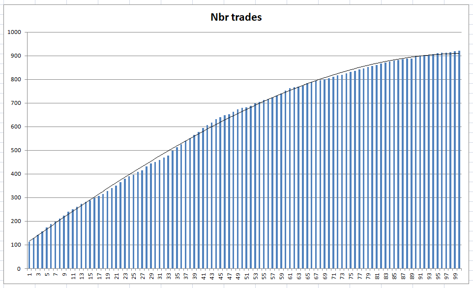
I’ve not done average orders per year but graphed total trade quantity for each bucket. At the extremes trade quantity gets a bit low for sensible analysis. Lovely half bell curves though!
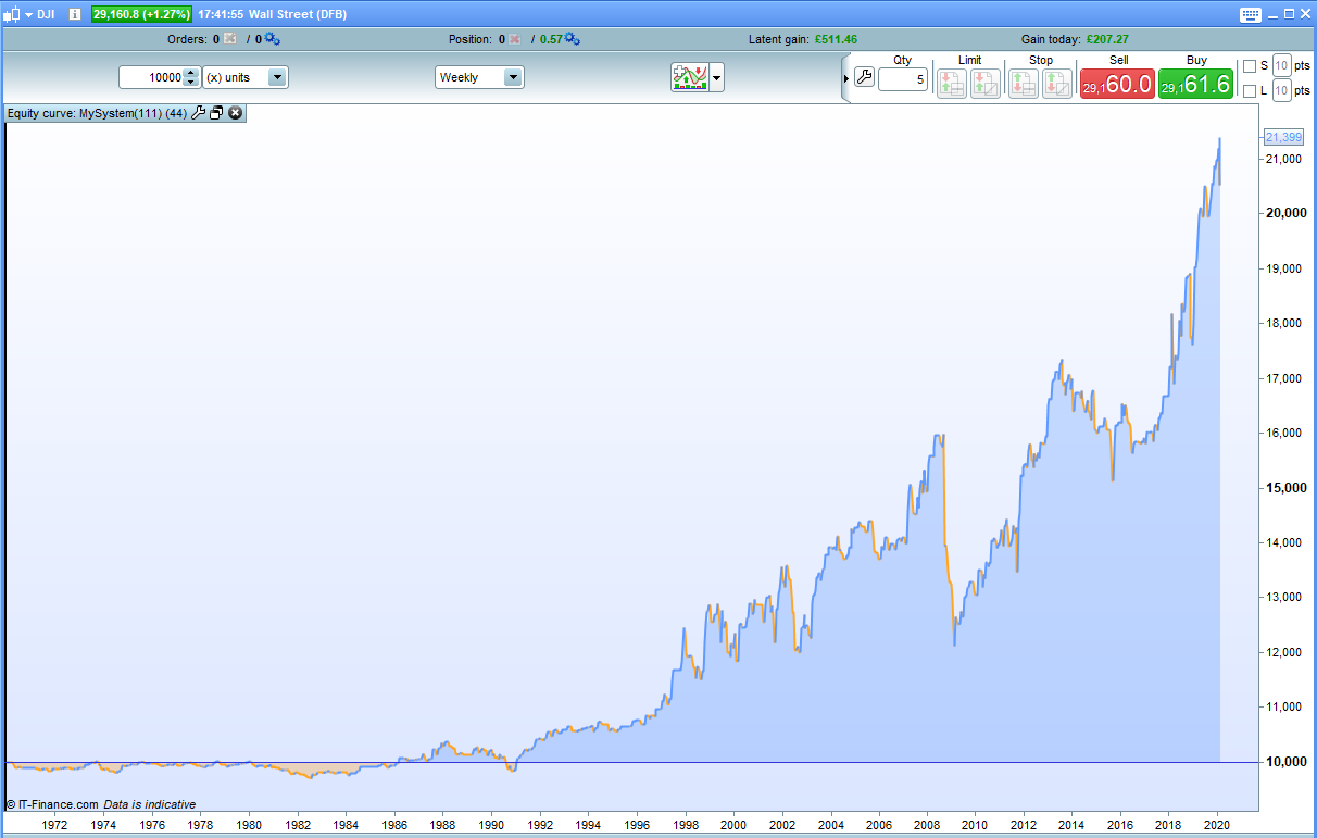
I turned it into a simple strategy:
if ((high - max(open,close))/(min(open,close) - low))*100 < x then
buy 1 contract at market
endif

if onmarket then
sell at market
endif
The equity curves are a bit bumpy but the analysis is interesting I think.