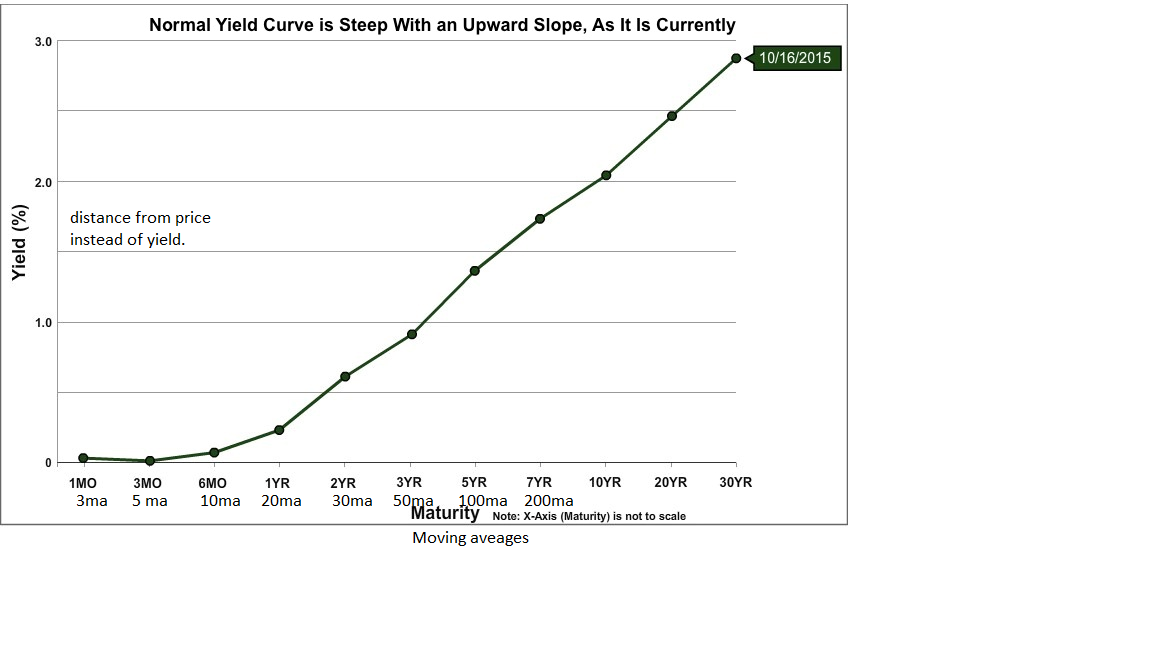
MA yield curve

Viewing 8 posts - 1 through 8 (of 8 total)
  • #38203

    Hello,

    I am interested in making a yield curve out of the different MAs. I am having a bit of trouble working out how to draw it, I was thinking points on a line but a historgram would probably be best or a line but I would want it to be uncorrelated to to the time areas.


    once ma3= Average[3](Close)
    once ma5= Average[5](Close)
    once ma10= Average[10](Close)
    once ma15= Average[15](Close)
    once ma30= Average[30](Close)
    once ma50= Average[50](Close)
    once ma100= Average[100](Close)
    once ma200= Average[200](Close)
    if barindex>0 then
    ExtMapBuffer3 = close[0] -ma3
    ExtMapBuffer5 = close[0] -ma5
    ExtMapBuffer10 = close[0] -ma10
    ExtMapBuffer15 = close[0] -ma15
    ExtMapBuffer30 = close[0] -ma30
    ExtMapBuffer50 = close[0] -ma50
    ExtMapBuffer100 = close[0] -ma100
    ExtMapBuffer200 = close[0] -ma200
    endif
    DRAWLINE(ExtMapBuffer3,ExtMapBuffer5,ExtMapBuffer10,ExtMapBuffer30,ExtMapBuffer50,ExtMapBuffer100,ExtMapBuffer200) coloured(r,g,b)
     // error as draw line isnt right, I was thinking a list and a historgram or something like that?
    Any help would be most appreciated.
    Kind regards,
    Vignas
    #38250

    I’m not sure to understand your request. You want to draw the points differences between multiple moving average fixed values with the current Close? I count 8 returned buffers to draw, they will be drawn in the past individually from the 8th bar to the current one? Sounds possible but I need to be sure before coding it 🙂

    #38252

    Hi Nicolas,

    Sorry for not being clear, I basically was reading trading psychology 2.0 and he mentioned that instead of a yield curve for bond yields, he implements the same idea with moving averages instead of different bond dates. I’ve added a picture of what I mean, if that helps.

    Yeah the 8 past bars works well, I wasn’t sure if it was possible. 🙂 I was thinking of doing it in excel but I didn’t think that would be as useful.


    #38255

    ok thanks seems interesting, let’s do it! 😉

    #38256

    This is what I made so far, is it how it should look? We can join the X with segments if you like.

    With graphical objects, the auto scale of the window isn’t working, so that’s why you see white dots .. they are there to tell the platform what is the high/low of the scale so it automatically adapt the chart. I don’t know how to make it look better actually… 😐

    #38262

    I think it looks perfect, the line isn’t really necessary and the white dots are barely visible. From what I read, it was only comparing how it moves over time, if it turns into a U bend, its likely to be reversion or ranging where as if its all a lovely straight line/curve, its probably more likely to be a trend.

    Be interesting to play around with it and see how it moves 🙂

    #38264

    This is the code, a bit rough one but that do the job 😉


    #38265

    That’s amazing! Thanks! and it works like a charm 🙂

    I’ll keep you updated if I find out anything interesting about it!

    1 user thanked author for this post.
Viewing 8 posts - 1 through 8 (of 8 total)

Create your free account now and post your request to benefit from the help of the community
Register or Login