Hello PRT experts,
I would like to include in my Proscreener a few conditions that filter out those stocks whose 1 minute candle data is not clear. To define what is clear and what is not, please see the pictures in the attachments.
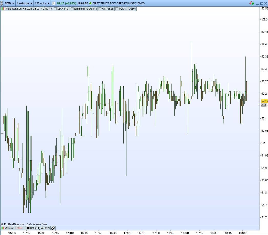
FIXD has what I call low-quality M1 candles
[attachment file=”123647″]
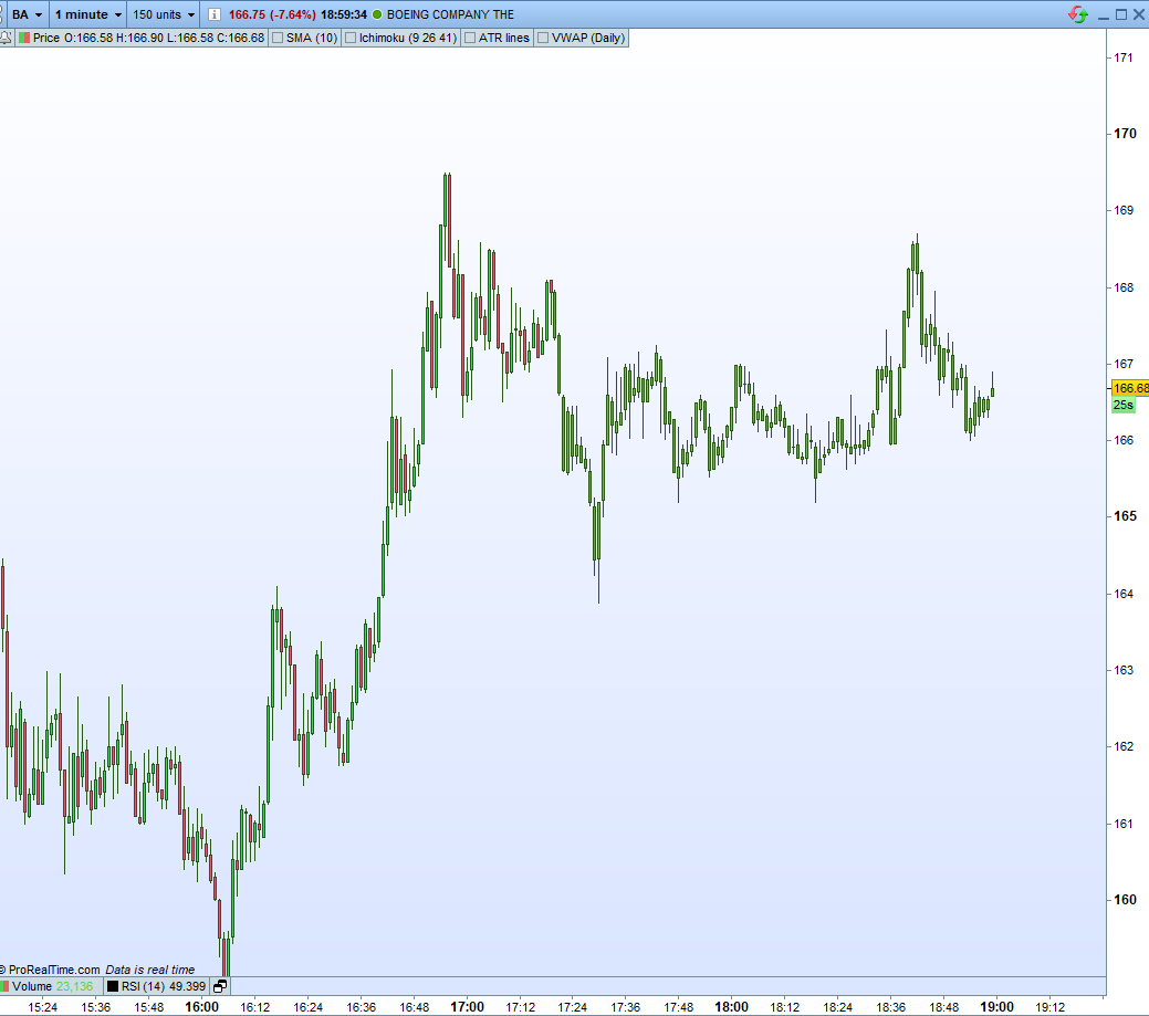
, while BA has what I call high-quality M1 candles.
[attachment file=”123646″]
I have been playing with features such as Average Daily Volume, ATR, Price, MinDailyCapital (volume*price), Market Cap (in different software) but still I cannot filter out stocks like FIXD in this day. It should be noted that the same stock, for example FIXD, could have high quality M1 candles one day but not have them the next, so it’s not a permanent feature on the stock, it is feature of liquidity I believe.
I could really use your help in here.
(Please ignore LK chart, error in editing and I cannot remove it)
That’s indeed the lack of liquidity for that particular stock that build this kind of candlestick. Not all stocks are traded by speculative actors on the market.
Any idea Nicolas on how I can filter out in PRT these kind of stocks? Since I trade the 1 minute, the presence of these stocks overburdens my screeners.
Why don’t you just create lists of only major stocks to run your screener on? For example only those in the FTSE100 as that way you can ensure liquidity and avoid what you call low quality candles.
It’s definitely an option Vonasi; however, I do not want to limit myself to those stocks that I know so far or those correlated with the indexes, since the are many smaller stocks that are not in the NASDAQ or SP500, for example, but have enough liquidity and great opportunities. I was hoping to find a combination of variables that could proxy for liquidity in this case.
Any other ideas?
No ideas from me I’m afraid but if you can define exactly what the qualities of a high quality candle are then I’m sure it can be coded. Perhaps some sort of calculation based on average volume per candle?
This indicator returns the average volume per candle. Perhaps you could have a filter that removes low average volume instruments from your screener?
if volume <> 0 then
flag = 1
endif
if flag = 1 then
total = total + volume
count = count + 1
avg = (total/count)
endif
return avg
Based on your code Vonasi, I have written the following:
/////////////////////////////////////////////
// Min req

TIMEFRAME(daily)
avol = average(volume)[10]
atr = AverageTrueRange[14](close)
MinDailyCapital=200000000
c1min = atr > 0.8
c2min = avol > 600000
c3min = volume[2]*DClose(2)>MinDailyCapital or volume[1]*DClose(1) > MinDailyCapital or volume*DClose(0)>MinDailyCapital

TIMEFRAME(1 minute)
avolM1 = average(volume)[20]
c4min = avolM1 > 50000

cmin = c1min and c2min and c3min and c4min

/////////////////////////////////////////////

TIMEFRAME(daily)

c = open < close

/////////////////////////////////////////////

s = volume/avol

SCREENER[cmin and c] (s as "%AVOL")
I thought that, perhaps, using the “average” command I could make it simpler to filter out stocks with a low average volume in the 1 minute TF. However, the code yields no results.
Can you spot the error?
My suggestion would be to create an indicator and apply it to some stocks to check what values you get for things like volume[2]*DClose(2).
For future reference, the indicator I have created following you guidelines, Vonasi, goes as follows:
defparam drawonlastbaronly=true

candleCapital = volume*DClose(0)
atr = AverageTrueRange[14](close)
AVOL = average(volume)[10]
relativeVolume = volume/AVOL

drawtext("candleCapital = #candleCapital#",barindex,1,Dialog,Bold,15)
drawtext("AVOL = #AVOL#",barindex,0.5,Dialog,Bold,15)
drawtext("atr = #atr#",barindex,0,Dialog,Bold,15)
drawtext("relativeVolume = #relativeVolume#",barindex,-0.5,Dialog,Bold,15)

return
It shows the information on the indicator window, centered at the zero level. Though manually I can gauge the approximate values, still it’s not optimal. Though it’s a temporary solution.
Any further improvement do you think I could make?
I would not show things as text on the last bar only I would create a line graph so I can see values throughout all of history. Perhaps your conditions are way off real life reality?
What I finally came up with is the following:
/////////////////////////////////////////////
// Min req

TIMEFRAME(daily)
avol = average(volume)[10]
atr = AverageTrueRange[14](close)
candleCapital = 100000000
c1min = atr > 0.8 and avol > 600000 and volume[2]*DClose(2)>candleCapital or volume[1]*DClose(1) > candleCapital or volume*close>candleCapital

TIMEFRAME(5 minutes)
Matr = AverageTrueRange[200](close)
Mavol = average(volume)[200]
McandleCapital = average(volume*close)[200]
c2min = Mavol > 50000 and Matr > 0.1 and McandleCapital > 1000000

cmin = c1min and c2min

/////////////////////////////////////////////

TIMEFRAME(default)

c = open > close or close > open

/////////////////////////////////////////////

SCREENER [ cmin and c ] (Mavol as "MAVOL")
It is not to strict but just enough, and flexible ood to keep making adjustments. The 200 average should be wide enough to capture a good picture of those parameters in the stocks in the 5 minutes. Also, clasifying the securities by the M5 AVOL allows me to keep on top those most liquid.
It’s a pity that there is not an only metric I can use to easily sort through those illquid stocks, since I have noticed that still I miss some great stocks to trade and that, depending on market conditions, I have to readjust the parameters of the screener, and that makes it burdemsome.
Please, Vonasi, send me a PM or a reply should you come up with something that can push the niddle a little bit forward, and thank you for your contribution.
that there is not an only metric I can use to easily sort through those illquid stocks, since I have noticed that still I miss some great stocks to trade and that, depending on market conditions
So please provide ways to sort them easily. What you have at disposal : price, time and volumes.
As you discovered, there is no empirical way to exclude that ugly looking candlesticks from a screener. In fact, it is just a question of maths to translate what is plotted on the chart. A lot of things are easily spotable with human eyes, but hardly to be recognized with codes.