I’ve been trying to analyse how much influence over sized candle range has on whether we will win or lose. On most indices it became apparent to me that often an over sized daily red candle is often followed by a green candle but I wanted to carry out some analysis to confirm whether the size of the candle effects the probability of a green candle or how much it effects profit based on its size. I also noticed that different days of the weeks had different average ranges so it was unfair to compare a Sunday candle with a Monday candle so this had to be built into the analysis.
So I wrote a simple strategy that calculated the all time average range for each day of the week and could be optimised to go long any time a candle was bigger than 0.1 times average range for that day up to 10 times average range for that particular day in steps of 0.1. The strategy simply sold the next day.
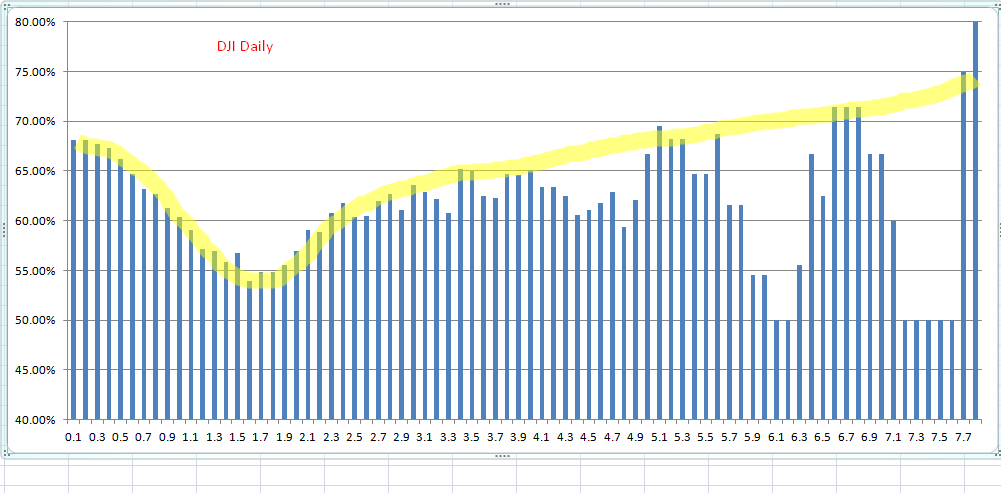
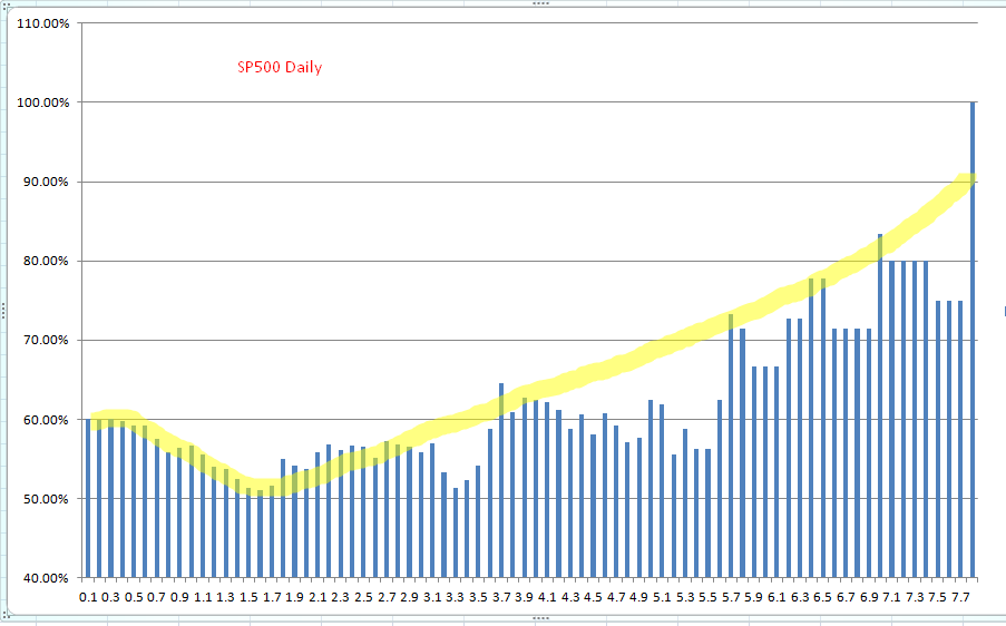
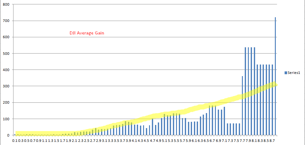
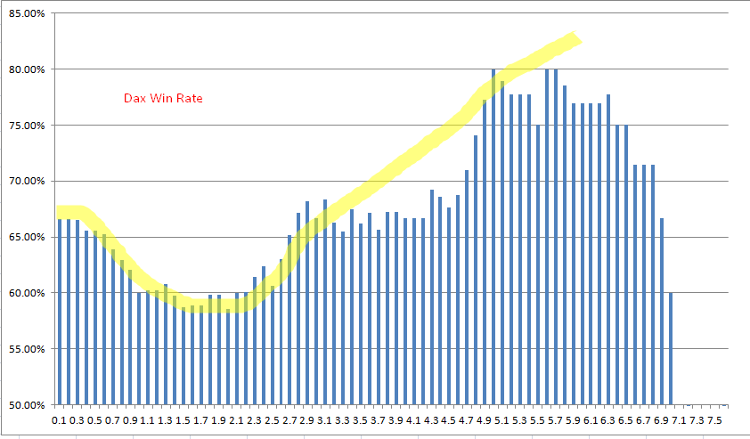
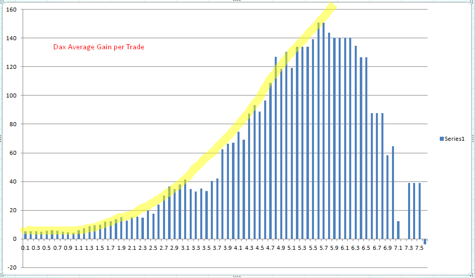
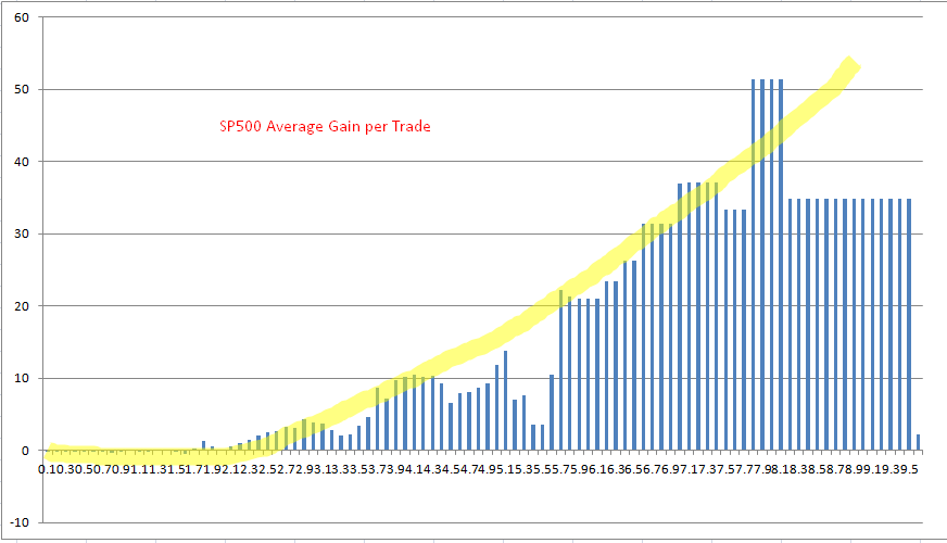
The results were interesting (to me anyway!) and I plotted them in Excel. It has to be taken into consideration that as you get further from the average range for any day the less likely you are to get any trades and so the data for high numbers can be a bit erratic when plotted so I drew on my own interpretation of what I thought was happening. Attached are win rate and average gain per trade charts for the DJI, SP500 and DAX
It can be seen that below a certain multiple of the daily average the win rate drops off but then gets better the further from that point we get. It can also be seen in the average gain charts that below a certain multiple there is little or no gain to be had but beyond that the returns start increasing the further away we get.
There is obviously the possibility to use both the probability of higher returns and a higher win rate the bigger a candle is compared to its all time average range in a strategy or for position sizing in a strategy.
I post my analysis here just in case it is of any interest to anyone (although I do feel like I am talking to myself most of the time!) Still I think of these sort of posts as my private journal – except it is public!
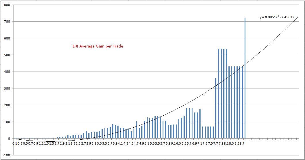
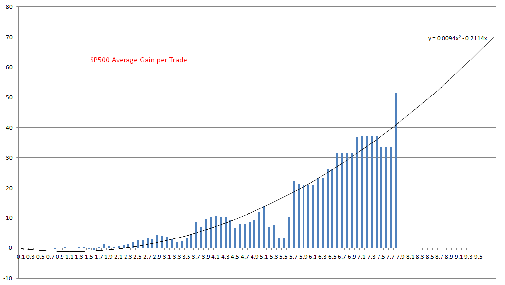
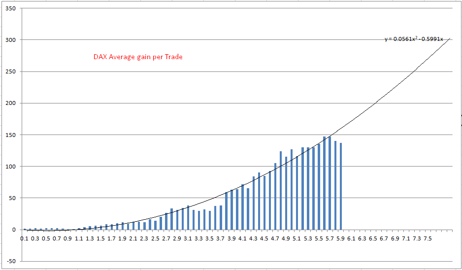
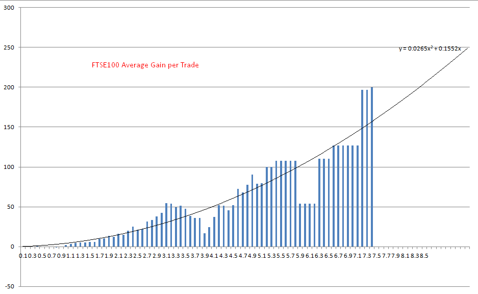
I found an interesting feature in Excel that I didn’t know existed – you can draw trend lines! Polynomial trend lines too… and you can get the equation for the line!
So here are the average gain per trade charts with polynomial trend lines (power 2) starting from zero for the DJI, SP500, DAX and FTSE100. On the last three I removed some of the extreme data as it was effecting the trend plot and was very poor data based on very few trades. I should probably do it on the DJI as well to improve the trend line plotting.
It would be interesting to try to build those calculations into a strategy somehow – most probably for position sizing.
The next question is whether the dips along the way are levels where less profit is truly available or whether they are just due to a not having enough data.
I tried to code a polynomial based position sizing system…. but failed. So I created a power based one instead which I think will suffice.
The multiple of the current days range compared to all time average range is recorded as the variable ‘thisday’. This multiple will be anything from 0 upwards as we ignore smaller candles. Then we get our stake size my multiplying it by (thisday – 0.1) and then adding 1. Obviously for very low multiples of the average range we get small stake sizes so we then set a minimum stake of 1. It might actually be better not to trade these positions as our position size is larger than our theory says we should be placing.
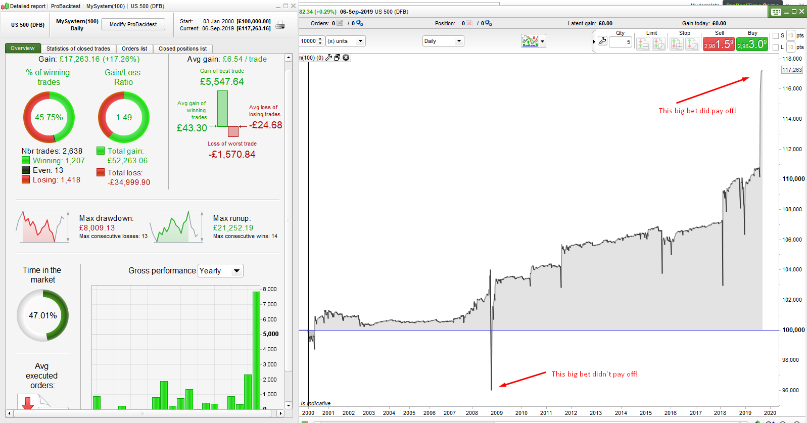
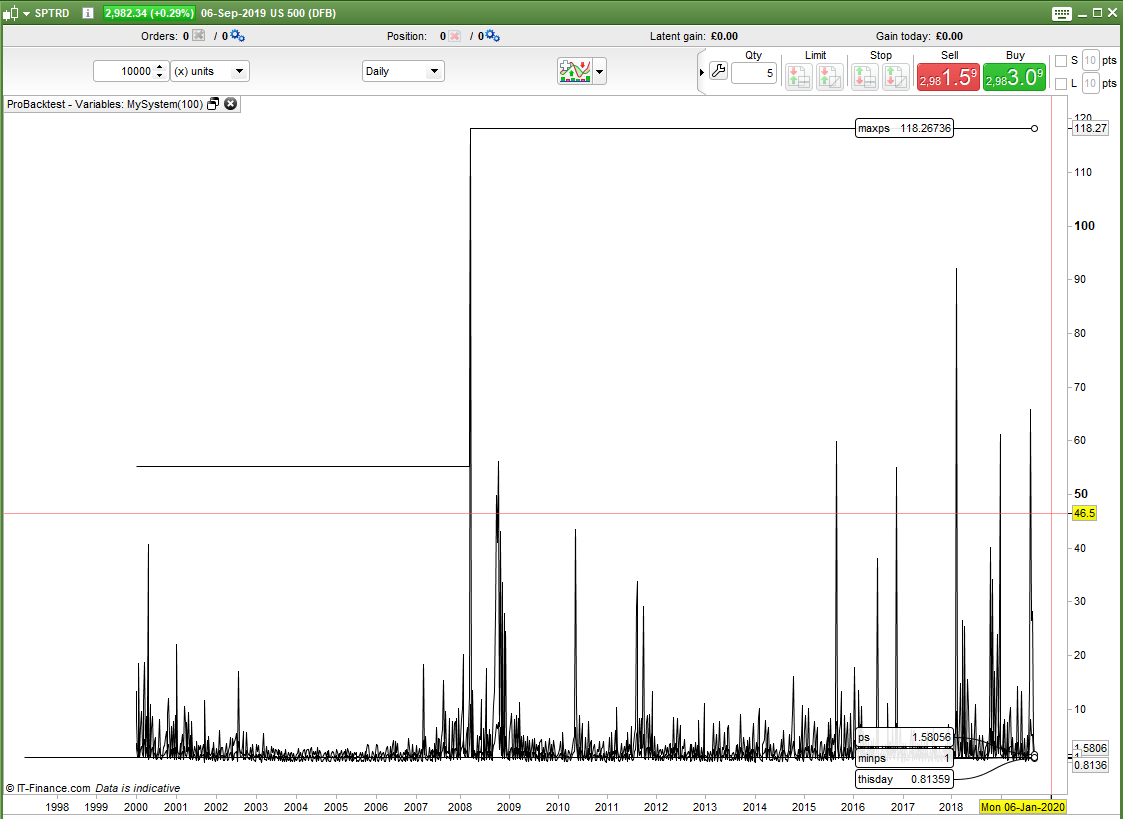
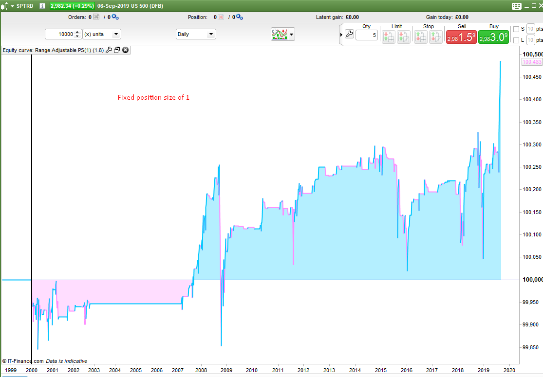
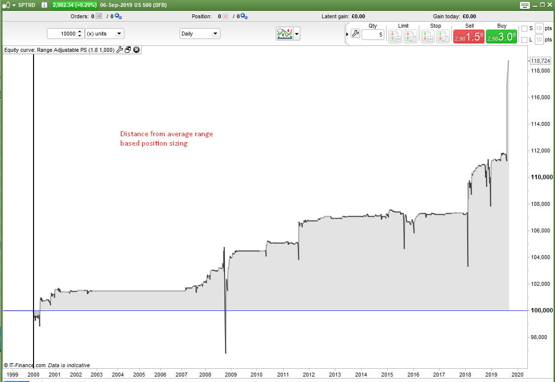
I tested the position sizing on the SP500 with the same simple strategy allowing it to adjust the position size indefinitely based on size of range. Every time there was a bigger than average candle and it was red it bought and sold on the next bar. The results are in the image attached. There is also an image of the position sizes and as you can see some of them are quite scary but when they pay off it is great – when they don’t however it is not so great. In the image it says that a position didn’t pay off but looking closer it was actually massive draw down. Perhaps a maximum allowed stake is required to prevent heart attacks and phone calls from the broker!
So a good comparison is to go back and compare the theory directly with level stakes. I did this and I plotted the results in Excel and also applied my ‘Average gain per 1’ code snippet so a to be able to make a direct comparison on a level playing field . (Note to GraHal – I added it to the code snippet library as it was not in there!)
See here for that very useful code snippet:
Average Gain Per 1 Code Snippet
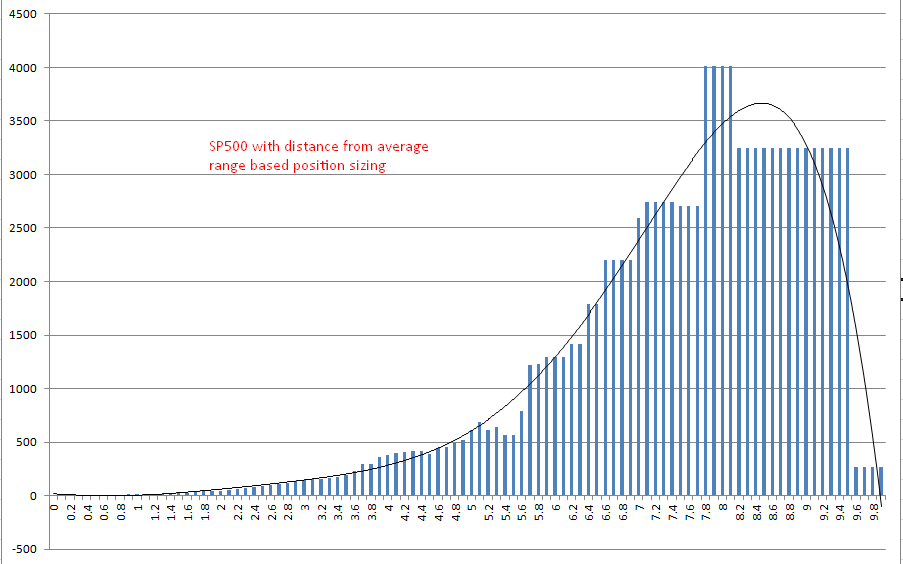
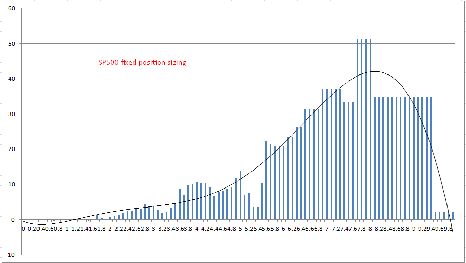
Without position sizing the strategy struggles to make any money unless range is at least 1.7 times the average. With it it makes it from 0 times the average. Attached are the two equity curves for opening positions if the range is 1.8 times the average of any day of the week.
With level stakes the equity curve is horrible and the strategy makes less than £1.4 per £1 staked. With the distance from average range position sizing it makes over £6.1 per £1 staked. A massive improvement.
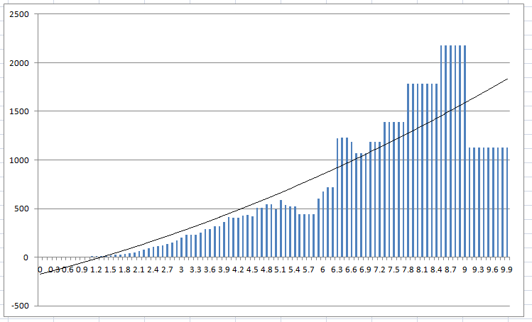
Attached are also images of the average gain per trade if opening positions when range is greater than or equal to the multiple value on the x axis. To me it looks like the position sizing has done a good job of smoothing out the plot. Once again to the right of the chart the data to analyse is very limited.
Hi Vonasi, Thanks a lot for this analysis.
I do believe a lot of members read your posts and find them very interesting.
Just speaking for myself, the only thing I can really do is hit the thank you button as I have nothing valuable (most of the time) to contribute to your extensive analysis.
But be assured your posts are very appreciated.
Best regards
Well put and I echo O-jay8 comments.
Hi Vonasi,
I have couple of questions regarding the all time average range to calculated.
1. Did you calculated each weekday separately i.e. only Mondays average range which is then obviously different to Wednesdays avg. range etc.
2. Did you take the absolut range or percentage range because the absolut range is changing a lot over the years. Absolut range would distort the result in my view as Indices prices increases significantly over the years.
3. Is the average range moving forward over time or did you take just a snapshot from the beginning of data until now?
Thanks once again for sharing your ideas
- Yes – every day was calculated separately.
- Absolute range. We are interested in comparing to the all time average range which will be increasing as price increases.
- All time average range and not a rolling part of the data. Perhaps a rolling part of the data would be an interesting test but then we throw in a variable – rolling history of the last 10 bars, the last 50 bars or the last 200 bars or maybe the last 42 bars. Best to keep curve fitting variables out of the analysis in my mind.
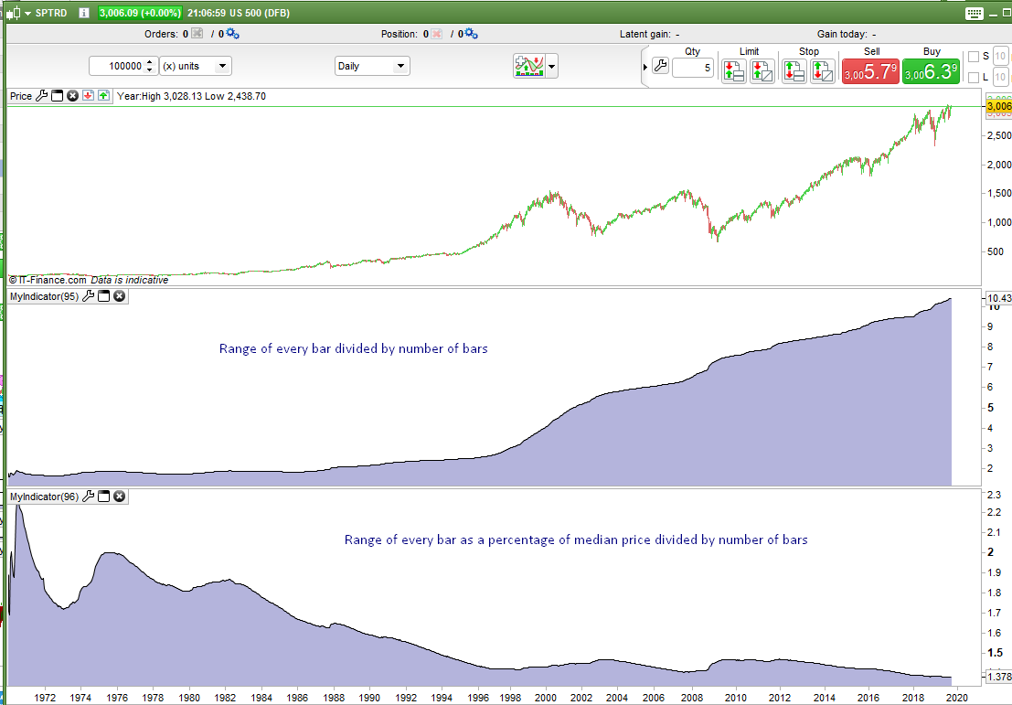
Regarding the all time average of range it is interesting to compare the charts of absolute compared to percentage of price. With percentage of price we have thrown an extra variable in to the calculation – price. One tells us that range is increasing with time and the other tells us that compared to price it is decreasing – which is best only testing will tell us.
Interesting to compare the absolute range of each individual bar and the range as percentage of median price of each individual bar to the calculated averages.
Perhaps I need to revisit this analysis for further testing!
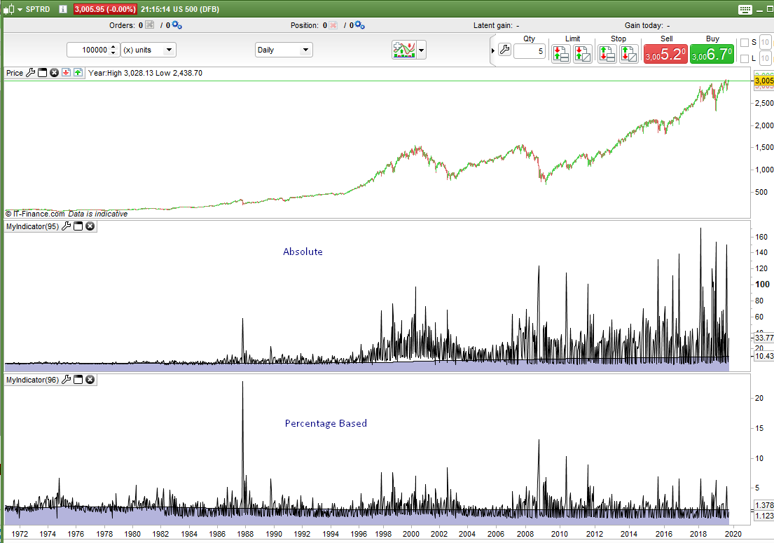
I went back and modified my code so that the range calculations were all based on range as a percentage of median price and then re-ran the test and plotted the results. Interestingly it came out with an almost identical chart. The only difference being that the absolute values were lower. This sort of proves (to me after a couple of glasses of wine anyway) that position sizing based on range size for out of the ordinary range size bars works whether it is absolute range based or percentage of price range based position sizing.
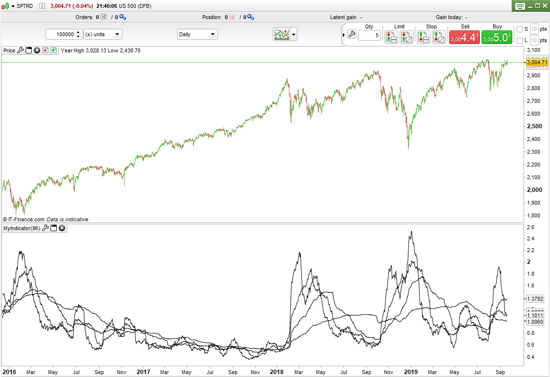
The reason why rolling average don’t work very well and lead to curve fitting can be seen in the attached image. It shows four averages of range as a percentage of median price. 200, 100, 50 and 25 period averages period. Wow!!! they are so different – which one do we choose to base our position sizing on???
Sarcasm aside it shows how easy it is to curve fit a trading idea or curve fit a filter to an average. If however we use a very slow moving datum such as an all time average then we have exactly that a nice slow moving datum as a decision point. If the market suddenly goes crazy volatile then our datum will be little effected and most likely once volatility has settled down everything will return to the datum . If the market barely moves up or down then our datum will just become even more accurate.
Hello Vonasi! Do you have the polynomial regression channel indicator?
No I don’t. You have also asked this question elsewhere in a new topic. Please only ask questions in one place as double posting just wastes peoples time and leads to confusion.