I’ve never used the Aroon indicator before and I’m slightly confused by the examples in the PRT documentation
https://www.prorealcode.com/documentation/aroonup/
N = 20

myAroonUp = AroonUp[N]

if(myAroonUp > 50 ) THEN
     SIGNAL = 1
ELSE
     SIGNAL = -1
ENDIF

RETURN SIGNAL coloured(35,194,57)
This seems to make sense, except that Aroondown shows the same example:
AroonDown
N = 20

myAroonDown = AroonDown[N]

if(myAroonDown > 50 ) THEN
     SIGNAL = 1
ELSE
     SIGNAL = -1
ENDIF

RETURN SIGNAL coloured(221,33,33)
Is this a typo? Should maybe be “if (myAroonDown < 50 )” ???
or have I completely misunderstood how this works?
🤔🤔🤔
Aroon scale is 0 -> 100%, so if the red aroon is superior to 50, it is indeed a signal for a bearish movement happening.
The only typo is the fact that I should have used 0 for no signal, instead of -1.
Thanks Nicolas, I re-read your explanation and then it became clearer.
So could it also be used something like this:
uptrend = AroonUp[N] > 50 and AroonDown[N] < 50
downtrend = AroonDown[N] > 50 and AroonUp[N] < 50
???
So I’ve been playing around with this indicator and found a config that seems to work in practice but I have a feeling that it doesn’t actually makes sense (and the good result may be an anomaly?)
DAX 1 hour
uptrend = AroonUp[7] > 0 and AroonDown[7] < 100
downtrend = AroonDown[7] > 0 and AroonUp[7] < 100
Does anyone have any experience with Aroon? Wouldn’t these conditions almost always be the case?
Do u run long and short in same system?
// Conditions to enter long positions
DEFPARAM CUMULATEORDERS = false
defparam preloadbars = 10000


uptrend = AroonUp[7] > 0 and AroonDown[7] < 100
downtrend = AroonDown[7] > 0 and AroonUp[7] < 100

IF NOT LongOnMarket AND uptrend THEN
BUY 1 CONTRACTS AT MARKET
SET STOP %LOSS sl
SET TARGET %PROFIT tp
ENDIF

//// Conditions to enter short positions
IF NOT ShortOnMarket AND downtrend THEN
SELLSHORT 1 CONTRACTS AT MARKET
SET STOP %LOSS sl2
SET TARGET %PROFIT tp2
ENDIF
1 2 uptrend = AroonUp[7] > 0 and AroonDown[7] < 100 downtrend = AroonDown[7] > 0 and AroonUp[7] < 100 Does anyone have any experience with Aroon? Wouldn’t these conditions almost always be the case?
Just wondering … shouldn’t it be so that the 25 “periods of data” should be obeyed somehow ? Aroon[7] would not make much sense to me (or I can’t wrap my head aroond it). Just AroonDown[0] would tell you formally (?) whether its true (> 50 ??) for the past 25 highs. We could obviously compare that to AroonDown[7] (etc.) but *that* wouldn’t make sense inherently (although we obviously can derive from it what we want).
The indicator is typically applied to 25 periods of data, so the indicator is showing how many periods it has been since a 25-period high or low.
(https://www.investopedia.com/terms/a/aroon.asp)
IMO, in order to do that, it will require an “unexpected amount” of history ?
Additionally, I can imagine that as of late no much sense will come out of anything (would you know what the current trends are ? ;-)). However, I feel that it could work on EUR/USD (without really checking, but having it on-screen all the time, I’d say there’s a clear swing of at least 4 or so weeks lately – past few days going up again).
Anyway, correct, > 0 and < 100 should not make sense because the result is always between that. So it will be about the 50 as the midpoint (flat trend ??), the more above it, the stronger the trend (?).
Also, I would say that an AroonDown of 0 (1 ?) is the same as an AroonUp of 100 (and vice versa).
Just theorising … 🙂
Do u run long and short in same system?
It’s just a trend indicator, so yes you can use it both ways, as part of a bigger strategy.
Anyway, correct, > 0 and < 100 should not make sense because the result is always between that.
That’s what I was thinking, although I guess if it’s >0 than at least some sort of up trend has begun (and the downtrend has weakened). All other values gave a worse result. The value of 7 for the period I also got from optimization. On the strategies I’ve tested it with (looking for a 1 hour trend) the best result seemed to come in between 7 and 12. But in only one case was it a definite improvement on using a moving average for the same purpose, so I doubt if I’ll pursue it.
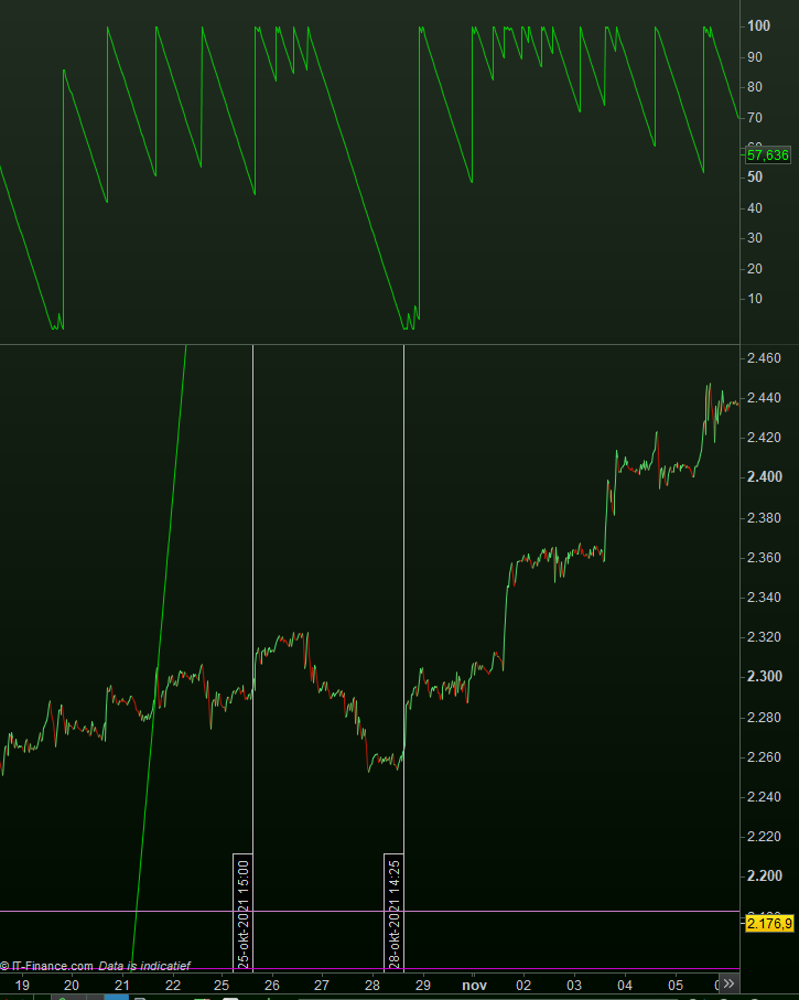
All for fun. Doing this in real time. This is post #1.
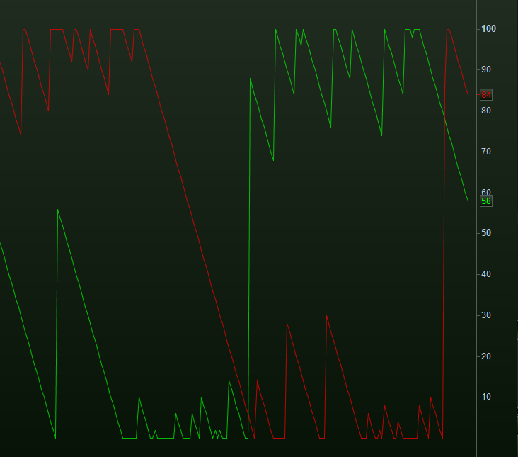
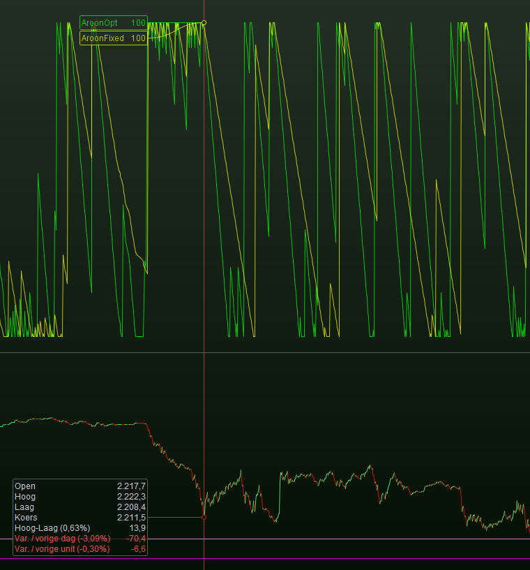
Down (red) and Up (green) are indeed the opposite.
Because they are the sane, we can use one only – the Up.
You can see it follows a trend all right.
The Mid point is 50 indeed.
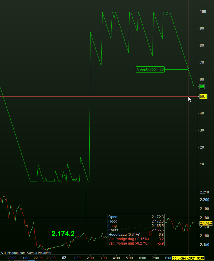
This post is crucial …
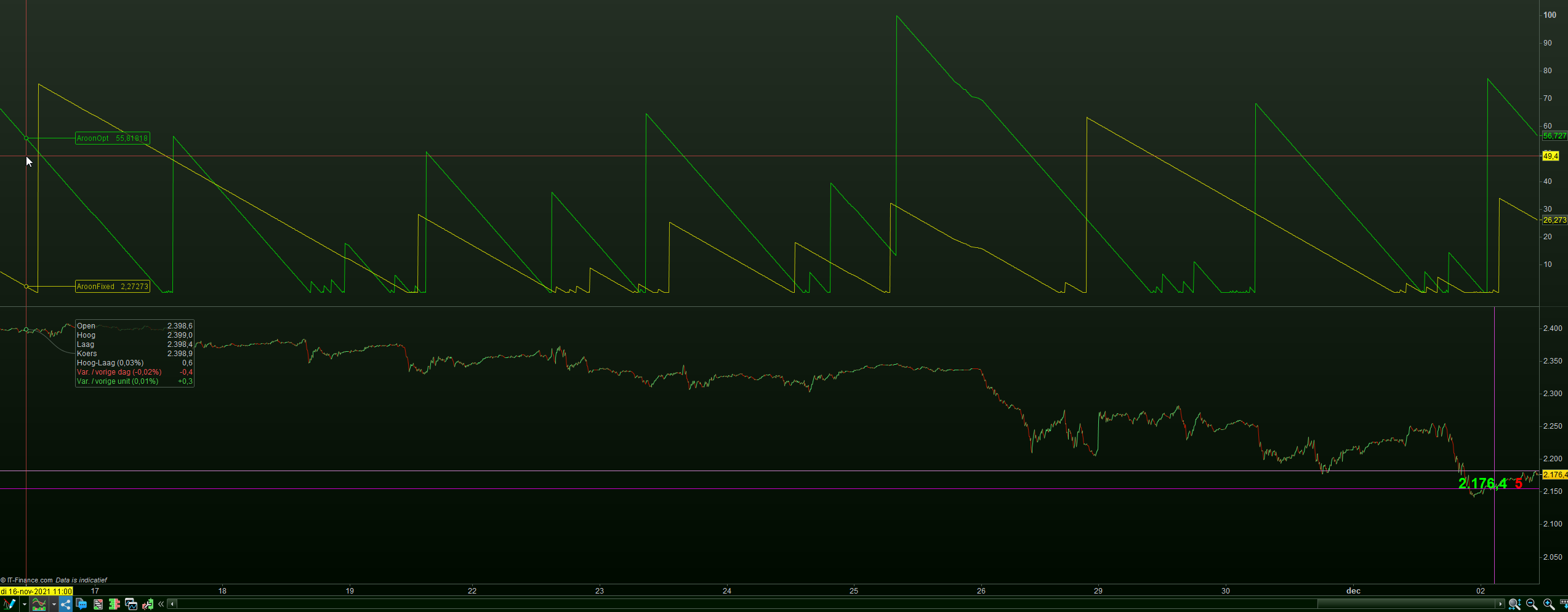
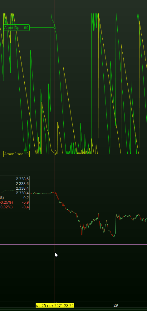
Graph AroonUp[aa] coloured (0,255,0,180) as "AroonOpt"      // Green.
Graph AroonUp[50] coloured (255,255,0,180) as "AroonFixed"  // Yellow.
The one with optimisation (aa) does not work at all. Whatever the value (like 50) the result is always the same, and rubbish.
The fied 50 looks fine, hence “does” something.
Green is 550, Yellow is 50.
This is just to stare at (for me it is).
Now we should try to make sense out of it, while it is clear that the sense is there all right.
I have not been looking for this at all, but see how remarkable the super fast response is at the right-hand vertical line.
Also, at the left-hand vertical line you can see at the top of the green line that something gets “in trouble”. It is topping …
(starting to get eager myself now)
Yeah, I tried using each on their own as well but I only got a result by using them combined.
It reads the number of higher highs (or lower lows) within a certain period, but that can only be read at the end of the candle (in my case, 1 hour) which makes it very laggy. A bit like using updateonclose.
Maybe it works better on a daily TF
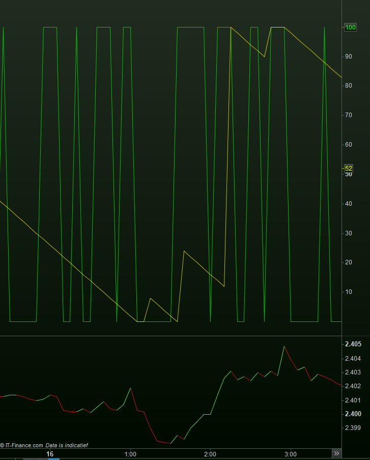
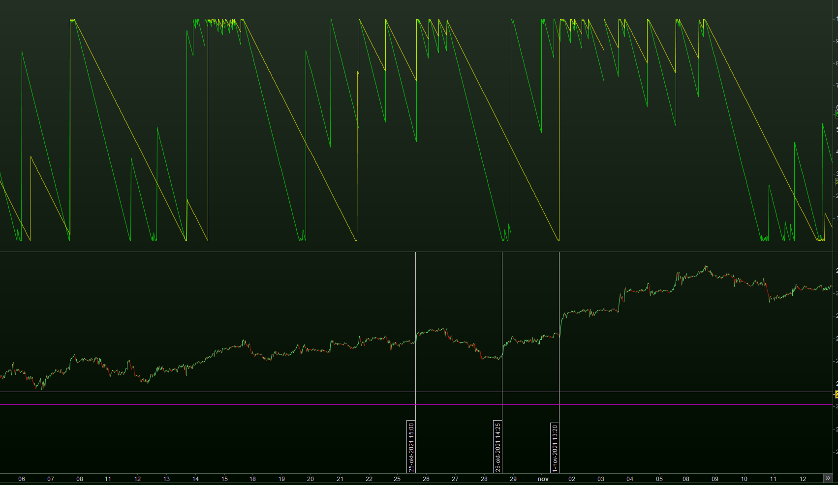
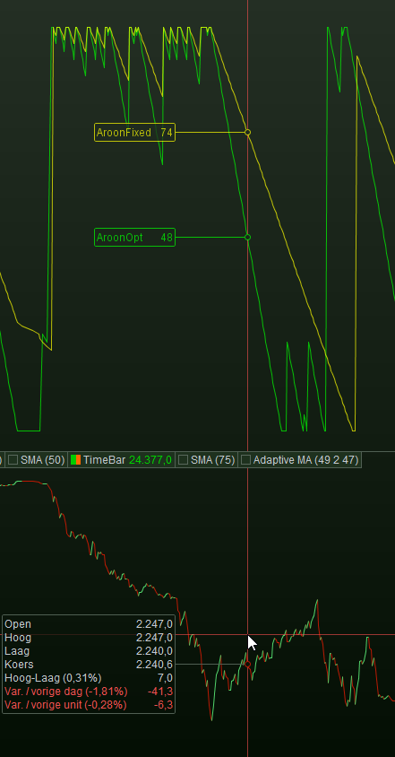
Green is 550. Yellow is twice as long at 1100.
The first attachment still shows the Up only.
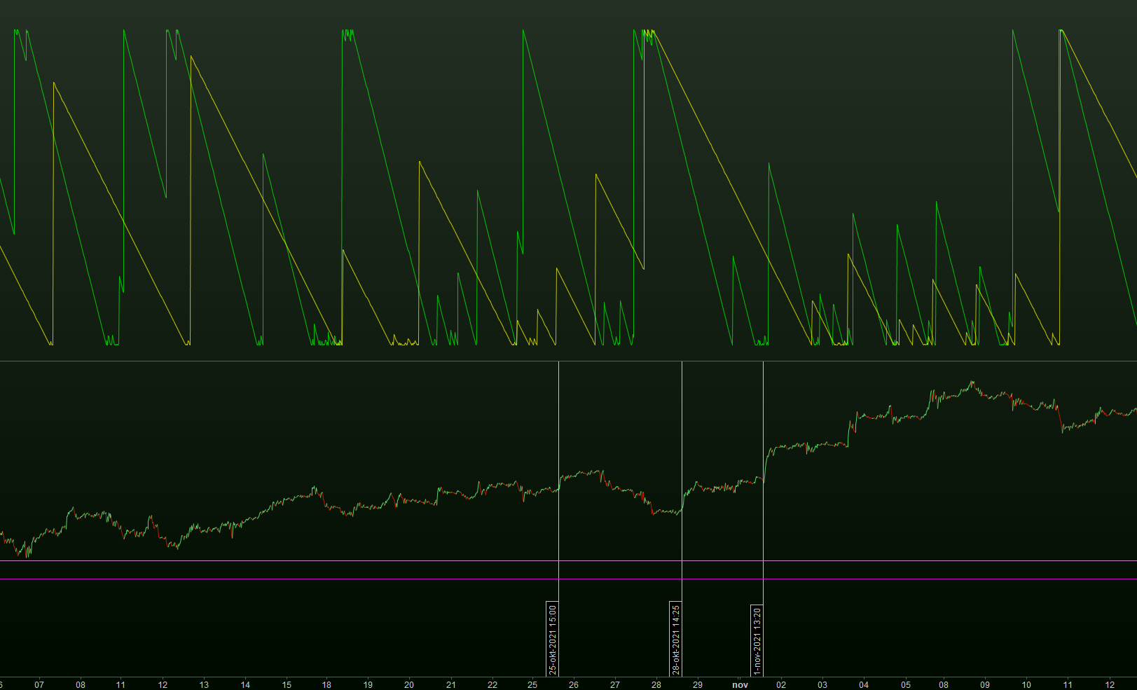
The second attachment shows the Down only.
There’s surely a difference between the two. I feel it like : the one is for it’s end representative for how long a top (or dip) lasts, and the other (at the same time) shows how it arrives there (when it starts to go there).
In I think one more post I will try to find the relation between “swings” and what the indicator requires for parameter value.
Difficult. I’m still trying to find the basics.
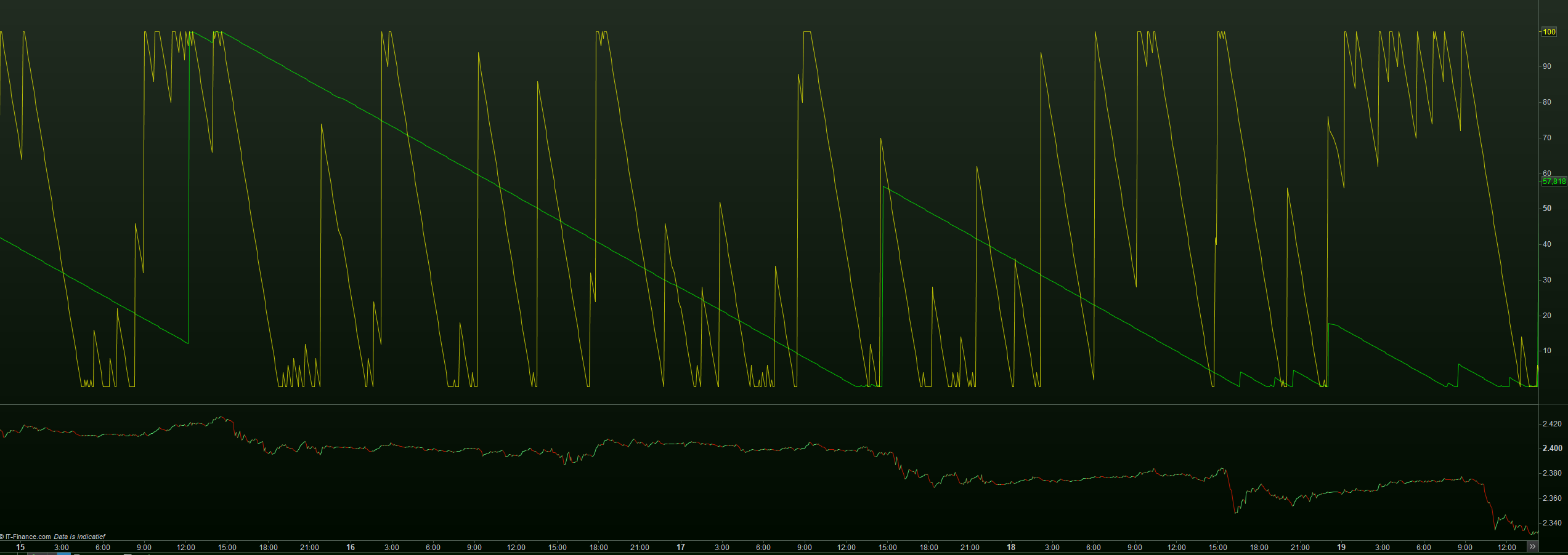
The red line is at the mid point.
Both are the Up only.
The shorter term (green) manages a bit to cross the midpoint, upwards. It is the most clear (price graph) that the trend is down. That highest peak of green shows a bit of up trend, but way too late (indeed lag). What the longer term does (yellow), … I don’t see it. Probably too much lag.
So let’s make all way shorter, to 50 and 100 respectively. Btw, TF is 5 minutes.
Because I am showing the down only, we should look at the downtrends-only for interpretation. In attachment 2 you see that after the vertical red line, this really shows a truth, and it does it right when it happens (no lag). The green, at a length of 50, starts to drop, which is measurable (by our program).
Attachment 3 shows the opposite and shows Down only, with the vertical red line changed to where the up trend starts. But now I need to zoom in to see the start of it ?
Well is doesn’t (attachment 4) because the turn around is too abrupt. In itself that may tell something.
Do notice that you would be able to tell the turn around when the green line drops under 50.
I will need one more post.