

CCI Multiperiods HeatMap
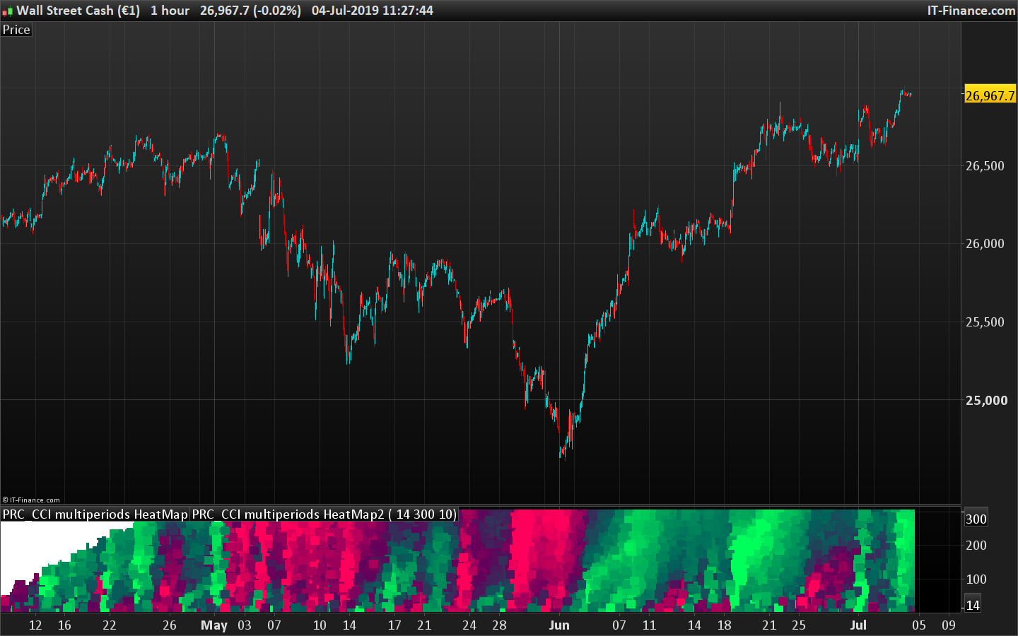
This “heatmap” type indicator plots the returned values of the CCI oscillator for all its calculated periods between the values of “StartPeriod” up to “MaxScale”. Each value is colored according to its degree of over-sold (in light red) and over-bought (in light green).
Darker areas mark the “no trend” zones or “end of trend” moment.
The more reddish is the whole area, the more bearish if the trend.
The more greenish is the whole area, the more bullish if the trend.
This indicator is another derived version of the RSI heat map posted earlier in the library.
The ensemble thus forms a cloud of colored dots making it easy to better identify how the market behaves in the different dimensions.
It is thus possible to determine the best opportunities for positions in trend following or mean reversion without wondering what is the best period of observation with respect to the instrument and the timeframe used. .
//PRC_CCI multiperiods HeatMap | indicator
//Plot an heatmap of the CCI range of periods
//04.07.2019
//Nicolas @ www.prorealcode.com
//Sharing ProRealTime knowledge

// --- settings
startperiod=20 //start period of the loop
maxscale=500 //end period of the loop
Step=10 //period step of the loop
// --- end of settings

iPeriod=startperiod //first period to test is..startperiod

while iPeriod<=maxscale do

 // --- indicator calculation
 osc = cci[iperiod]
 // -----

 R = max(0,50-osc)
 G = max(0,50+osc)

 drawtext("■",barindex,iperiod,dialog,bold,18) coloured(min(r,255),min(g,255),90)

 iPeriod=max(startperiod,iPeriod+Step) //increase indicator period for next loop iteration
wend

return startperiod,maxscale