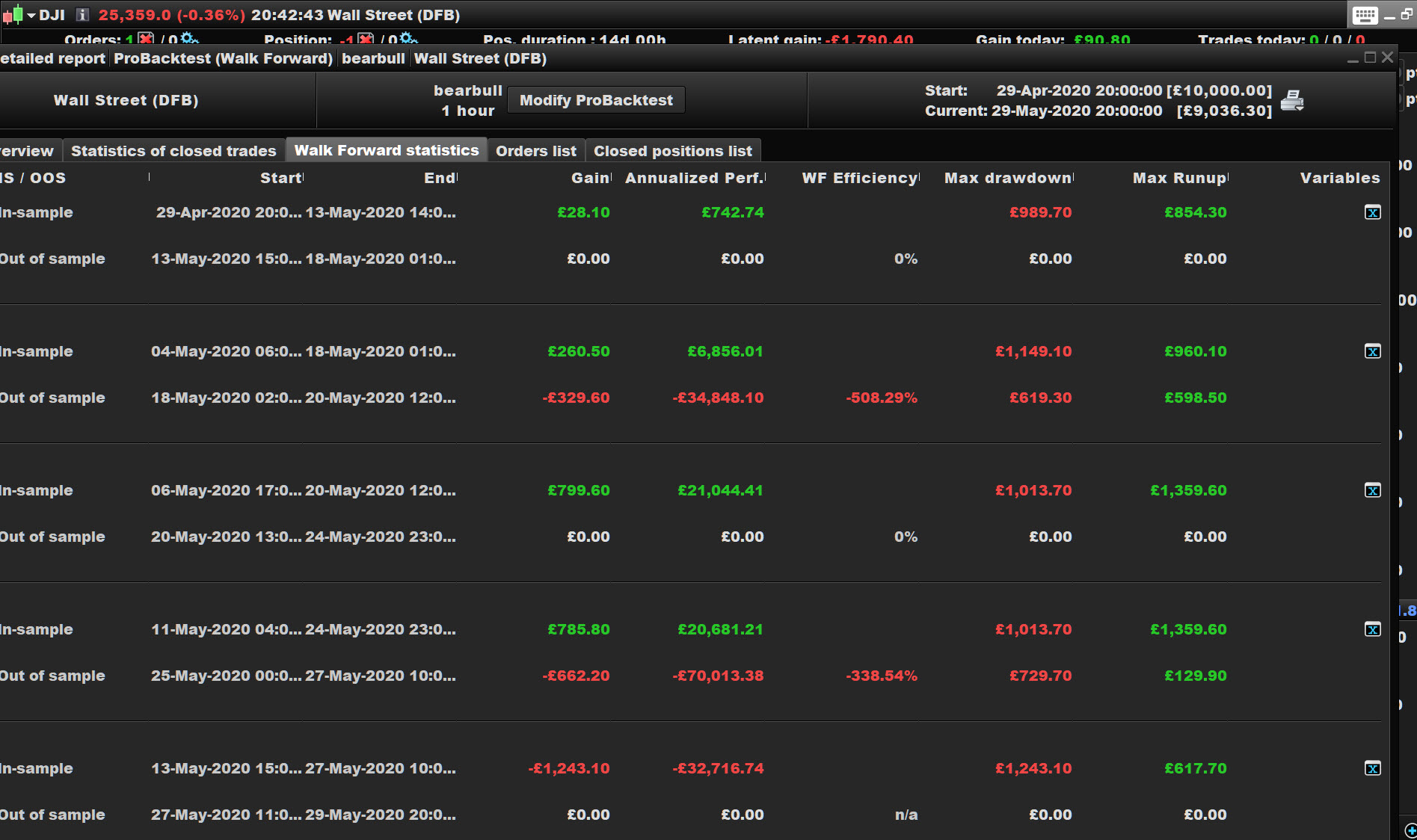
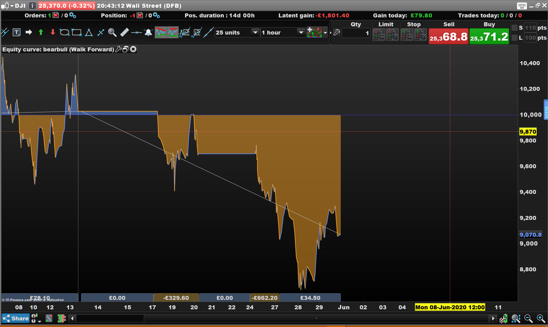
After the WF runs, we get a detailed report. I have never paid much attention to this as I was primarily interested in the values that were used in each optimisation period.
Now I have a WF report that produces by far the best looking monthly histogram as well as other metrics, but no combination of variables can reproduce those results. So where does it come from?
Go on … post a screen shot! 🙂
Is this something new on V11 you are seeing??
No, I’m still on 10.3
I’d post something but there’s nothing to see; it’s just that I can’t reproduce the results that came up on the WF Detailed Report. I’ve tried all the possible combinations that would have been covered in the optimisation. Obviously some are close enough to work with, but now I’m curious to know what values it draws on to produce that report.
I just tried on mine and the table values do match the values on the equity curve.
So if you enter the values from the last opt period, you get the same results as what’s on the overview of the WF report?
I’ll try in the morning.
Just registering my home Covid Test Kit … had a bad cough for days so I thought I’d get tested!
That is one test you really want to fail. All fingers crossed.