Hi All,
I am trying to build an indicators that draws a box around a range that represents an area of consolidation. I define this as a range less that 30% of the daily ATR. I have written the below but cannot seem to get it to draw anything. The use of for loops in PRT is not something I’ve tried before so I’d really appreciate some input if anyone can help.
Thanks
// Daily ATR
ATRperiod = 20
// ---

dTR = 0
for i = 0 to ATRperiod
dTR=dTR+max(abs(Dhigh(i)-Dlow(i)),max(abs(Dhigh(i)-Dclose(i+1)),abs(Dlow(i)-Dclose(i+1))))
next

// dATR
avg = dTR/ATRperiod

// ATR threshold
ATRt = 0.3 * avg

// Donchian Channel
DonchPeriod = 50
dh = HIGHEST[DonchPeriod](high)
dl = LOWEST[DonchPeriod](low)
DonchRange = dh - dl

if DonchRange <= ATRt then
for i = 0 to DonchPeriod do
if high[i]=dh then
x2 = barindex[i]
endif
if low[i]=dl then
x1 = barindex[i]
endif
next
if ABS(x2-x1) >= DonchPeriod then
DRAWRECTANGLE(x1,dl,x2,dh)coloured(255,10,10)
endif
endif

RETURN
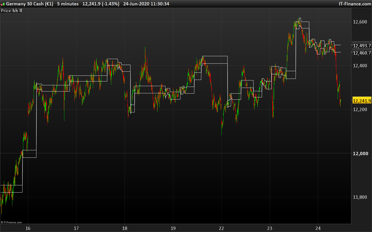
I figured it out in the end and it was much more simple than I thought. In essence I wanted to identify periods of consolidation and mark these out as ranges so that I could play breakout of these ranges. I use a Donchian channel and calculate when the range of the channel is less than a certain percentage of the daily ATR – e.g. in the example below I use 10 period Donchain and calculate when it is less than 10% of the daily ATR. I define this as a consolidation range and draw lines to mark it out.
Here is the code to draw lines on the chart.
// Daily ATR
ATRperiod = 20
// ---

dTR = 0
for i = 0 to ATRperiod
dTR=dTR+max(abs(Dhigh(i)-Dlow(i)),max(abs(Dhigh(i)-Dclose(i+1)),abs(Dlow(i)-Dclose(i+1))))
next

// dATR
avg = dTR/ATRperiod

// ATR threshold
ATRt = 0.1 * avg

// Donchian Channel
DonchPeriod = 10
dh = HIGHEST[DonchPeriod](high)
dl = LOWEST[DonchPeriod](low)
DonchRange = dh - dl

if DonchRange <= ATRt then
hh = dh
ll = dl
endif

return hh as "hh", ll as "ll"
It can also be useful as an indicator on a separate panel where a line for the ATR threshold is drawn and then the Donchain range is overlaid when the range is below the ATR threshold we are in consolidation and when above in a breakout
// Daily ATR
ATRperiod = 20
// ---

dTR = 0
for i = 0 to ATRperiod
dTR=dTR+max(abs(Dhigh(i)-Dlow(i)),max(abs(Dhigh(i)-Dclose(i+1)),abs(Dlow(i)-Dclose(i+1))))
next

// dATR
avg = dTR/ATRperiod

// ATR threshold
ATRt = 0.1 * avg

// Donchian Channel
DonchPeriod = 10
dh = HIGHEST[DonchPeriod](high)
dl = LOWEST[DonchPeriod](low)
DonchRange = dh - dl

RETURN DonchRange COLOURED(70,130,180) as "DR", ATRt COLOURED(255,69,0) as "ATRt"
Thanks for the code sharing. Will be of great help for future reference. Do you find it useful to filter the range period? I found that ADR (Average Daily Range) is more useful (powerful?) in this case.
I have used the code on my platform, but I am having difficulty with the code that boxes areas of the chart. The other code that shows DR and ATRT is a little confusing for me. One chart I noticed that it shows a break in consolidation when the gap between the two is at a certain point, but that is not the same with other charts. Anyone be kind to explain the full use if the indicator?
Thanks in advance.
Hi Nicolas or Thally,
I can’t seem to get this code that you guys write/used to work and draw those boxes. Any help, please?
// Daily ATR
ATRperiod = 20
// ---

dTR = 0
for i = 0 to ATRperiod
dTR=dTR+max(abs(Dhigh(i)-Dlow(i)),max(abs(Dhigh(i)-Dclose(i+1)),abs(Dlow(i)-Dclose(i+1))))
next

// dATR
avg = dTR/ATRperiod

// ATR threshold
ATRt = 0.1 * avg

// Donchian Channel
DonchPeriod = 10
dh = HIGHEST[DonchPeriod](high)
dl = LOWEST[DonchPeriod](low)
DonchRange = dh - dl

if DonchRange <= ATRt then
hh = dh
ll = dl
endif

return hh as "hh", ll as "ll"
Frankkeyo – Please use the ‘Insert PRT Code’ button when posting code – as instructed in the forum rules. I have edited your post for you.
You must have sufficient history loaded to get the daily ATR correctly calculated, try to expand the displayed units of the price chart.
I extended the unit number as much as 50000. The only thing it shows is a straight line at the bottom of the price chart. Nowhere near the candlesticks. Any other suggestions?
Cheers.
Do you apply the code on the price chart?
Yes. On the price chart is shows a line at the bottom of the chart. I have attached a print screen.
Did anyone found a fix for my problem with creating the lines on the price chart?
Works ok for me. Make sure you have sufficient units displayed on the chart in order to get the sufficient data to compute the X days ATR calculation.
Nope. I am trying everything I know. It is not working. I don’t know why it wouldn’t work for me. I am using the code and adding it to the price chart. All it is doing is drawing on the price chart way off the candlesticks.
Is the code you are using edited from the code found here?
Open the properties of the price chart and tick the option to scale data, on the lower side of the properties.