Hello everyone,
In order to make the website more ‘user friendly’, I made some recent improvements on it since its launch in the last days of March.
I wanna make sure everyone have seen the new features, because there are made for ensure the best experience on the website! I hope so 🙂
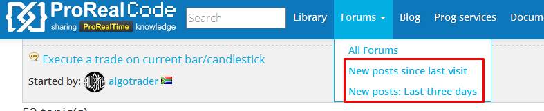
Forums links:
1/ the last posts since your last visit
2/ the last posts since 3 days
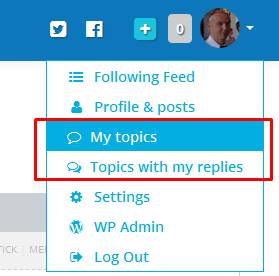
3/ my topics
4/ topics with my replies
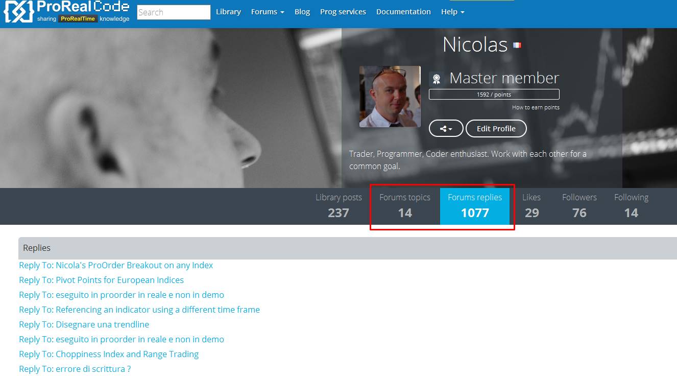
In everyone’s profile :
5/ topics of the user
6/ replies of the user
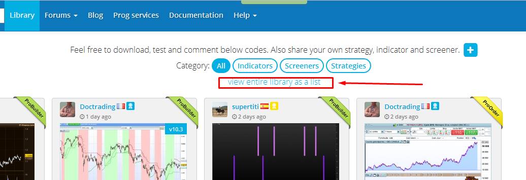
Library list view:
7/ the library’s list has been changed with a better sort of the whole posts
Website search engine:
8/ the website search engine has been completely renewed to return results of the whole content of the site. Search results now return everything related to the terms or search sentence typed in the search box of the top navigation bar with relevance sorting criteria across forums posts, library posts, forums replies, blog posts, commentaries and documentation. Still need design improvement though, but this feature were well needed in my opinion, so here it is. (the seach results may be slow sometimes to appear, so stay calm 🙂 )
Great job!
Suggestion:
I would really like annotations whenever someone replies to my topics/forum posts/comments.
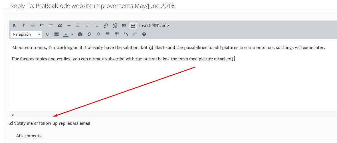
About comments, I’m working on it. I already have the solution, but i’d like to add the possibilities to add pictures in comments too.. so things will come later.
For forums topics and replies, you can already subscribe with the button below the form (see picture attached).
great job. those 2 buttons that show my topic and topic where I have replied make everything simpler…
Would be nice to have a third one that tell me the library post where I have commented
thank you David. I add the “my comments” on my to-do list 🙂
 Stef
StefParticipant
Average
Hi @Nicolas,
Thanks for this! How about creating a section on the Forum specifically for ProRealCode web site suggestions?
Here’s one:
Can you move the author information so that it is displayed at the top of a post – currently this is displayed at the bottom?
If you follow a link directly to a post, you have to scroll down to the bottom before you can see who the author is. I like to know who wrote something before I read it – not sure how others feel about this.
Regards
Stef
Hello Stef, anyone can add requests on this topic.
About the author information at the bottom, you are right, this is something that is also annoying me somehow. I’ll add this information right below the title too, thanks.
 Paul
PaulParticipant
Master
The black template layout in v11 is great to use 24h.
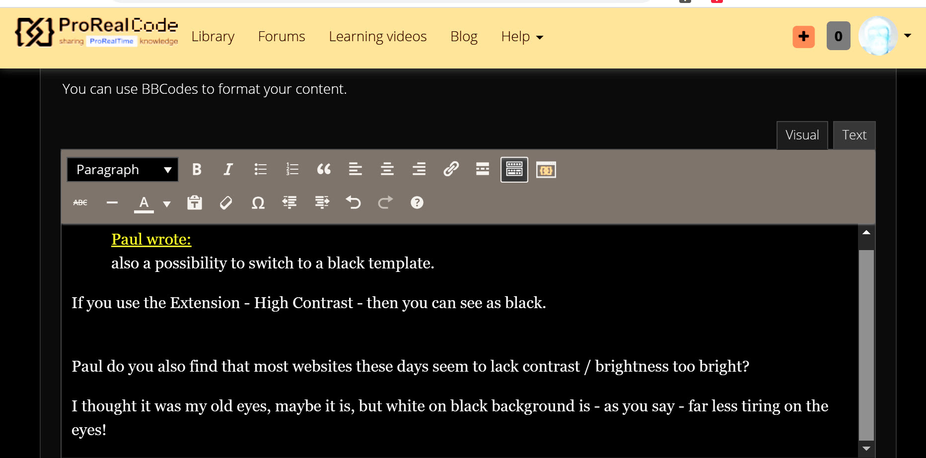
Using this website at the same time as with prt makes me wish that there was also a possibility to switch to a black template. Maybe an idee to add such option to the settings?
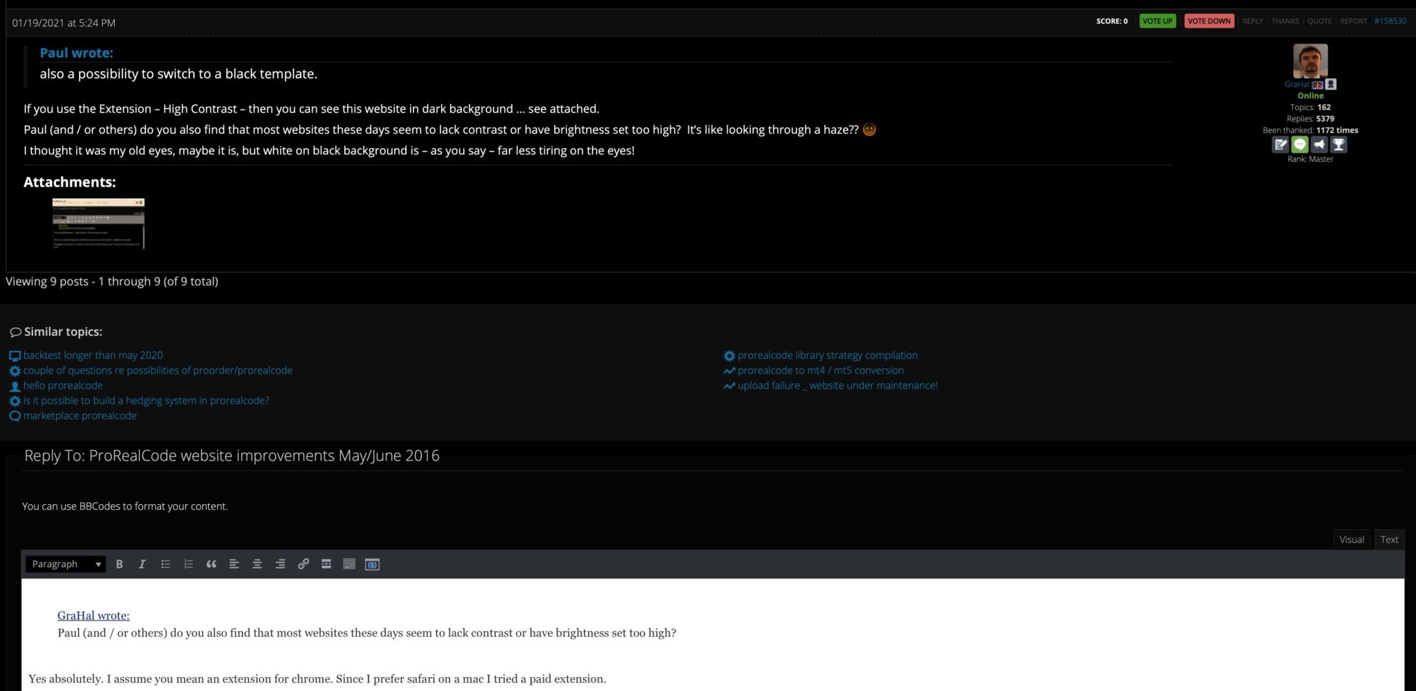
also a possibility to switch to a black template.
If you use the Extension – High Contrast – then you can see this website in dark background … see attached.
Paul (and / or others) do you also find that most websites these days seem to lack contrast or have brightness set too high? It’s like looking through a haze?? 🙂
I thought it was my old eyes, maybe it is, but white on black background is – as you say – far less tiring on the eyes!
Personally I find black backgrounds depressing. They also remind me of what computer screens used to look like when computers were first invented. A brighter, lighter screen feels like we have made some progress in life.
It might also explain why indicators with lots of bright colours are more popular than black and white ones even if they are totally useless indicators!
PaulParticipant
Master
Paul (and / or others) do you also find that most websites these days seem to lack contrast or have brightness set too high?
Yes absolutely, brightness is too high but lowering it in the mac isn’t always the right solution.
I assume you mean an extension for chrome. Since I prefer safari on a mac I tried a paid extension.
On this site typing a message is still on a white but much less “bright white” background.
All in all a bit strange at first glance but better. Other sites I find it improved too. Probably I will experience a bit more.
Thnx for this great tip!

