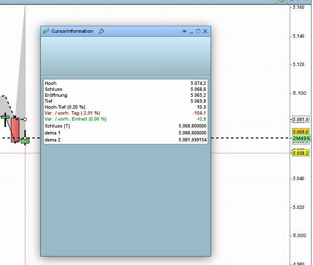
I’m trying to draw/plot a zone between two daily-timeframe values on a 5-minute chart. In general, everything seems to work except for the last candle, where the fill function produces a noticeable spike.
Additionally, the text labels do not appear; when I don’t use the timeframe function, they show up on the right side as expected (see cursor information, it seems to be correct floats).
Spike on colorbetween
1
2
3
4
5
6
7
8
9
10
11
12
13
14
defparamdrawonlastbaronly=true
// 1 DAY (1D)
TIMEFRAME(1DAY)
dema1=DEMA[1](close)
dema2=DEMA[2](close)
DRAWTEXT(" dema 1",BarIndex,dema1,Dialog,Bold,12)COLOURED(1,1,1)
DRAWTEXT(" dema 2",BarIndex,dema2,Dialog,Bold,12)COLOURED(1,1,1)
Hi!
The issues you are encountering are due to how Multi-Timeframe (MTF) instructions handle the BarIndex and the data aggregation. To hide the visual artifact on the forming candle you coudl manipulate transparency.
try this:
1
2
3
4
5
6
7
8
9
10
11
12
13
14
15
16
17
18
19
20
21
defparamdrawonlastbaronly=true
TIMEFRAME(daily,updateonclose)
dema1=DEMA[1](close)
dema2=DEMA[2](close)
oncealpha=50
ifislastbarupdatethen
alpha=0
endif
timeframe(default)
DRAWTEXT(" dema 1",BarIndex,dema1,Dialog,Bold,12)COLOURED(1,1,1)
DRAWTEXT(" dema 2",BarIndex,dema2,Dialog,Bold,12)COLOURED(1,1,1)
What I was able to verify (by printing the value of the last candle) was that the value of dema2 was N/A. However, the lines can be drawn and dema1 is allways defined. Why does the function work fine on the first calculation but not on all subsequent ones?
We use cookies to ensure that we give you the best experience on our website. If you continue to use this site we will assume that you are happy with it.