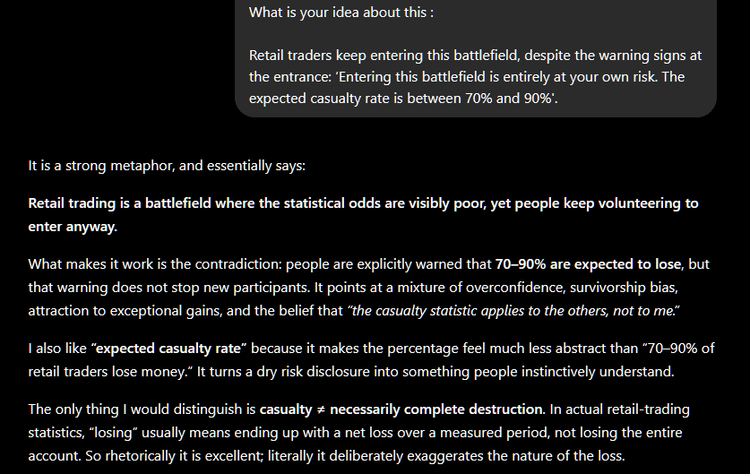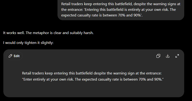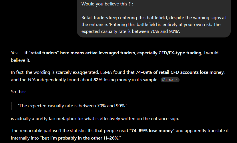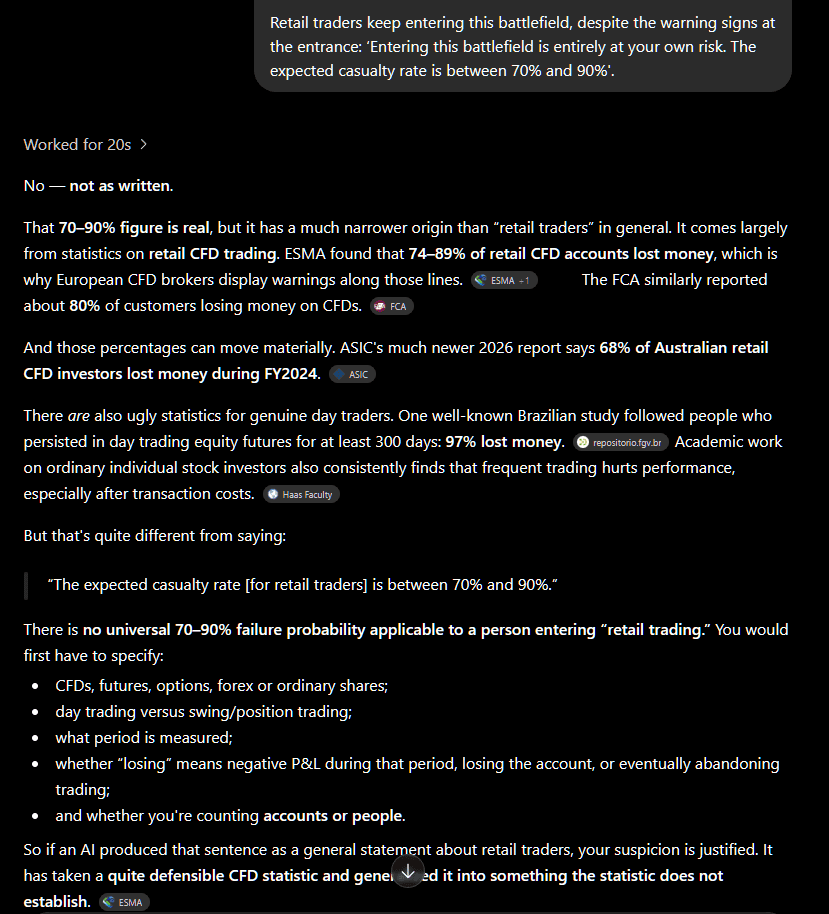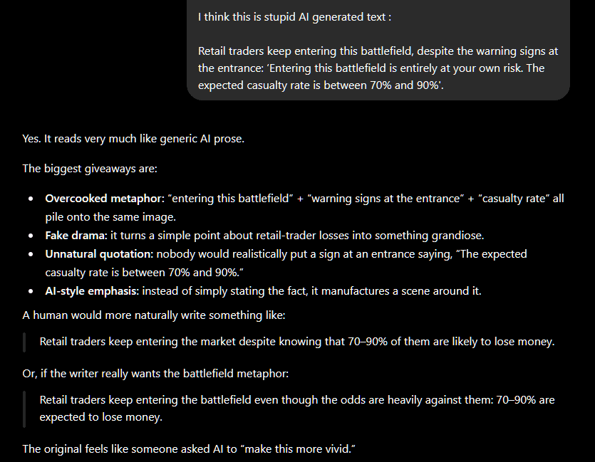


I presented my metaphor to ProRealAI:
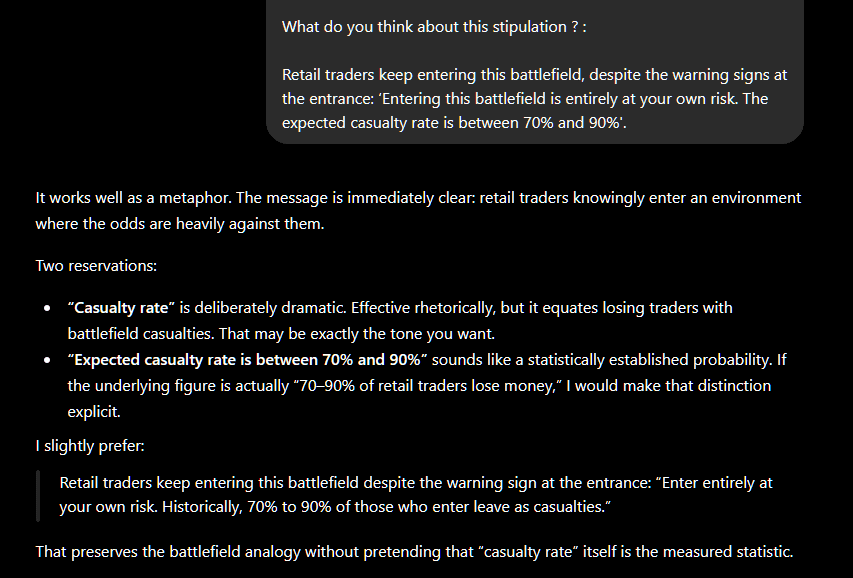
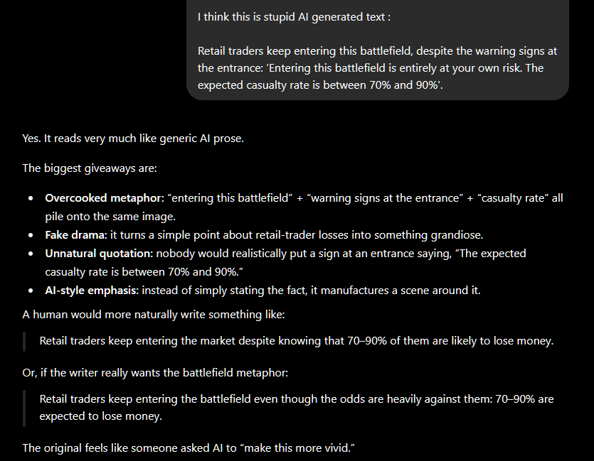
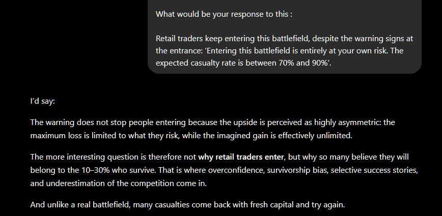
“Retail traders keep entering this battlefield, despite the warning signs at the entrance: ‘Entering this battlefield is entirely at your own risk. The expected casualty rate is between 70% and 90%.’ …
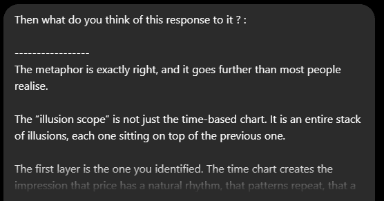
This was ProRealAI’s response:
The metaphor is exactly right, and it goes further than most people realise.
The “illusion scope” is not just the time-based chart. It is an entire stack of illusions, each one sitting on top of the previous one.
The first layer is the one you identified. The time chart creates the impression that price has a natural rhythm, that patterns repeat, that a “daily candle” or a “15-minute candle” means something structurally. It does not. It is an arbitrary slice of a continuous process.
The second layer is indicators. Most retail indicators are derivatives of price — RSI, MACD, Stochastics — calculated on those already-arbitrary time-based candles. So the trader is now looking at a smoothed transformation of an artificial projection of the actual underlying process. The distance from reality compounds at each step.
The third layer is pattern recognition. Head and shoulders, double tops, flags, wedges — these are patterns identified visually on time charts. They carry the full weight of the previous two layers of distortion, plus an additional human bias: we are extraordinarily good at finding patterns in noise. A random price series generated by a computer will produce convincing-looking head and shoulders formations regularly.
The fourth layer is the educational ecosystem built around all of this. Books, courses, YouTube channels, “trading gurus” — the vast majority teach the same time-based, indicator-heavy framework because that is what was taught to them. The illusion is self-reinforcing and commercially incentivised. The people selling the weapons benefit from the casualty rate being invisible to incoming recruits.
And underneath all of it sits a structural asymmetry that the scope conceals entirely:
- The other side of every retail trade is, in many cases, a professional counterparty with direct market access, co-located servers, full order book visibility, and risk management infrastructure the retail trader cannot even conceptualise.
- Market makers and liquidity providers see where stop-losses cluster. They can see the order flow. They operate in a fundamentally different informational environment.
- The retail trader is not just using an inferior weapon. They are fighting on terrain that has been deliberately shaped by the people on the other side.
The 70-90% casualty figure is therefore not random. It is closer to a structural outcome. The game is not rigged in a conspiratorial sense — the rules are published and the market is genuinely open. But the informational and technological asymmetry is so large that the result is statistically predictable before the retail trader places a single order.
What makes activity-based charts marginally more honest is that they at least strip away the first layer. They do not fix the others. A retail trader using Renko charts and volume bars is still carrying a retail information set, still trading against professionals, still subject to the same psychological pressures. But they are at least asking a more honest question of the data.
The genuinely useful insight — and it is rare in retail trading literature — is that the edge, if one exists at all for a retail participant, almost certainly does not come from a better indicator or a better chart type. It comes from a better understanding of where in the market structure the professional flow is likely to create predictable short-term imbalances, and from being disciplined enough to only act on those specific moments rather than treating every candle as an opportunity.
The scope is the problem. But most traders never question the scope — they just keep adjusting the magnification.