Hi there, was wondering if anybody could help with this simple requirement:
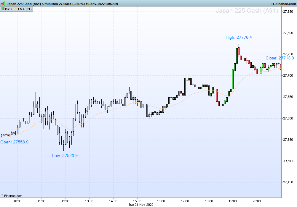
Let’s use Australia 200 Cash CFD for the below example.
Is there a simple way to click a button or have an indicator whereby on click the following happen:
- The chart immediately snaps to a view showing the opening hours (10am – 4pm) on the 5m chart (i.e. the screen will only show 72 5min candles).
- Or if this is not possible then alternatively have the platform draw vertical separators or colour code the period between 10am-4pm.
- Then of those 72 candles on screen, it will show the Open, Close, High and Low for the 10am-4pm session only (not showing premarket data). Perhaps right in the top left corner for convenience.
- Bonus: And even better if I could make one click to export the Open, Close, High and Low in CSV format.
I was wondering if the above can be achieved with some simple configuration and not requiring any coding?
Thanks in advance!
 JS
JSParticipant
Veteran
Hi @Voyager
You can easily adjust the graph yourself:
Set your “units” to 72
Limit your chart view from 10:00 am to 4:00 pm
(All candles will display the Open High Low and Close…)
Hi JS thanks for responding.
I was hoping more something like this. Was wondering if this is possible out of the box or will I need to program some custom indicator?
Say I have a chart with a
n number of candles on screen. I’d like to see the high, low, open and close only for the set of candles on screen like below.
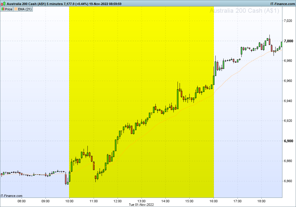
Additionally when trading an instrument such as Australia 200 Cash CFD the price data is continuous as it is based on the futures price which trade 24 hours a day 5 days a week.
And this makes it hard to see the times that matter which are the opening hours (in this case 10am-4pm). So was wondering is there a way to have color-coded session breaks like this?
Thanks and appreciate your input.
JSParticipant
Veteran
Hi Voyager,
For the colored background you can use the indicator…
You can set the color yourself according to the RGB table…
SessionStart = 100000
SessionEnd = 160000

If OpenTime >= SessionStart and OpenTime <= SessionEnd then
r = 255
g = 255
b = 0
t = 0
Else
r = 255
g = 255
b = 255
t = 255
EndIf

BackGroundColor(r,g,b,t)
Return
JSParticipant
Veteran
As for the Open/High/Low/Close…
Each bar/candle has its own Open/High/Low/Close
What you show on your screenshot is the Open of the session and the highest value, the lowest value and the Close of the session. You won’t know these values until the session ends…
You can determine these values with:
If OpenTime = SessionStart then
xOpen = Open
ElsIf OpenTime = SessionEnd then
xClose = Close
xHigh = Highest[72](High)
xLow = Lowest[72](Low)
EndIf
JSParticipant
Veteran
Hi @Voyager
Here is the full indicator with colored background and text…
Perhaps needless to say:
- Import the “itf -file” (under “Indicators”)
- Add the indicator below the “Price” (top left of your chart)
SessionStart = 100000
SessionEnd = 160000

If OpenTime >= SessionStart and OpenTime <= SessionEnd then
r = 255
g = 255
b = 0
t = 255
Else
r = 255
g = 255
b = 255
t = 255
EndIf
BackGroundColor(r,g,b,t)

If OpenTime = SessionStart then
xOpen = Open
ElsIf OpenTime = SessionEnd then
xClose = Close
xHigh = Highest[72](High)
xLow = Lowest[72](Low)
EndIf

N=72
For i=0 to N-1
If Open[i] = xOpen then
DrawText("Open=#xOpen#",BarIndex-i+5, xOpen,SansSerif,Bold,15)Coloured(255,0,0)
ElsIf High[i] = xHigh then
DrawText("High=#xHigh#",BarIndex-i, xHigh+5,SansSerif,Bold,15)Coloured(255,0,0)
ElsIf Low[i] = xLow then
DrawText("Low=#xLow#",BarIndex-i, xLow-5,SansSerif,Bold,15)Coloured(255,0,0)
ElsIf Close[i+1] = xClose then
DrawText("Close=#xClose#",BarIndex-i, xClose,SansSerif,Bold,15)Coloured(255,0,0)
EndIf
Next
Return
Hi
@Voyager thanks for the code snippets, much appreciated!
You’ve helped me resolve the colored background for the session and that’s visually very helpful and that bit is all good now.
Regarding the annotation of the chart with the Session Open, Close, High and Low it’s getting really close to what I had in mind.
I was wondering if it were possible to access specific bars based on
specific time conditions and not just based on using the index offsets.
The reason for this is if I switch from a 5m chart to a 15m chart the offset is no longer 72 candles but instead only 24 15 minute bars between 10am-4pm. And if I switch to a 10m it will be 36 bars.
Perhaps this will illustrate better what I mean. I’ve added some pseudo-code in [brackets]:
SessionStart = 100000
SessionEnd = 160000
If OpenTime >= SessionStart and OpenTime <= SessionEnd then
r = 229
g = 255
b = 204
t = 80
Else
r = 255
g = 255
b = 255
t = 0
EndIf
BackGroundColor(r,g,b,t)
If OpenTime = SessionStart then
xOpen = Open
ElsIf OpenTime = SessionEnd then
xClose = Close
xHigh = [Highest price during the period between 10am-4pm?]
xLow = [Lowest price during the period between 10am-4pm?]
EndIf
// Annotate chart
DrawText(xOpen)
DrawText(xClose)
DrawText(xHigh)
DrawText(xLow)
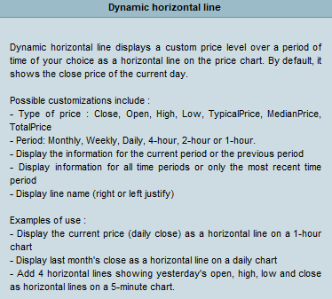
[Or use Dynamic Horizontal Line if possible?]
Return
Also while playing around with the settings, I came across Dynamic Horizontal Line and was wondering if we could utilise that in the code instead of using DrawText?
But if that is not possible (I’m guessing it will draw 4 lines for every single day thus cluttering the entire chart?) the text annotation is very much good enough.
Thanks for your input.
JSParticipant
Veteran
Hi @Voyager
The problem with the text can be solved with “GetTimeFrame”
“GetTimeFrame” gives the time frame in seconds so you can calculate the periods with:
GTF = GetTimeFrame
Period = 3600 / GTF * 6
SessionStart = 100000
SessionEnd = 160000

If OpenTime >= SessionStart and OpenTime <= SessionEnd then
r = 255
g = 255
b = 0
t = 255
Else
r = 255
g = 255
b = 255
t = 255
EndIf
BackGroundColor(r,g,b,t)

GTF = GetTimeFrame
Period = 3600 / GTF * 6

If OpenTime = SessionStart then
xOpen = Open
ElsIf OpenTime = SessionEnd then
xClose = Close
xHigh = Highest[Period](High)
xLow = Lowest[Period](Low)
EndIf

For i=0 to Period-1
If Open[i] = xOpen then
DrawText("Open=#xOpen#",BarIndex-i, xOpen,SansSerif,Bold,15)Coloured(255,0,0)
ElsIf High[i] = xHigh then
DrawText("High=#xHigh#",BarIndex-i, xHigh+5,SansSerif,Bold,15)Coloured(255,0,0)
ElsIf Low[i] = xLow then
DrawText("Low=#xLow#",BarIndex-i, xLow-5,SansSerif,Bold,15)Coloured(255,0,0)
ElsIf Close[i+1] = xClose then
DrawText("Close=#xClose#",BarIndex-i, xClose,SansSerif,Bold,15)Coloured(255,0,0)
EndIf
Next
Return
Hi
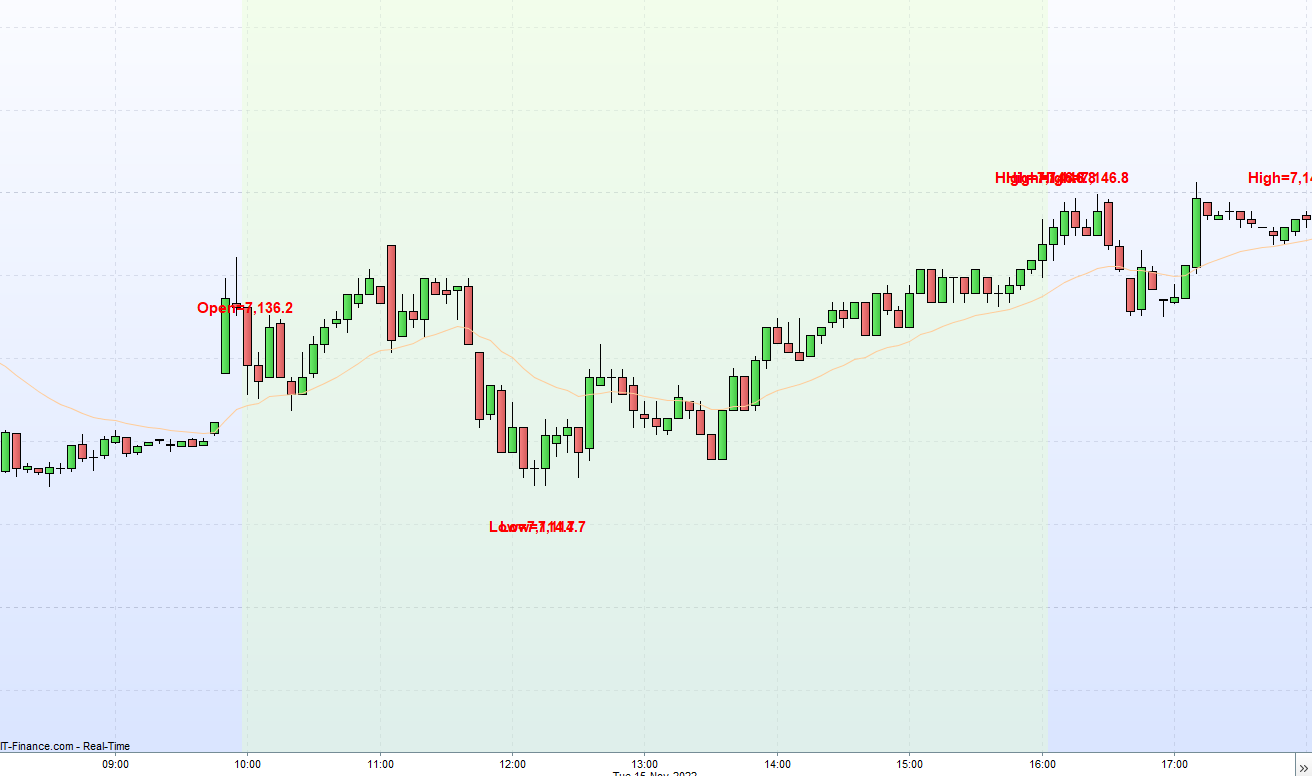
@JS thanks for the new code using time to calculate the daily highs and lows.
I saw your attached screenshot and it looks great however I seem to be unable to reproduce it on my end? I copied your code as is.
I was confused because I keep getting lots of overlapping text during the Market Open hours (i.e. the periods with highlighted background) such that it becomes unreadable.
And also in your screenshot there is no text annotation for the Market Close hours which is what I was expecting on my end too. However I get a lot of “noise” during Market Close periods with lots of Highs and Lows being reported which I was surprised because they fall outside the time period that the IF statement should take care of?
Any idea what could be causing this overlapping and unclear text?
JSParticipant
Veteran
Hi
@Voyager
Try this…
//DefParam DrawOnLastBarOnly = True
SessionStart = 100000
SessionEnd = 160000

If OpenTime >= SessionStart and OpenTime <= SessionEnd then
r = 255
g = 255
b = 0
t = 255
Else
r = 255
g = 255
b = 255
t = 255
EndIf
BackGroundColor(r,g,b,t)

GTF = GetTimeFrame
Period = 3600 / GTF * 6

If OpenTime = SessionStart then
xOpen = Open
DrawText("Open=#xOpen#",BarIndex, Open,SansSerif,Bold,15)Coloured(255,0,0)
EndIf

If OpenTime = SessionEnd then
xClose = Close
DrawText("Close=#xClose#",BarIndex, xClose,SansSerif,Bold,15)Coloured(255,0,0)
xHigh = Highest[Period](High)
xLow = Lowest[Period](Low)
For i=0 to Period-1
If High[i] = xHigh then
DrawText("High=#xHigh#",BarIndex-i, xHigh+5,SansSerif,Bold,15)Coloured(255,0,0)
ElsIf Low[i] = xLow then
DrawText("Low=#xLow#",BarIndex-i, xLow-5,SansSerif,Bold,15)Coloured(255,0,0)
EndIf
Next
EndIf
Return
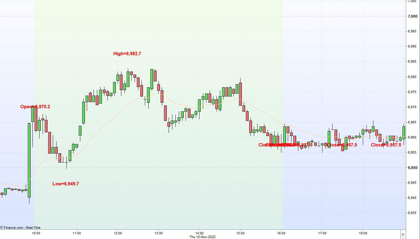
Hi
@JS thanks for the code.
I’ve just tested it and it works much better now with far fewer overlapping text. For some reason there is still some but far less such that I can live with that.
I’ll have a go at implementing your code for both the session background color and the High/Lows for other timezones and other markets myself.
Thanks for your help with this and I believe I can mark this support topic as resolved now.
I hope you have a nice weekend!
@
Voyager
Do not embed pics and other files in your post, as this slows down the loading of pages; Select File is all you need to attach them.
Thank you 🙂