

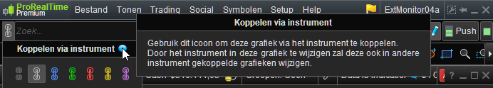
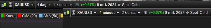
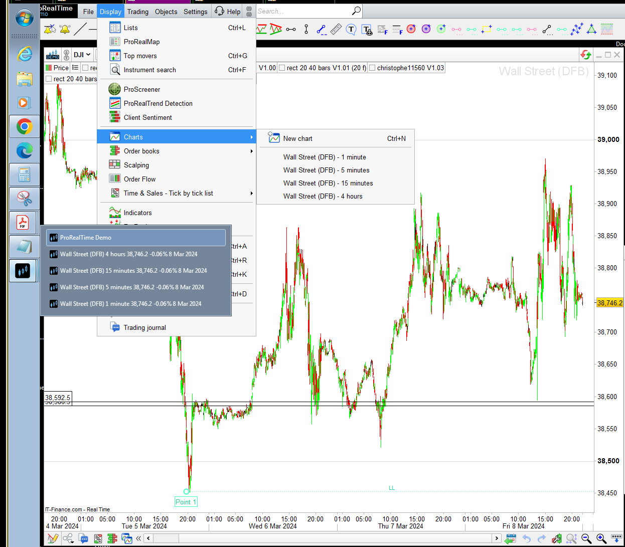
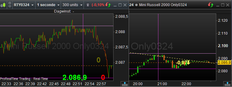
How To Keep Scale On Different Time Frame
Viewing 6 posts - 1 through 6 (of 6 total)
Viewing 6 posts - 1 through 6 (of 6 total)
- You must be logged in to reply to this topic.
New Reply
Summary
This topic contains 5 replies,
has 3 voices, and was last updated by ![]()
2 years, 2 months ago.
Topic Details
| Forum: | Platform Support: Charts, Data & Broker Setup |
| Language: | English |
| Started: | 03/08/2024 |
| Status: | Active |
| Attachments: | 9 files |
Loading...