Hi Team, need help please as I am not good with coding.
Can you please help me with an indicator that puts an arrow when a candle is closed above the previous bullish candle provided we have a bearish candle in between a cluster of say 7-9 candles?
Same with an arrow when a candle is closed below the previous bearish candle provided we have a bullish candle in between a cluster of say 7-9 candles?
thanks
ChatGpt gave me this. not working due to some parentheses issue…
// ProRealCode for Bullish Arrow Indicator
// Define a bullish candle
BullishCandle = close > open
// Define a bearish candle
BearishCandle = close < open
// Define the cluster range
ClusterRange = 9
// Initialize variable to store condition
BullishCondition = 0
// Loop through the range to check conditions
FOR i = 1 TO ClusterRange DO
IF close[i] > open[i] THEN
// Check for bearish candle in between
FOR j = 1 TO i-1 DO
IF close[j] < open[j] THEN
BullishCondition = 1
ENDIF
NEXT
// Plot arrow if condition is met
IF BullishCondition THEN
DRAWARROWUP(close[i-1], open[i-1], 0.5, “”, “”, 10)
BullishCondition = 0
ENDIF
ENDIF
NEXT
// ProRealCode for Bearish Arrow Indicator
// Define a bearish candle
BearishCandle = close < open
// Define a bullish candle
BullishCandle = close > open
// Define the cluster range
ClusterRange = 9
// Initialize variable to store condition
BearishCondition = 0
// Loop through the range to check conditions
FOR i = 1 TO ClusterRange DO
IF close[i] < open[i] THEN
// Check for bullish candle in between
FOR j = 1 TO i-1 DO
IF close[j] > open[j] THEN
BearishCondition = 1
ENDIF
NEXT
// Plot arrow if condition is met
IF BearishCondition THEN
DRAWARROWDOWN(close[i-1], open[i-1], 0.5, “”, “”, 10)
BearishCondition = 0
ENDIF
ENDIF
NEXT
 JS
JSParticipant
Veteran
Hi,
Can you give an example of how to place the different candles (bullish/bearish) in the cluster…?
Hi,
Can you give an example of how to place the different candles (bullish/bearish) in the cluster…?
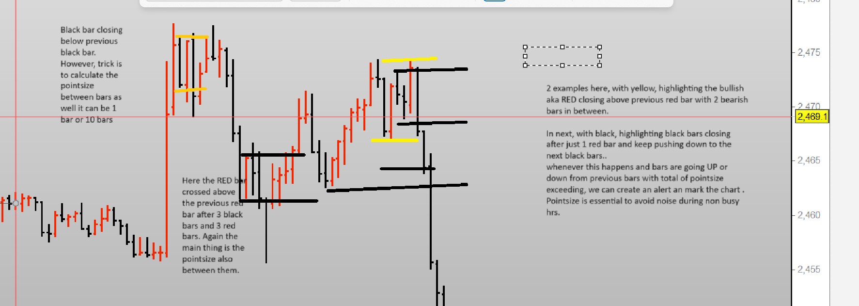
Hi JS, many thanks for your response. I am trying to highlight in a picture what I am requesting. Hope it helps, if not please ask me. as I am not too good with few things 🙂
in a nutshell, whenever there is a cluster of candles with same bars i.e. bullish OR bearish regardless of the consecutive bars range from 2 onwards (7,10 etc), and pointsize of the total bars exceeds for example say 50, we highlight that area as it’s potential buy or sell area whenever the price reach there next. Doing it manually for few months. helpful but miss a lot of things sometimes. so looking for help here.
another picture if that helps in anyway as well please.
JSParticipant
Veteran
Hi,
It’s not entirely clear to me yet… 🙂
You say something about “calculate the pointsize between bars”, what do you mean by this…?
(I only know the “pointsize” in relation to contracts)
Hi JS, thanks for the response.
ok, maybe I am going into jargon of probuilder coding. To put simply pointsize is the price movement summing the total of consecutive bars..
For gold it will be $5 or 50 pips. Not sure How you calculate that but for Dow or Dax, it’ll be simply 50 pips.
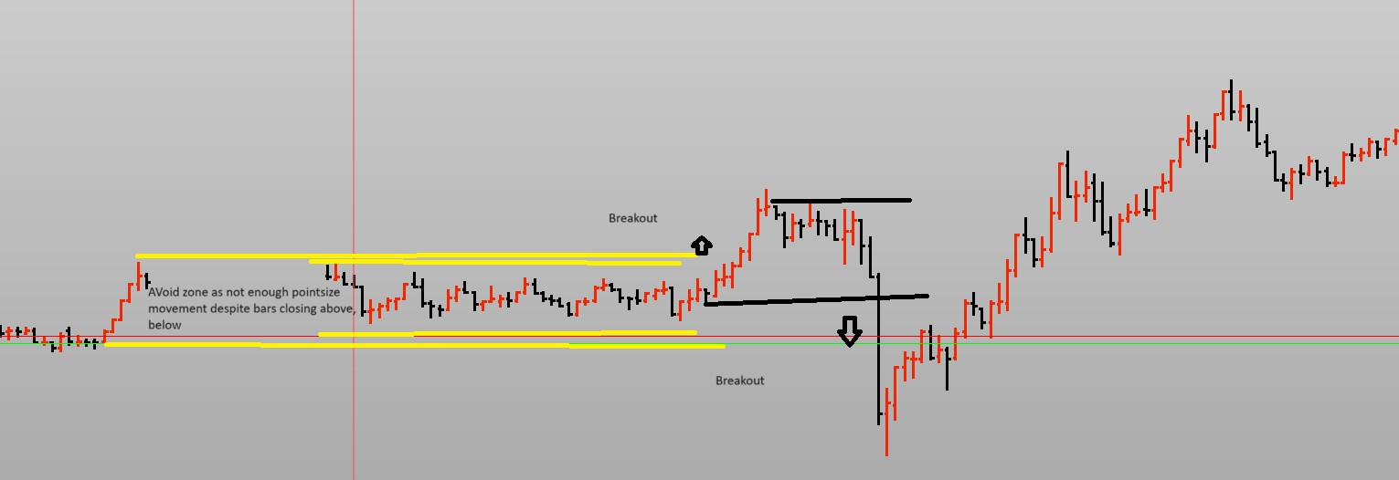
so example 65consecutive bars formed on 1 minutes chart with total pip value of 20 as highlighted in picture 2 (both red and black bars are 5 consecutive). Even if We do break below or above these previous bullish or bearish bars. It’s not worth to trade these. Where when price did break above the 6 red bars however, the total of 6 bars was more than 50 pips (in picture 2 only, extreme left ), this was worth the wait have the price retraced to. On the right you’ll see black bars going below the black bars after 7 red bars, again worth the trade go for due to high pipsize value and mark on the chart for reversal.
In chart 1, which gold chart, extreme left, black bar closed below the black bar straight after 1 red bar, total pip value was $5 or 50 points I think.
in chart 1, in the middle, you’ll see both black and red bars closing above and below after x number of bars. We just highlight these areas where pip value is great than [n] regardless of the consecutive bars they close above or below from.
JSParticipant
Veteran
Hi,
First draft as a “breakout” that considers the width of the channel from which it breaks out… (the “pointsize” mentioned?)
So, you can set the minimum width of the channel before a breakout can occur…
Once Cluster=9

xHighest=Highest[Cluster](High[1])
xLowest=Lowest[Cluster](Low[1])

xPointDiff=xHighest-xLowest

If xPointDiff>15 and High>xHighest then
DrawArrowUp(BarIndex,High)Coloured("Green")
EndIf

If xPointDiff>15 and Low<xLowest then
DrawArrowDown(BarIndex,Low)Coloured("Red")
EndIf

Return xHighest as "xHighest" Coloured("Green"), xLowest as "xLowest" Coloured("Red")
Hi JS, much much appreciate your help, exactly what I was looking for, saves me a lot of hassle to draw lines manually and gives a clear picture of the range we need to trade in!!. Again many thanks!
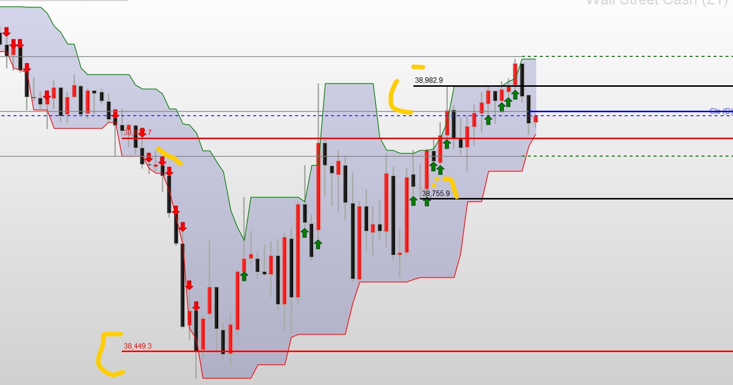
Hi JS, apologies, bothering again, is it possible to actually mark the 1st and last bars from where the price movement actually started, if there are “more than 2 consecutive down or UP bars” with lines as highlighted in the picture please?
In the attached, Red is highlighting the down bars move and black is highlighting the UP bar moves.
Thank you very much for your help so far!!
JSParticipant
Veteran
Hi,
The problem with lines is that once they’re drawn, you can’t remove them. The result is a graph with a lot of lines and therefore totally confusing. What do you think of this alternative? (Currently only for the positive “breakout”)
Hi JS, I understand the issue you’ve described about too many lines! Indeed will get confusing. What you’re showing does make sense. We’ve already filtered the pip size so we know that we’ve some move during retracement and if it reverses than the whole channel or more as very clear in your chart. Let’s give it a go 🙂
JSParticipant
Veteran
Hi,
I’ve added the “negative breakout”…
You can optionally adjust the colors and the style and size of texts…
I hope you can do something with it…
Once Cluster=9

xOffSet=Average[Cluster](Range)/Cluster //

xHighest=Highest[Cluster](High[1])
xLowest=Lowest[Cluster](Low[1])

xPointDiff=xHighest-xLowest

If xPointDiff>15 and High>xHighest then
DrawArrowUp(BarIndex,High)Coloured("Green")
EndIf

If xPointDiff>15 and Low<xLowest then
DrawArrowDown(BarIndex,Low)Coloured("Red")
EndIf


If xPointDiff>15 and High>xHighest and High[1]>xHighest[1] and High[2]>xHighest[2] and High[3]<xHighest[3] then
StartUpBar=BarIndex
StartUpPrice=Open
DrawSegment(BarIndex,Open,BarIndex+5,Open)Coloured("Green")
DrawText("Open=#StartUpPrice#",BarIndex+3,Open+xOffSet,SansSerif,Bold,14) Coloured("Green")
EndIf

If xPointDiff>15 and High<xHighest and High[1]>xHighest[1] and High[2]>xHighest[2] and High[3]>xHighest[3] then
EndUpBar=BarIndex
EndUpPrice=Close[1]
DrawSegment(BarIndex-1,Close[1],BarIndex+5,Close[1])Coloured("Green")
DrawText("Close=#EndUpPrice#",BarIndex+3,Close[1]+xOffSet,SansSerif,Bold,14)Coloured("Green")
EndIf

If xPointDiff>15 and Low<xLowest and Low[1]<xLowest[1] and Low[2]<xLowest[2] and Low[3]>xLowest[3] then
StartUpBar=BarIndex
StartUpPrice=Open
DrawSegment(BarIndex,Open,BarIndex+5,Open)Coloured("Red")
DrawText("Open=#StartUpPrice#",BarIndex+3,Open+xOffSet,SansSerif,Bold,14) Coloured("Red")
EndIf

If xPointDiff>15 and Low>xLowest and Low[1]<xLowest[1] and Low[2]<xLowest[2] and Low[3]<xLowest[3] then
EndUpBar=BarIndex
EndUpPrice=Close[1]
DrawSegment(BarIndex-1,Close[1],BarIndex+5,Close[1])Coloured("Red")
DrawText("Close=#EndUpPrice#",BarIndex+3,Close[1]+xOffSet,SansSerif,Bold,14)Coloured("Red")
EndIf

Return xHighest as "xHighest" Style(Line,3)Coloured("Green"), xLowest as "xLowest" Style(Line,3)Coloured("Red")
Hi JS, thank you much appreciate your help. Let me try and work on it. Much grateful!