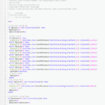
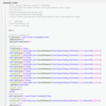
Up the topic to get more votes!
MazParticipant
Veteran
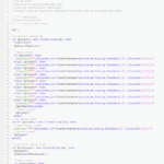
It *really* needs to be a kind of monospace / fixed-width / fixed-pitch font where the characters are the same with apart. Code should be these types of fonts to make it easier to read – especially if you don’t have proper indentation.
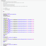
That’s why I think font#1 is a bad idea 🙂 but it seems to be the most preferred by members actually!
I voted Font 1 because it’s the most easily read (for me anyway) due to far better definition / contrast.
I soooo wish the PRT Platform could have the same font, it would make coding sooo much easier for those with less than 20/20 vision! Can’t you lean on a few folk at PRT Nicolas please? 🙂
GraHal
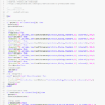
The first font is ‘Adobe source sans’. My preference goes to the second one 🙄
Upping topic again for more votes? I must admit I hesitated between 1 and 2, because 1 seems more pleasant on the heavily filled space of left-hand side where the “elseif” and “drawtext” keywords appear with different colors, but 2 seems more pleasant on the right hand side when lines are clearly spaced.
I agree Noobs … my preference would be Font 1 (good definition / contrast) combined with Font 2 (good spacing).
AVTParticipant
Senior
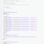
My vote was 4 – for several reasons
- kind of monospace
- zero with dash to have a clear difference to letter O
- greater and less signs good visible
- the multiplication sign not too small to miss
But I am used to do coding in my editor (keeps templates without complaints) and simply copy and paste.