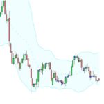
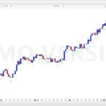
Hi, i have got this indicator to detect and put a dot under every candle that has a body which is 50% or lower than the whole range. Problem is that it is in consequent, some candles it misses and some candles are not 50% or less that get a dot. Robertogozzi which wrote the code cant find the bug either. I would really be thankful if someone could help me solve this. Best!
DEFPARAM CalculateOnLastBars = 1000
R=0
G=255
B=0
F=255
IF close > open THEN
UpperShadow = high – close
LowerShadow = open – low
ELSE
UpperShadow = high – open
LowerShadow = close – low
ENDIF
Shadows = UpperShadow + LowerShadow
Body = range – Shadows
IF Body <= (Shadows / 2) THEN
DotVal = low – (100 * pipsize)
DRAWTEXT(“•”,barindex,DotVal,Dialog,Bold,12) coloured(R,G,B,F)
ENDIF
RETURN
I think the problem could be that the conditions you are testing for are “on-going”; only when the bar closes you can know for sure if that bar needs a dot
Line 15… would get rid of the “/2” to make it “IF Body <= Shadows THEN”, so that you get a 50% frontier of body vs range
Really thank you! It helped me. Just wondering if you know a easy way to get those dots in the middle of every candle instead of below? Just if you knew a easy way to do that i would love you! 🙂
Line 16, I’d try replacing it with Dotval= (high+low)/2 in case you want middle of whole candle. Or if you prefer middle of body only rather than whole candle then you could also try with Dotval= (open+close)/2
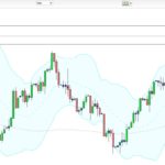
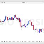
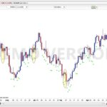
Ok thanks! But somehow the indicator doesnt work, see image. Some candles which is obvious dont get the dot. I thought the problem was solved first. =/
Is this attachment on a weekly timeframe by any chance? There’s a platform bug for graphical instructions in weekly (and x weeks) timeframes only, that display any text or arrow one candle too early… All other timeframes are without this bug.
So even if you didn’t say what timeframe this graph is, all dots look furiously in the wrong place to me, but at the right height if shifting all of them to the right by one candle, which is a strong match for the weekly graphical bug. So am I guessing right, your graph here is weekly but other smaller timeframes are ok?
No its not only weeks. the attached is daily. =/
last attachment in daily seems ok, dots on candles where they should be at first glance, what’s wrong with it?
there is a few which is missing dots.
I tried it on DAX & EURUSD, daily charts, and it seems to be working fine!
I did not take the the time to check each candle and do the math, but could not find any odd result.
yes it looks good on yours! hmm strange.. what is wrong with mine then…
What instrument is in your screenshot?
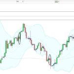
It works perfectly on GOLD daily chart, as from the attached screenshot. I highlighted the same candles you circled.
Here is the code, in case mine and yours mismatch, aside from where you want a dot plotted:
DEFPARAM CalculateOnLastBars = 1000
R=0
G=255
B=0
F=255
IF close > open THEN
UpperShadow = high - close
LowerShadow = open - low
ELSE
UpperShadow = high - open
LowerShadow = close - low
ENDIF
Shadows = UpperShadow + LowerShadow
Body = range - Shadows
IF Body <= Shadows THEN
DotVal = low - (10 * pipsize)
DRAWTEXT("•",barindex,DotVal,Dialog,Bold,12) coloured(R,G,B,F)
ENDIF
RETURN
If it’s the same…. maybe a graphical issue, the numer of pixels…. I really couldn’t tell!