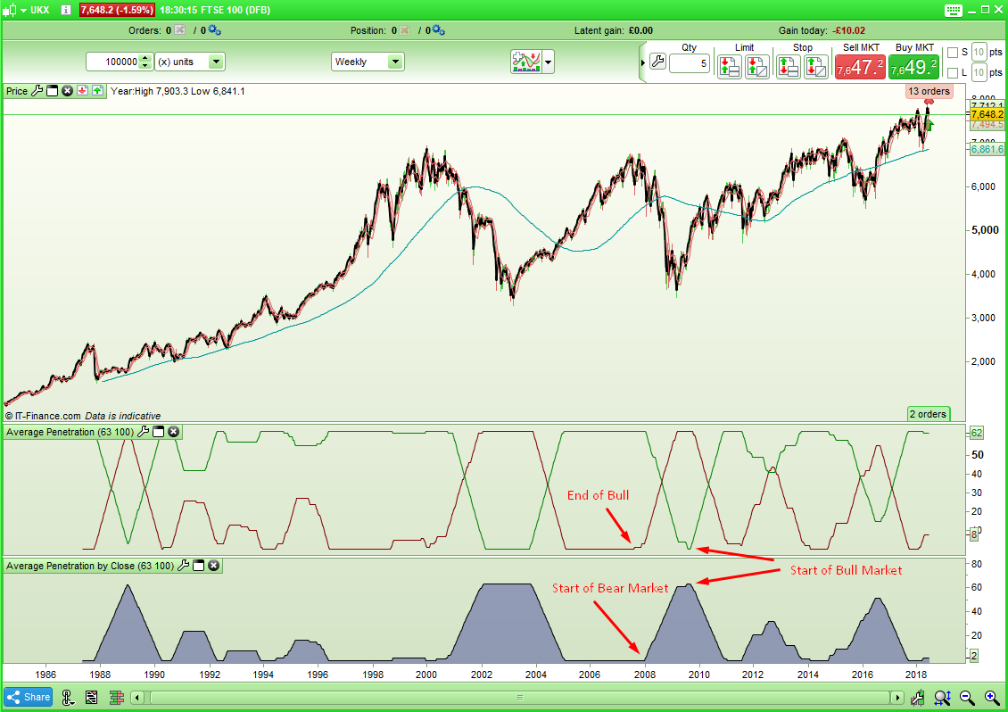
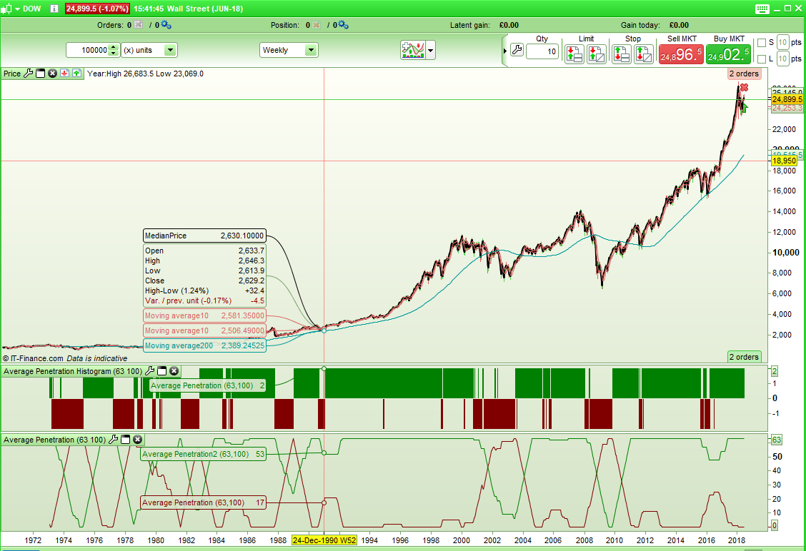
I spotted this idea in a magazine someone kindly sent me today (thanks!) and I thought it was interesting. Basically it is a sum of the number of times in a look back period that a close penetrates below an average line.
In the article the author is suggests using an average of 100 and a look back time period of 3 months – but for some reason chooses a value of 63 to represent this. He suggests that a value below 7 indicates bullishness but when I created an indicator it seemed better to say that if the returned value is falling or flat lining at zero then it is a bull market and if it starts rising then it is time to not be on the market.
The code for the indicator is very simple:
LBPeriod = 63
AvePeriod = 100
ClosePenLow = Summation[LBPeriod](close < Average[AvePeriod])
Return ClosePenLow
I decided that it would be interesting to see how many times the high is above and the low is below during the look back period and so this is the code for that: I feel that this is possibly a better indicator.
LBPeriod = 63
AvePeriod = 100
LowPen = summation[LBPeriod](low < Average[AvePeriod])
HighPen = summation[LBPeriod](high > Average[AvePeriod])
return LowPen coloured(128,0,0), HighPen coloured(0,128,0)
[attachment file=73379]
It is meant to be applied to daily charts but I found that as an overall trend filter on weekly charts it worked pretty well so that is what I have shown here.
Obviously the indicator code can be easily adapted to be used in a strategy as a filter.
As usual – any thoughts, ideas and improvements are welcome…..
Almost similar to Aroon but with moving average.
Nice to read some fresh idea 😉
63 will be average number of trading days in 3 months?
I’ve been round with the hoover and it got sucked into the Snippet Library! 🙂
I’ve just re-read the article and the author calls it his stiffness filter. It took me a few moments to work out why and then I remembered that it was all about penetration! 🙂
I decided to turn the high and low average penetration filter into a histogram so as to more quickly see what it is telling us without having to analyse the lines.
If green line is above red line but gap is reducing then it switches to bearish and if red line is above green line but gap is reducing then it switches to bullish. Otherwise green above red = bullish and red above green = bearish
Here is the code:
LBPeriod = 63
AvePeriod = 100
LowPen = summation[LBPeriod](low < Average[AvePeriod])
HighPen = summation[LBPeriod](high > Average[AvePeriod])
IF HighPen > LowPen then
Flag = 2
endif
IF HighPen < LowPen then
Flag = -2
endif
If flag = 2 and Highpen - LowPen < HighPen[1] - LowPen[1] then
Flag = -2
endif
IF flag = -2 and LowPen - HighPen < LowPen[1] - HighPen[1] then
Flag = 2
endif
If flag > 0 then
R = 0
G = 128
else
R = 128
G = 0
endif
return Flag coloured(R,G,0) style(Histogram,2) as "Average Penetration"
[attachment file=73389]
Do you think it is worthy of the indicator library or is it a bit too simple?
Been published in TASC magazine, so why not in our codes library? 😉
Been published in TASC magazine, so why not in our codes library?
OK – I will submit something when I get some time to do it.
GigiParticipant
Senior
Bonsoir,
Existe t’il un screener de cet indicateur?
Gigi – There are some simple forum rules one of which you have failed to follow. If you want to ask a question in the English speaking forums then ask it in English. If you want to communicate in French then ask the same question in a new topic in the French forums.