I guessed that was the case, but I haven’t proved that it is, yet!, but now you mention it!
If the price ‘just’ triggered the order(short) at the entry level,
then you would expect the entry would be below the entry level by halve the spread.
Since the price never changes, exit was halve the spread above the entry level,
These to points make up the whole spread distance. ( spread = 0.7 + 0.7 = 1.4 )
That could explain what happened, but not why the chart doesn’t represent that or why it happened.
Thanks #GraHal, another possible piece of the puzzle.
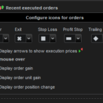
On another point, I haven’t seen any information explaining about the icon’s in the image.
Not really rocket science, but somethings been bugging me for a while about them, especially the X, maybe I’m a bit slow!
I think what may have puzzled me was if both a back-test is run in chart with its orders displayed and Recent orders displayed as well, the orders same or similar can display both.
However if you hide one set, then you can get different closed icons
.When in back-test, the order icons for ENTRY; STOP; TARGET; Trailing STOP, sh0w as expected if there triggered.
However, if a order is closed for another reason, FLATAFTER; a REVERSED ORDER, the closed order is the X icon.
In the proOrder(demo), other than the ENTRY(arrow), only the X is used for all closing of trades regardless of why, and probably if QUIT or STOPPED.
Still observing, but I think that so far.
Regards