

Pivot Line Analysis Market Sentiment of Every Candle
My Pivot Line Analysis Market Sentiment indicator (https://www.prorealcode.com/prorealtime-indicators/pivot-line-analysis-market-sentiment-indicator/) got me thinking. Why not use pivot line calculations to create pivot points for every candle instead of just daily pivot lines. Then we can compare the current candle’s lines with the previous candle’s and get an idea of immediate market sentiment.
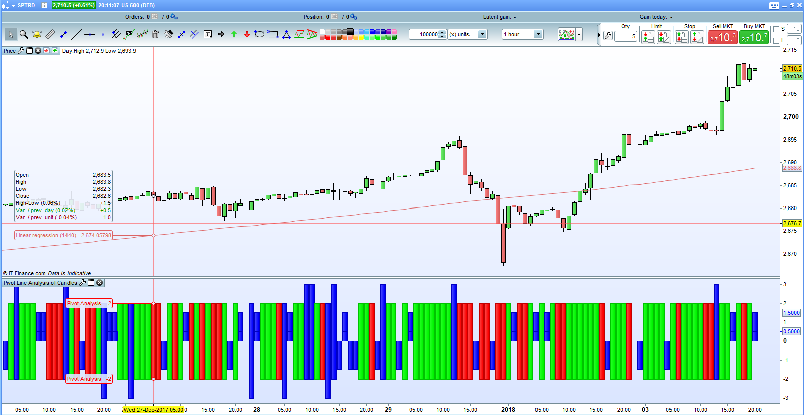
This simple indicator helps us see immediate market sentiment at a glance. It can be applied on any time frame and any market.
- Rising Pivots. If this candle’s R1 is higher than the last candle’s R1 and this candle’s S1 is higher than last candle’s S1 then sentiment is bullish.
- Falling Pivots. If this candle’s R1 is lower than last candle’s R1 and this candle’s S1 is lower than last candle’s S1 then sentiment is bearish.
- Outside Pivots. If this candle’s R1 is higher than last candle’s R1 and this candle’s S1 is lower than last candle’s S1 then the bulls and bears had a big fight resulting in increased volatility and the market may be at a point of indecision.
- Inside Pivots. If this candle’s R1 is lower than last candle’s R1 and this candle’s S1 is higher than last candle’s S1 then the bulls and bears had a very evenly matched fight and the market may be at a point of indecision.
A green bar indicates that this is a bullish candle.
A red bar indicates that this is a bearish candle.
A long blue bar indicates that this candle was a more volatile candle.
A short blue bar indicates that this candle was a candle of indecision.
The indicator bar below each candle refers to the sentiment of the candle immediately above it.
If the blue bar is raised then it indicates that the bulls came out slightly on top.
If the blue bar is lowered then it indicates that the bears came out slightly on top.
The blue bars are of the most interest and can be used to predict possible changes of market direction. Several blue bars in a row can indicate that the market is really going sideways and a breakout may happen soon.
H1 = High[0]//High
L1 = Low[0]//Low
C = Close[0]//Close

HH1 = High[1]//High
LL1 = Low[1]//Low
CC = Close[1]//Close

Pivot1 = (HH1 + LL1 + CC) / 3
R11 = 2*((HH1 + LL1 + CC) / 3)- LL1
S11 = 2*((HH1 + LL1 + CC) / 3)- HH1
Pivot = (H1 + L1 + C) / 3
R1 = 2*((H1 + L1 + C) / 3)- L1
S1 = 2*((H1 + L1 + C) / 3)- H1

//Outside Pivot Up
IF R1 > R11 and S1 < S11 and Pivot > Pivot1 THEN//R1 - R11 > S11 - S1 THEN
 Flagup = 3
 FlagDown = -2
 R = 0
 G = 0
 B = 255
ENDIF

//Outside Pivot Down
IF R1 > R11 and S1 < S11 and Pivot < Pivot1 THEN//R1 - R11 < S11 - S1 THEN
 Flagup = 2
 FlagDown = -3
 R = 0
 G = 0
 B = 255
ENDIF

//Inside Pivot Up
IF R1 < R11 and S1 > S11 and Pivot > Pivot1 THEN//R11 - R1 < S1 - S11 THEN
 FlagUp = 1.5
 FlagDown = 0.5
 R = 0
 G = 0
 B = 255
ENDIF

//Inside Pivot Down
IF R1 < R11 and S1 > S11 and Pivot < Pivot1 THEN//R11 - R1 > S1 - S11 THEN
 FlagUp = -0.5
 FlagDown = -1.5
 R = 0
 G = 0
 B = 255
ENDIF

//Up Pivot
IF R1 > R11 and S1 > S11 THEN
 Flagup = 2
 FlagDown = -2
 R = 0
 G = 255
 B = 0
ENDIF

//Down Pivot
IF R1 < R11 and S1 < S11 THEN
 Flagup = 2
 FlagDown = -2
 R = 255
 G = 0
 B = 0
ENDIF

return FlagUp coloured(R,G,B) Style(Histogram,2) as "Pivot Analysis",FlagDown coloured(R,G,B) Style(Histogram,2) as "Pivot Analysis"